
Abstract
The publicly available visual-only scientific space data from NASA lacks accessibility to the BVI (Blind and Visually Impaired) community. The objective of this paper is to increase awareness and outreach of sonification. Inaccessibility hinders the scientific progress of BVI researchers and advancement of science as a whole. The BVI community brings unique perspectives and innovation to the scientific community, making inclusion vital. The lack of accessibility for BVI scholars can be addressed through data sonification, a process that converts data into sound to convey information, patterns, or enhance interpretations. Scientific data is ideal for a sonification application as it often contains clear variables and can reveal small data changes through discernible pitch changes. With extensive guidance, this research developed through three primary phases: Investigating Data, Sonification, and AI music tools; Seeking Guidance, Strengthening Depth, and Ensuring Inclusivity; and Experimentation and Exploration. Following the exploration of tools and public data archives, light curves—heavily studied in BVI projects—were selected for use in the sonification process. From Kaggle Hub, Kepler-452b light curve data were downloaded and cleaned, and later converted into basic sound using the grand piano as the primary instrument. A survey was created to assess knowledge of space data, accessibility challenges, and sonification as a viable alternative to data interpretation. The sonified Kepler-452b’s data were attached to the survey and shared with various people, receiving 32 respondents. The majority of participants believed the sonification was representative of Kepler-452b’s data, responding positively to sonification as a data interpretation tool.
Keywords: accessibility, sonification, blind and visually impaired, BVI, data interpretation, NASA space data, data science, audification, sound based data-visualization.
Introduction
Sonification, first coined by William Buxton in 1989, is the “use of sound for data representation, [being] the auditory counterpart of data visualization”, making scientific information more accessible—especially for BVI scientists and researchers1. Sonification —the process of converting data into sounds —offers the BVI community immense benefits, particularly in environments such as astronomical institutions or projects where data interpretation is crucial. NASA, the largest government organization responsible for civil space exploration and scientific discovery, maintains a public archive containing data for a wide range of topics, including 100,000+ datasets relating to space. NASA contains data for fields such as general science, space research, aeronautics, environmental changes, and more, allowing the general public to access frequently updated and accurate data. However, the way these datasets are presented —primarily through visual formats—renders them inaccessible to the BVI researchers, scientists, and students, who are left unacknowledged at the expense of targeting the “general public”. This lack of accessibility is a significant problem because BVI researchers and scientists have made significant contributions to scientific discoveries across multiple disciplines, including space research. The BVI community has limited access to these datasets due to the way the data is presented and the lack of alternative modalities. When critical datasets are only available in visual formats, it creates a barrier that prevents BVI scholars from fully engaging with and contributing to the field. By excluding them from accessing the same information as their peers, scientific progress is inhibited. This paper aims to increase the accessibility of publicly available visual-only formatted scientific data and increase outreach to ensure the holistic progress of science. To address this issue, the method of sonification proves effective and robust in facilitating data interpretation among BVI scientists and researchers. Sonification has been previously used in many applications. Sonification encompasses general techniques such as audification, parameter mapping sonification, and model-based sonification2.
Audification is a directly play of data into sound without mapping any parameters or data values, mostly for aesthetics and not to communicate any information or data. Sonification is about mapping of data parameters and value to sound parameters, usually representing meaningful information.
By transforming visual information into sound, sonification enables BVI individuals to detect patterns, identify anomalies, and analyze complex data. Sonification can also provide interpretations that are much more comprehensible than commonly used data representations, such as graphs and charts. This may not only weaken the barrier of accessibility but also enrich the scientific process with new methods and perspectives.
Space data is important because it drives discovery, protects Earth, and ensures that humanity can plan for the future both on and beyond our planet. Space data was selected for this project over various alternatives, such as environmental data, due to its uniqueness–space data being novel and fairly new. Additionally, space data was chosen due to the high difficulty of visualizing space phenomena through numerical data. Gravitational waves, stellar light curves, and cosmic radiation are extremely complex and difficult to understand by simply observing numbers. Additionally, other types of data, such as environmental data, might be more diverse and contain more variation. These extreme, ubiquitous fluctuations are much harder to understand. Space data offers sporadic fluctuations that are better understood, and data that is popular.
The Audible Universe Project, an international initiative, explores how astronomical data, particularly stars, can be translated into sound for scientists to interpret complex cosmic phenomena3. NASA’s Black Hole Sonification Project converted data from the Perseus galaxy cluster and the Milky Way’s black hole into sound for listeners to “hear” the movements of celestial phenomena4. Essentially, by researching the BVI community’s lack of accessibility to space data, this paper aims to depict sonification as a reliable means of better data interpretation. While both of these projects are often framed as public engagement tools, they are not interactive sonification platforms and lack BVI scientists’ leadership, a crucial point in the development of a platform aimed at the BVI community.
BVI scientists from all around the world have made significant contributions to science. The BVI community brings many notable scientists to the scientific community. Ensuring their inclusivity in data analysis is extremely crucial because the BVI community brings different sensory approaches that can reveal patterns missed in traditional visual analysis. Dr. Wanda Diaz-Merced, a BVI Puerto Rican Harvard Smithsonian Astrophysicist, pioneered the use of sonification to analyze astrophysical data, converting light curves and cosmic ray signals into sound. She introduced an alternative modality, enriching the toolkit of astrophysics and providing proof that sonification can serve as a legitimate scientific method to reveal discoveries. By elevating sonification into mainstream astrophysics, she paved the way for its application in other data-intensive fields5. Dr. Kent Cullers, a BVI radio astronomer at the SETI Institute, relied on computational pattern recognition algorithms and auditory analysis instead of traditional telescope imaging, leading to methods still used in radio astronomy. He became the first totally blind physicist and radio astronomer employed in the U.S. (at the SETI Institute). His algorithms and approaches formed the backbone of SETI’s data analysis techniques, showing that blindness does not prevent one from making breakthroughs in observational astrophysics6.
The United Nations, according to Britannica, is an international organization that aims to promote global peace and universal rights. The UN’s SDGs are the United Nations Sustainable Development Goals. A set of 17 global goals, they aim to tackle the world’s most urgent challenges—like inequalities7. The United Nations Office for Outer Space Affairs has been actively highlighting sonification as an inclusive tool for space data accessibility. It has promoted and supported the method in several important ways. UNOOSA’s Space for All initiative pushes for inclusive participation in space activities and elevates sonification as a legitimate and necessary method for analyzing space data8. The United Nations’ policy of SDGs focuses on making the world better and equitable by 2030. They target various issues and aim to address various problems, including inequality. Excluding the BVI community reduces diversity, limits talent, and can contradict the UN’s SDGs on equality and inclusion. Sonification aims to contribute to the UN’s 10th Sustainable Development Goal: Reduced Inequalities. Additionally, the significance of this research is to understand space-data accessibility challenges and the viability of data sonification as an alternative to data interpretation.
Sonification is a 4-step process. It starts with identification of the data type and source, cleaning and filtering of data to get accurate, sole raw data values, mapping data to basic sound pitches through direct parameter mapping styles, and finally, using software tools and algorithms to generate sound output in MIDI file format. Below is a detailed method.
- Identification of the data type and source
- Data type can be of different kinds: NASA data, climate data, mathematical data, and general STEM data. that contains 1 x-variable and 1 y-variable.
- Search for public data archives or repositories that contain data for public use, such as MAST, Earthdata, and Kaggle Hub.
- Make sure that the acquired data is univariable and not multivariable because the sonification process will become more complex and prone to inaccessibility as multiple sounds and data increase complexity and difficulty in data interpretation
- Cleaning, Sizing, and Normalization of the data
- Filtering data from any descriptions or metadata. When data is downloaded, many data archives will include extra non-data files, which need to be removed when converting data directly to sound.
- Sizing and normalization of the data. If the length of the data is too big, the output can become misleading or overwhelming to understand and interpret.
- Identifying spatial values or variables. Identify which specific variable is dependent and ensure that there is only 1.
- Encoding data through Python coding, software tools, and the use of algorithms
- Use code editor tools such as VS Code, Notepad++, and Google CoLab to work on data and convert it into a sound file format.
- Write code, specifically using Python packages such as sounddevice and numpy to assign data values, play sound, and loop through the dataset. Develop a function that can directly assign data values to sound pitches and then store it in a new file.
- Python is optimal for coding.
- Generating MIDI sound output
- MIDI generation by using loops to map sound to data values and convert them into sound stored in MIDI files
- Assign starting pitch values, incrementation of notes based on data values.
- Use online MIDI editors like Signal or digital audio workstations like MuseHub to modify or refine the quality of the output.
The scope of this study is data representation, audience perception, conceptual evaluation, and specific data types. The limitations of this study were sample size and diversity. A limited number of participants and a lack of significant diversity in the respondent audience may affect the generalizability of findings. Additionally, there were some technical constraints and noisy feedback. The quality of the sonification recording attached was poor, and some responses may have been influenced by novelty or confusion rather than genuine understanding or appreciation.
Methods
Methodology Overview
The overall structure of the study was cross-sectional as it aimed primarily to capture perceptions and experiences. The data chosen for sonification were light curve data from the exoplanet Kepler-452b. The data was downloaded as a dataset from csv file containing values of light flux. The entire dataset was sonified, and the most commonly occurring value was chosen as the median note. Variations from that note were categorized as notes higher or lower in pitch in proportionality to the data values. The sonified recording was then attached to a survey. The survey findings were then analyzed to determine the usefulness of the sonified data particularly to BVI individuals in STEM. The primary variables and measurements that were studied were 1) comprehension of data from sonification only 2) perceived effectiveness of sonification, and 3) quantitative and qualitative measures such as scale ratings and participants’ feelings and opinions. The research was conducted in three primary phases. Each phase was designed to build on the findings of the previous phase and contribute to the overall goals of the study and the eventual data sonification process.
Phase 1: Investigating Data, Sonification, and exploring available Music Tools
This work with data sonification and extraction began with the process of gathering data from websites such as Kaggle, which, according to Wikipedia, an online hub for open datasets, machine learning projects, and data analysis challenges. We encountered upon countless data archives and projects initiated by different countries, including Japan’s DARTS at ISAS/JAXA, a notable space science data archive from Japanese satellites on solar physics, planetary science, and more9. India’s Chandranarayan-II, a second lunar exploration mission, generated massive, high-quality scientific datasets which are stored on the public ISRO Data Archive10. One of the most comprehensive and publicly available archives of environmental information, NASA’s EarthData website, served as a central hub for accessing data about climate change, ocean conditions, etc.11. Additionally, NASA’s Chandra X-Ray Observatory’s “Universe of Sound” project turns astronomical data into audio. Exploring this tool helped significantly understand conventional sonification structures and manipulation of data12. This experience and familiarity helped to broaden and deepen understanding of the structure and characteristics of real-world data. Notably, the website primarily relied on visual interfaces to convey its data, limiting accessibility to communities such as the BVI. However, various sonification tools that incorporate AI to convert patterns into sound were available for exploration. For example, Riffusion, an AI-powered web platform, generates music and soundscapes from textual descriptions and user-provided MIDI files13. A MIDI file, according to Lifewire, is a digital file containing instructions for music through performance data—pitch, timing, duration, velocity, and instrument assignments. Similarly, Suno is another AI platform designed for music creation, but it is primarily a creative tool for turning abstract text prompts into sound. Essentially, after exploring these resources and tools, data sonification proved that, once well explored, it could serve as a viable solution to data interpretation. Various tools could be used as aids in sonification.
Phase 2: Seeking Guidance, Strengthening Depth, and Ensuring Inclusivity
After significantly deepening the understanding of the circumstances and the possibilities of data sonification, various academia leaders in this field were contacted, including a pioneering, distinguished geo-environmentalist and professor at Rissho University in Japan. I was also able to connect with an established scientist associated with NASA’s Kepler Mission who has played an important role in analyzing vast amounts of exoplanet data. Additionally, to ensure the conducted research truly created an impact on the intended audience, important members of the BVI community were contacted, such as a blind accessibility consultant, accessibility tool tester, and content creator. I also connected with a passionate, blind accessibility advocate who has raised global awareness about the lived experiences of the BVI community through his TED-Ed talks and educational YouTube channel. Furthermore, I was able to learn from NASA’s math lesson, Exploring Exoplanets with Kepler, which significantly helped in reading and interpreting light curves and learn how dips in brightness reveal a planet passing in front of its star14. Through the discussions and exchange of ideas from various people, I was able to gain feedback and comprehend crucial elements that I should have in my work with sonification.
Phase 3: Experimentation and Exploration
After experimenting on various platforms such as MuseScore Studio 4, univariable datasets proved to be much easier to sonify. The process of mapping them directly to a sound property, such as pitch, volume, and duration, is much simpler because univariable datasets, datasets with one dependent variable, allow us to clearly see the effect of the independent variable on it without other factors or variables that can influence the final outcome. In data sonification, values are directly mapped to sound properties like pitch, volume, and duration so patterns can be heard instead of seen. For example, higher numbers might be played as higher-pitched notes, larger values as louder sounds, and time-based data as sequences of tones. This direct mapping would make it easier for listeners to perceive trends or anomalies in the data. This phase allowed me to understand what sonification was like from a simple perspective, and what elements I could manipulate without changing the data.
Sonification
Sonification encompasses various methods and is typically Python-based. Sonification begins with the gathering of the dataset intended to be sonified. Because sonification can be used across various fields, this data could be scientific data, financial data, or even environmental data. Then, the structure of the data is analyzed, and the desired variables are determined. It is also best to determine the range of the data or any temporal relationships that are present. By restricting the domain of the data and selecting specific data points or time series that will be represented through sound, the data can be streamlined, which will better translate into the audible realm15. Through parameter mapping, specific data values are attached to different sound parameters such as pitch, volume, duration, or timbre. Thus, the ranges of the data are reflected in the variance of the sound through pitch or intonation. Next, the user should choose a sonification tool or library that converts the data into musical notes. There are many openly available tools and Python libraries like Astronify and STRAUSS which can help write the code that performs the data-to-sound parameter mapping16,17. I preferred Google Co-Lab due to my prior expertise and familiarity. Finally, the sonification can be rendered as an audio file (e.g., WAV, MIDI). This sound can be played directly through speakers or headphones.
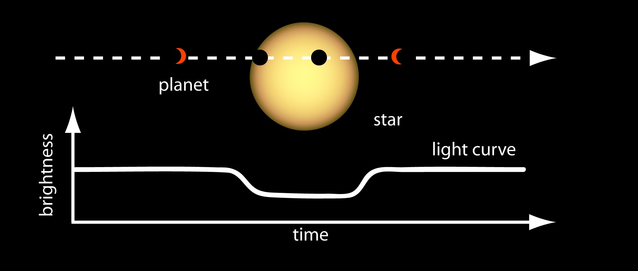
Pitch is chosen because, naturally, humans detect pitch changes extremely well, as we are naturally tuned to notice rising or falling pitches. Pitches can also create melodies, which can be memorable and are works best for data interpretation. Mapping data to volume is challenging because some volume changes can be barely noticeable, and are susceptible to interpretation and uncertainty, leading to distorted or differing perceptions. Additionally, data value durations or occurrences cannot effectively be represented in volume because volume cannot form rhythms or melodies by itself. Temp can represent data, but it is not ideal because to reflect changes in data, tempo would need to increase substantially, and for dense data, it is unfeasible because tempo speeds could become chaotic to keep up with. The parameters that were controlled in the Kepler-452b sonification were pitch and duration. Data values were mapped to pitch to account for changes in data values and a broad spectrum of changes. The frequency of data values was mapped to the duration of certain notes. Light curves are graphs that show the brightness of an astronomical object and how it changes over time18. They are primarily used to study exploding stars and exoplanets such as Kepler-10b. A transit happens when one object passes in front of another from a certain point of view, blocking some of its light19. In terms of exoplanet research, a transit refers to when a planet crosses in front of a star, causing a dip in the star’s light curve.
Kepler-452b and Light Curve Data
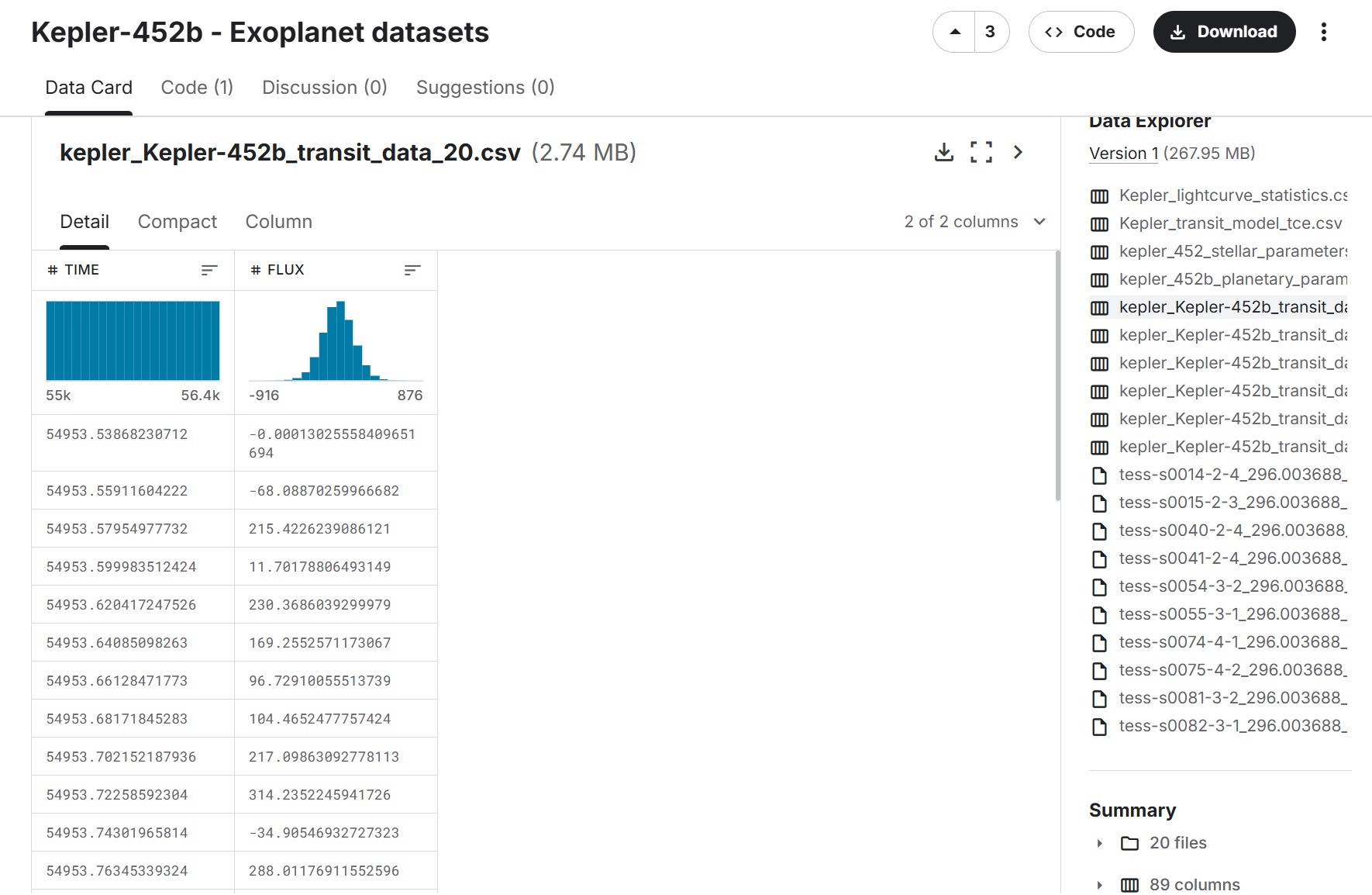
After conducting research, the most common type of astronomical data used in research projects, particularly BVI research, tends to be data concerning light curves of stars. While various stars like the Sun, Betelgeuse, and Proxima Centauri exist, Kepler-452b was chosen due to its regularity and patterned flux values. This aspect made the light curve data Kepler-452b particularly ideal for sonification, as a repeating cycle of data mapped to rhythm can be better understood, especially through pitch. Additionally, stars such as the Sun or Proxima Centuari might contain irregular and unpredictable patterns. This inconsistency of the pattern might make the sonification less musical and coherent. Kepler-453b is a rocky exoplanet with a short orbital period and frequent transits visible in its light curve. The planet is part of a larger star system, which is located in the Cygnus Constellation20. This dataset can be accessed and was collected through Kaggle Hub. The KIC ID for Kepler-452b is KIC 8311864. The Observation ID corresponds to each Kepler observation file.
We began by selecting a Kepler‑452b light‑curve file from the dataset and isolating the flux column, which contains the star’s brightness measurements recorded during the planet’s transit. After loading the full dataset, we cleaned the flux values by removing missing or invalid entries, leaving us with 694 usable measurements. To simplify the data and reduce noise, each flux value was floored to the nearest whole number. This cleaned and standardized sequence of 694 values became the basis for analysis and interpretation.
A flux is a measure of the total amount of light emitted by a specific source over a unit of time21.
Next. using Google CoLab, the cleaned set of 694 flux values was converted into a sequence of MIDI notes by treating the dataset’s mode, 13, as the central value. The middle note corresponds to F#5 or G flat. Each value was transformed into a semitone offset from this reference and mapped onto pitches. Every note was assigned a duration of 1 beat, and the tempo was set to 180 BPM, resulting in a 3 minute and 51 second long track. This process directly represented the dataset’s fluctuations, and the resulting midi file was downloaded to be edited in Signal.
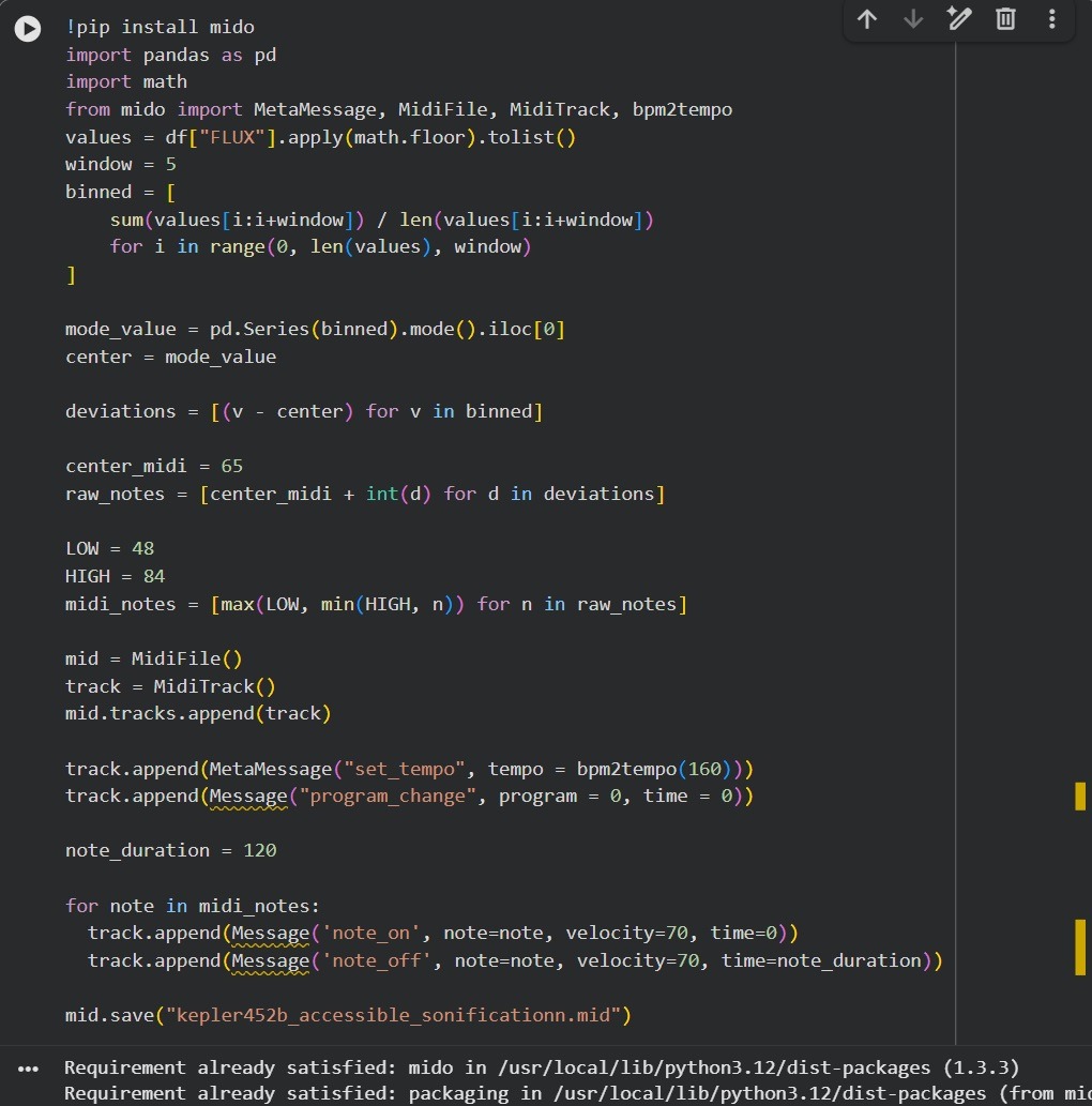
Importing the MIDI into Signal, an online MIDI editor that allows users to create, modify, and play back musical representations of data, the data is converted into the median notes, and can be heard audibly and seen on the track display.
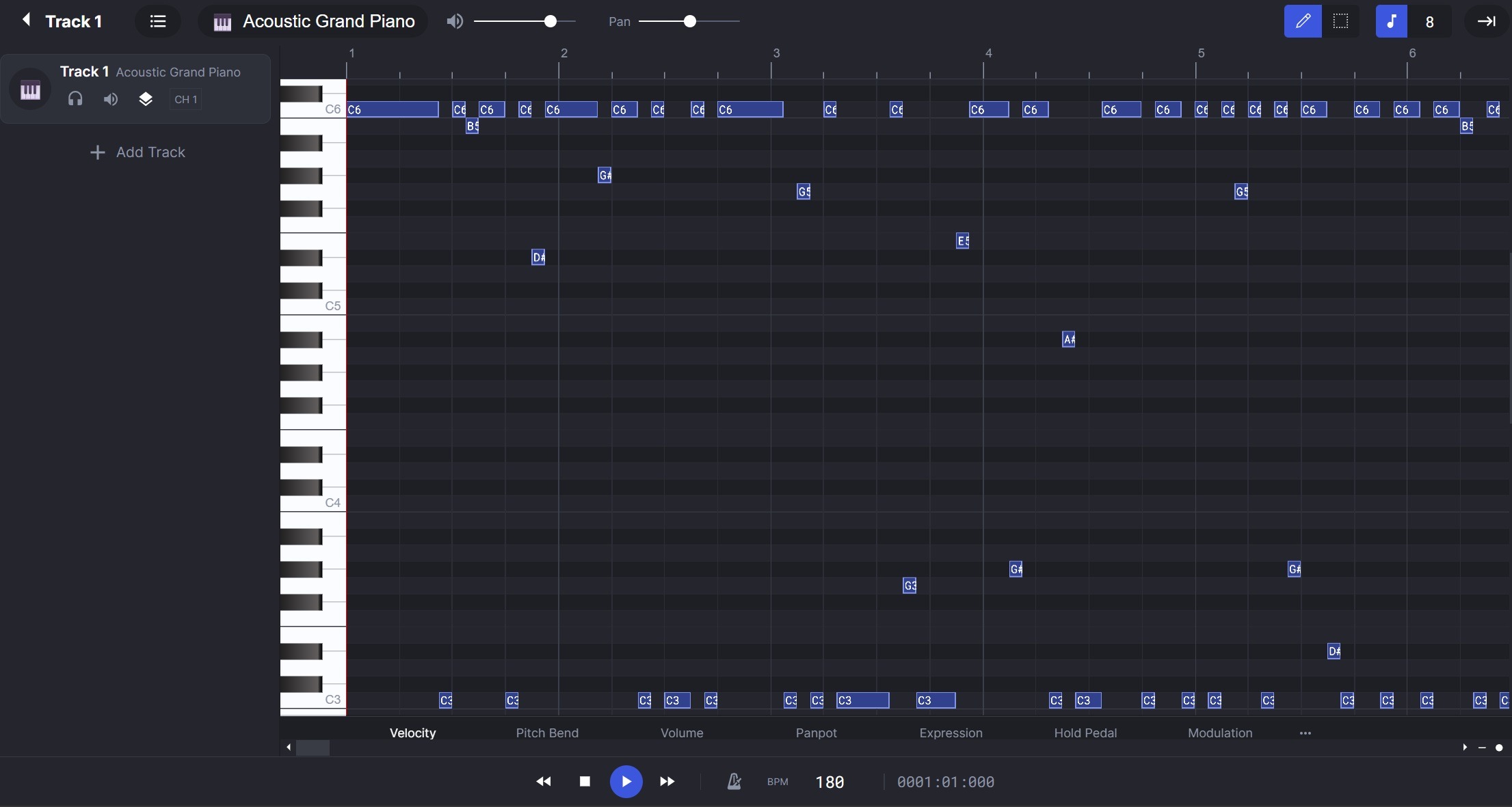
The final sonification recording: contained 1 instrument: the acoustic grand piano.
Parameter Setting: Parameters for sound generation has to be the y-variable or the dependent variable in the dataset. The parameter is the variable that is used in the sound generation and will be the dependent variable or the variable that is changing.
Audio and data dimension relationship: The pitch increases in the data correspond to the y-dimension in the data. As the y-values increase, the pitch directly increases as well to match and mirror the trend of the data. In the Kepler-452b sonification process, the data was directly mapped to sound and was a direct auditory representation that didn’t interfere with musicality of the recording nor extra elements to increase engagement with the end product.
Sonification and Survey
After finalizing the sonification recording, a Google Forms survey was created to understand how the Blind and Visually Impaired (BVI) community accesses publicly available scientific data, the challenges faced, and how accessibility can be improved. The sonification recording was attached to it the survey to understand sonification’s effectiveness compared to a traditional accessibility method, textual description, if sonification represents data well, and how it can be further improved. The survey was circulated with various STEM groups and communities. It was shared with various education service centers and with people with expertise in sonification and data. The survey was circulated and shared through various institutions, such as the Principals of Blind Schools STEM Group, education service centers in Texas, through social media platforms like LinkedIn, and through academia and industry leaders.
Ethical Considerations
In the survey, users were informed that participation was entirely voluntary, their responses would remain anonymous, no personally identifiable information (PII) would be collected, and that the data would be used solely for publicly shared research purposes. This ensures informed consent, privacy, the right to withdraw or decline, and prevents any ethical concerns. All participants took the survey at their own consent and no responses or participants were forced. The survey also mentions a potential risk of participation: mild listening fatigue. The participants are also made aware that their responses may help improve research on data sonification and accessibility for the blind community. Additionally, no email addresses were collected and users were told that the survey would take 13-15 minutes to complete.
Results
The data chosen for sonification experimentation was the light curve data from exoplanet Kepler-452b. This data was collected from Kaggle Hub, cleaned on Google CoLab, and sonified on Signal, an online MIDI editor.
There were several platforms that were engaged to better understand the structure, presentation, and appearance of real, scientific datasets. Sonification tools like Kaggle, EarthData, and Riffusion were used to construct an effective sonification. These tools enabled a better understanding of data and auditory intersections and interpretations. Through examining MIDI files, I was able to understand their role in structuring musical data. I was able to gain an idea of crucial elements or variables that are necessary in sonifying data. Furthermore, I was able to learn basic methods of data sonification, such as mapping median data values to notes and converting data changes to proportional notes. I was also able to experiment on MuseHub Studio and Signal with univariable datasets such as the global surface temperatures of Earth. By understanding what parts of sonification to keep and which parts could be manipulated to make the sound more appealing, I developed a strong idea of data sonification.
A survey was used to capture the feedback on sonification and affirm sonification’s viability in data interpretation, shed light on developing more interactive sonification for increased effectiveness, increase awareness of the lack of accessibility of publicly available visual-only space data, and outreach sonification.
Survey Stats
The survey was open for more than 8 weeks to the BVI community. The participants were informed that survey’s data will be used for research purpose only, no personally identifiable information (PII) will be shared or collected and all responses will remain anonymous. Participants were informed that the survey would take approximately 13-15 minutes. We also informed that the participation is entirely voluntary, they could experience mild or no listening fatigue and hence they are free to stop at any time or skip any question they did not wish to respond.
There were 4 rules in the eligibility criteria:
- You must be blind or visually impaired to participate
- You are familiar with screen readers
- You must be 13 years or older to participate
- You must be using a device that can output audio (via headphones, computer, speakers)
There was a total of 5 sections in the survey:
- Participant’s Profile
- Text-based Data Interpretation
- Sonification-based Data Interpretation
- Sonification and Text Data Interpretation
- Conclusion
Participants profile:
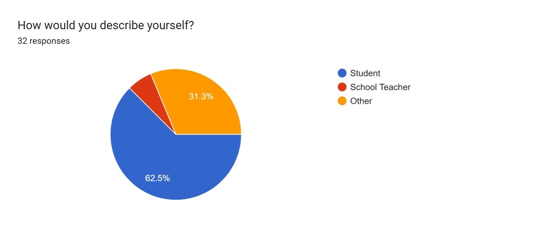
The survey received 32 respondents. (Figure 7).
- 62.5% of participants identified as students
- 6.3% as school teachers
- 31.3% as other
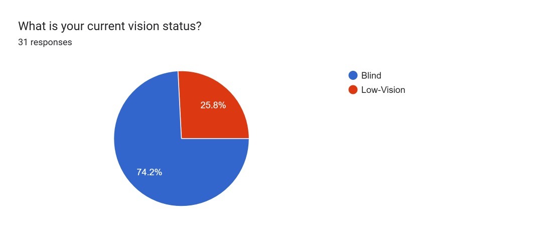
100% of participants were blind or visually impaired. (Figure 8).
- 74.2% of participants identified as blind,
- 25.8% of participants identified as low-vision
Survey Stats
The survey served 3 primary objectives:
- To understand accessibility challenges faced by the BVI community and common accessibility tools used
- To understand the familiarity of sonification as a tool and whether it is effective in data interpretation.
- How sonification can be improved upon and made better from participants’ feedback
First Objective:
The first purpose of the survey was primarily addressed through 2 questions on the survey as depicted in (Figure 9) on current accessibility tools and (Figure 10) on challenges in accessibility of publicly available scientific data.
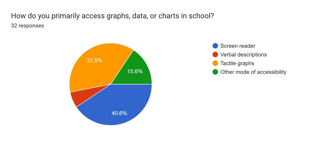
Primary accessibility tool for graphs, data and charts in school: (Figure 9)
- 37.5% of participants accessed graphs, data, or charts primarily through tactile graphs
- 40.6% accessed them through screen readers.
- 6.3% of participants accessed them through verbal descriptions
- 15.6% used another mode of accessibility
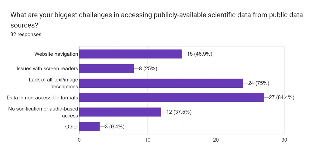
The biggest challenge in accessing publicly-available scientific data from public data sources (Figure 10).
- 84.4% mentioned data being in non-accessible formats.
- 75% indicated that there is the lack of alt-text/image descriptions.
- 46.9% indicated challenges in website navigation.
- 37.5% said there was no sonification or audio-based access
Second Objective:
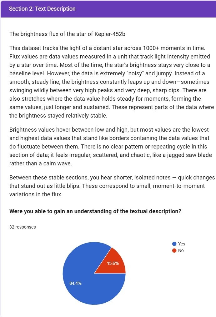
The next set of questions were to understand the familiarity of sonification as a tool and whether it is effective in data interpretation. The brightness flux of the star of Kepler-425b data was used in sections 2-4 to understand the effectiveness.
Section 2: Textual description of the data chosen which was the text describing the brightness flux of the star and used words that reflected the characteristics of the data. This was treated as the control condition.
Section 3: Sonified version of the same data. 2 audio files were shared in 2 different formats to ensure accessibility and device compatibilities: MP3 and WAV. This was the experimental condition and an accessibility tool.
Section 4: Both Text and Sonified data sets were shared. This was the experimental condition and another accessibility method.
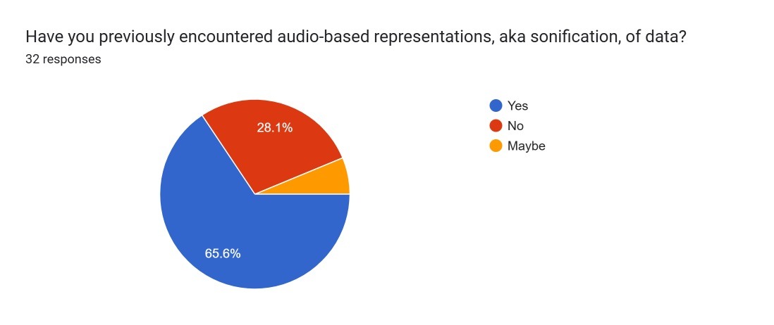
To understand familiarity with Sonification as an accessibility tool. (Figure 11)
- 65.6% participants had previously encountered audio-based representations, aka sonification of data while
- 6.3% were unsure of their familiarity
- 28.1% had not heard about sonification as an accessibility tool
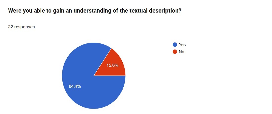
Section 2: Textual description of the data chosen which was the text describing the brightness flux of the star and used words that reflected the characteristics of the data. This was treated as the control condition and the responses were spread over 5 questions.
- Were you able to gain an understanding of the textual description? (Figure 12.)
a. 84.4% of the respondents said they were able to understand the data as described in the text.
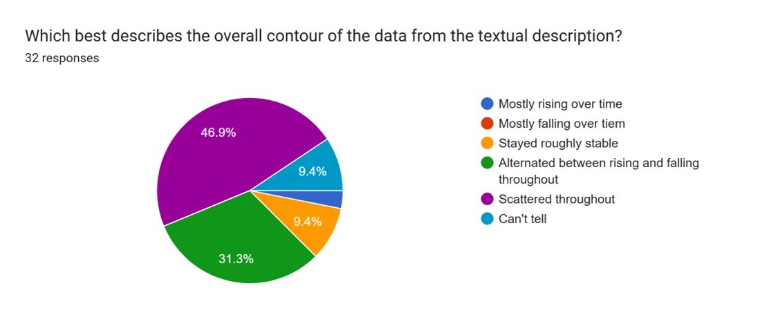
b. 15.6% did not understand the data based on the text. - Which best describes the overall contour of the data from textual description? (Figure 13)
a. 46.9% said that the data was scattered throughout
b. 31.3% said that the data was alternating between rising and falling throughout
c. 9.4% said that the data was roughly stable
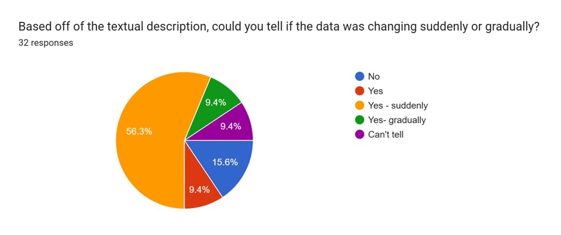
d. 9.4% said that they could not tell the contour of data - Based off of the textual description, could you tell if the data was changing suddenly or gradually? (Figure 14)
a. 56.3% said the data was changing suddenly
b. 15.6% could not tell if the data was changing suddenly or gradually.
c. 9.4% said they could only tell that the data was changing
d. 9.4% said they could tell that the data was changing gradually.
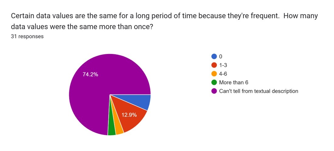
D. Certain data values are the same for a long period of time because they’re frequent. How many data values were the same more than once? (Figure 15)
a. 74.2% could not tell how many data values were same more than once
b. 12.9% could tell that 1-3 data values were same
c. 3.2% could tell that the values were changing between 4-6
d. 4.3% could tell that the values were changing more than 6 times
E. What were some positives and negatives about this method of accessibility?
a. Positive feedback: The respondents considered the text description as very clear to understand the data and its irregularity and could be inferred that the data is scattered and exhibits wild behavior.
b. Negative feedback: The respondents felt that the textual description lacked specified numbers and was very wordy, long and contained a lot of information in text.
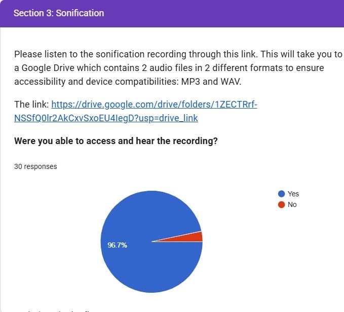
Section 3: Sonified version of the same data. 2 audio files were shared in 2 different formats to ensure accessibility and device compatibilities: MP3 and WAV. This was the experimental condition and an accessibility tool.
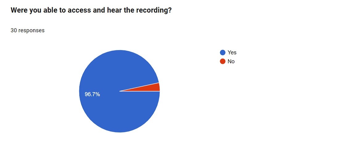
- Were you able to access and hear the recording?
a. 96.7% confirmed that they were able to hear the recording
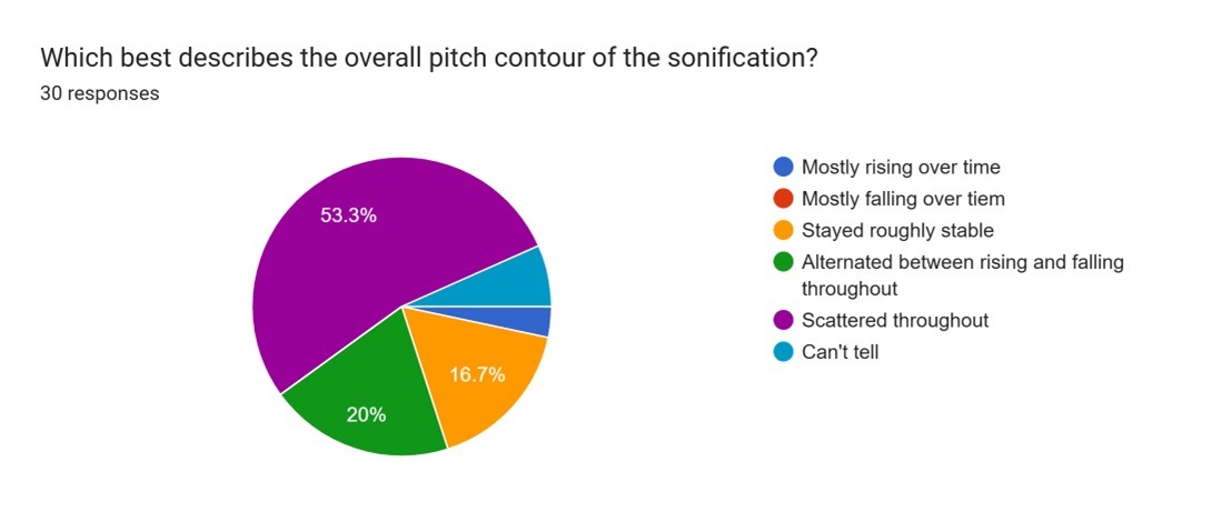
b. 3.3% said that they could not hear the recording. - Which best describes the overall pitch contour of the sonification?
a. 53.3% responded that the pitch contour was scattered throughout
b. 20% mentioned that the sound alternated between rising and falling
c. 16.7% said that pitch remained stable
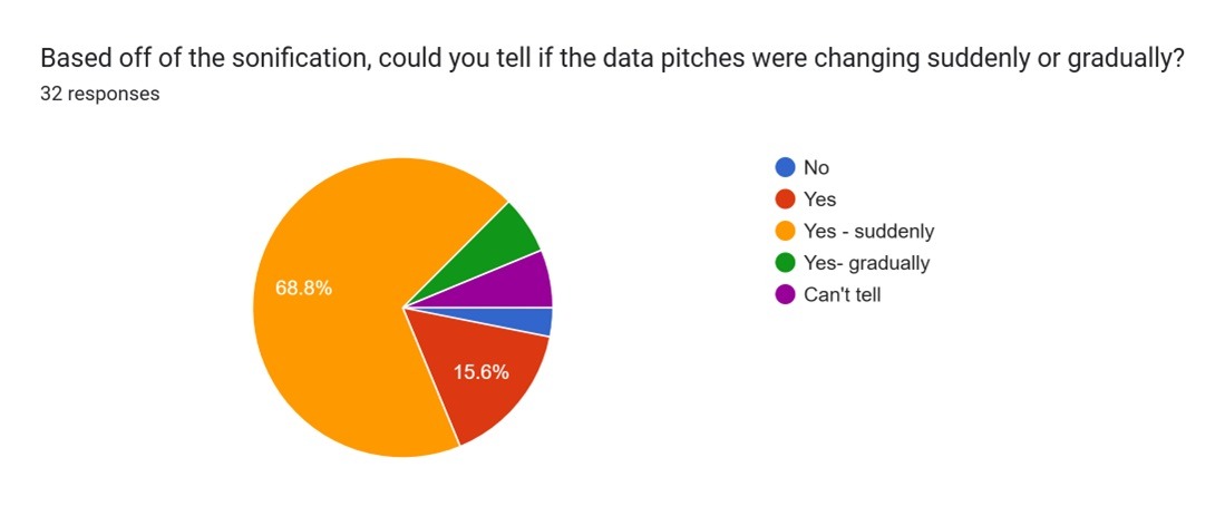
d. 6.7% could not tell - Based off of the sonification, could you tell if the data pitches were changing suddenly or gradually?
a. 68.8% said that the pitch was changing suddenly
b. 15.6% confirmed that the pitch was changing
c. 6.3% said that it changed gradually
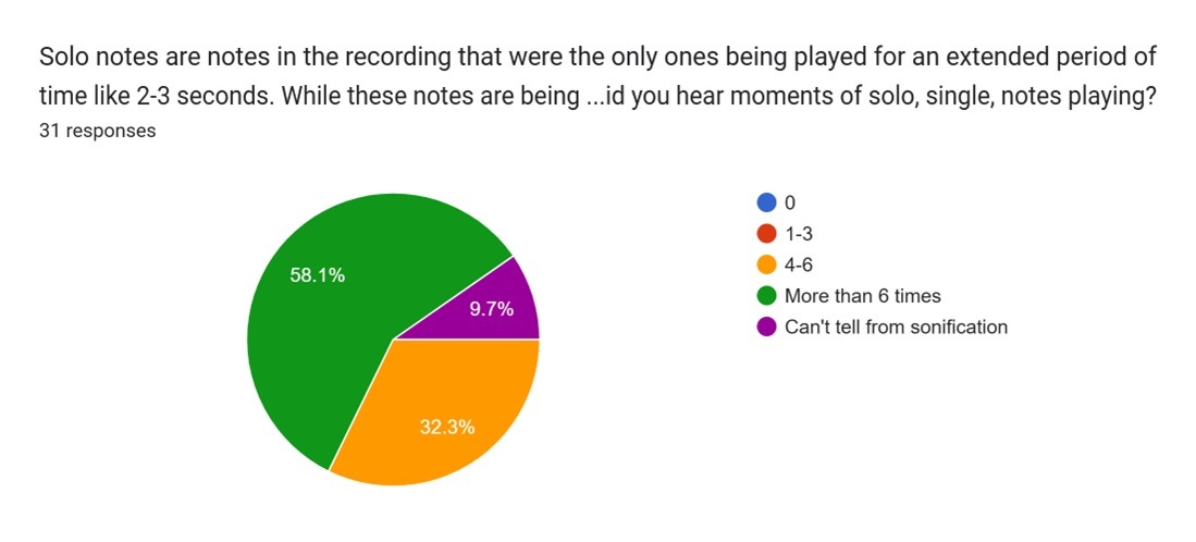
d. 6.3% said that they can’t tell if the pitch was changing. - How many times did you hear moments of solo, single, notes playing?
a. 58.1% said that they heard more than 6 times solo single notes playing
b. 32.3% said that they heard between 4-6 times
c. 9.7% said they can’t tell from sonification - What were some positives and negatives about this method of accessibility?
a. Positive feedback: respondents referenced that audio recording was more intuitive and made it easier to visualize the data and perceive the wild oscillations and scattered nature of the data.
b. Negative feedback: respondents said that it was difficult to memorize the data as it was long. Suggested providing mean, median, max/min values in terms of notes and an ability to change the speed of the audio.
Section 4: Both Text and Sonified data sets were shared.This was the experimental condition and another accessibility method.
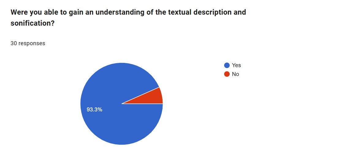
- Were you able to gain an understanding of the textual description and sonification?
a. 93.3% responded that they understood the textual and sonification of data.
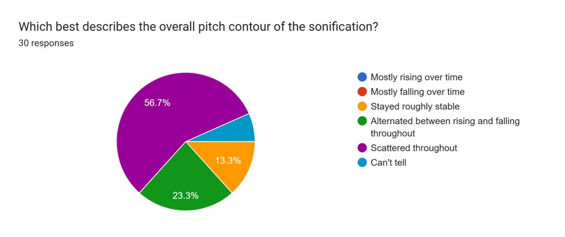
b. 6.7% said they did not understand. - Which best describes the overall pitch contour of the sonification?
a. 56.7% said that the data was scattered throughout
b. 23.3% said that the data was alternating between rising and falling throughout
c. 13.3% said that data was stable roughly
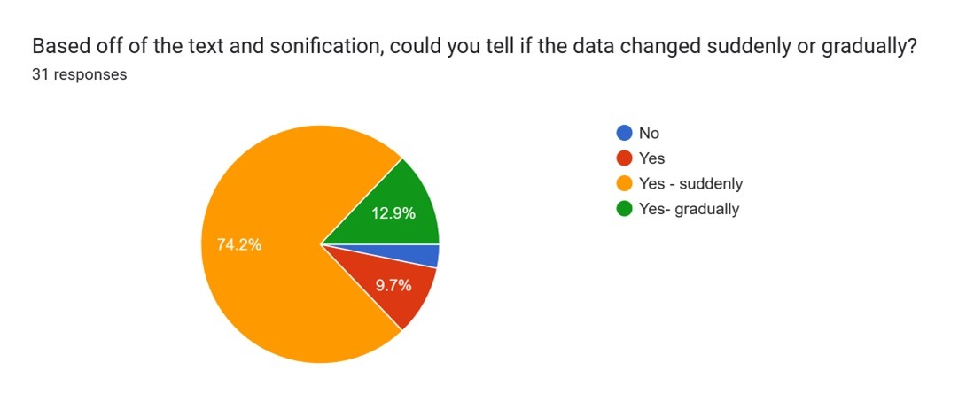
d. 6.7% said they could not tell - Based off of the text and sonification, could you tell if the data changed suddenly or gradually?
a. 74.2% said that the data was changing suddenly
b. 12.9% said that data changed gradually
c. 9.7% said that they could tell that data changed
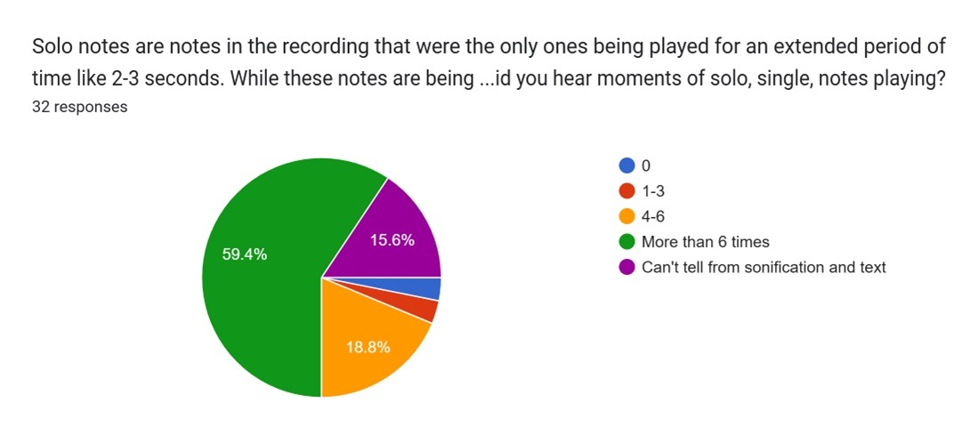
d. 3.2% could not tell - How many times did you hear moments of solo, single, notes playing?
a. 59.4% said that they heard more than 6 times solo notes playing
b. 18.8% said that they head the solo notes playing between 4-6 times
c. 15.6% said that they could not tell from sonification and text - What were some positives and negatives about this method of accessibility?
a. Positive feedback: Sound and text helped in understanding as sonification made it easier to visualize what the text was referring as it was less abstract and would prefer if the two or multiple accessibility methods were together as it would tell people anything that the other way had missed. Sonification works in the same way as alternative text for an image, allowing a more complete understanding of the phenomenon and the data.
b. Negative feedback: Some feedback received were that it took a lot of time, it would help if only if person had a musical background or it didn’t tell how far the moments were or how long each moment was.
Third Objective
The last purpose of the survey was carried out through 3 multiple-choice questions and 2 types of free-response questions.
The multiple-choice questions helped determine which representations were particularly helpful in understanding the dataset, which representation felt the most demanding, and if the combination of sonification and text coupled together better or weakened understanding
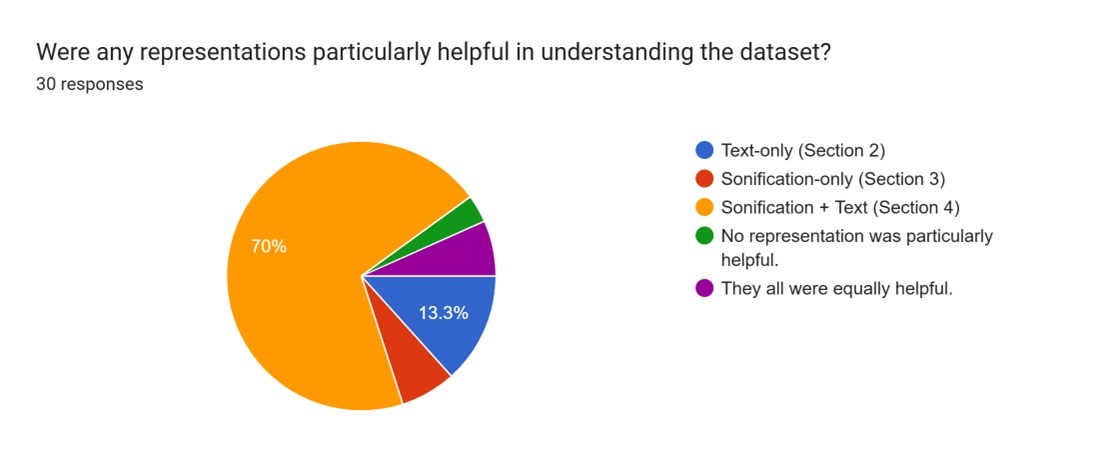
- Were any representations particularly helpful in understanding the dataset?
a. 70% respondents said that sonification along with text description was more helpful
b. 13.3% said text only
c. 6.7% said Sonification only
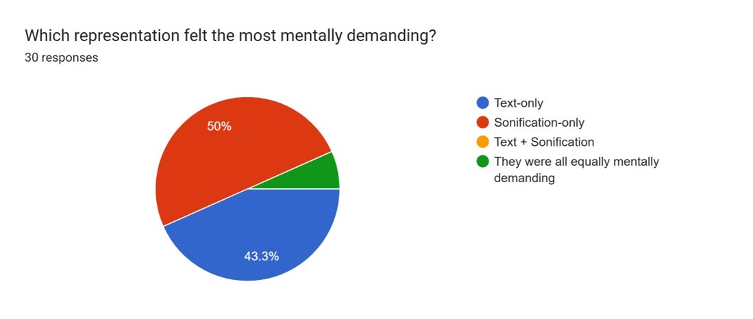
d. 6.7% said all were equally helpful - Which representation felt the most mentally demanding?
a. 50% said Sonification
b. 43.3% said text only
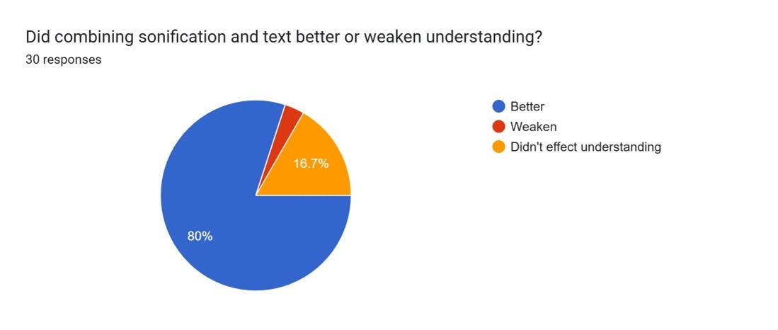
c. 6.7% said all were mentally demanding - Did combining sonification and text better or weaken understanding?
a. 80% said that it was better
b. 16.7% said that it did not affect understanding - 3.3% said weakened understanding
The Free response questions were of 2 types. The 1st type of free-response question, included in the 3 middle sections of the survey, asked about the positives and negatives of the representation (text-description, sonification, or both) The 2nd type of free-response question focused on the why of certain dislike or liking of particular representations engaged with in the 3 middle sections of the survey
- If there were any particular representations you want to share feedback on or really liked, please highlight those respective aspects, and why you liked or disliked them?Textual description of the data was super helpful and respondents enjoyed reading the text. Sonification alone was easier to follow the data but was mentally demanding. However, combining both text and sonification was very highly effective as they went ‘hand to hand’ in creating a clear mental image. However, it was suggested that more specific and technical interpretation of data would be more effective than data left for open interpretation.
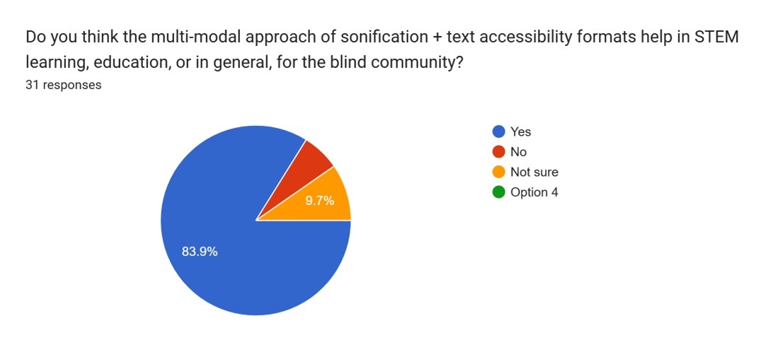
- Do you think the multi-modal approach of sonification + text accessibility formats help in STEM learning, education, or in general, for the blind community?
a. 83.9% said that multimodal approach of sonification plus text as an accessibility was helpful to the blind community.
b. 9.7% said they were not sure
c. 6.5% said no to multi-modal approach
Conclusions
General Information and Effectiveness of Sonification Compared to Traditional Accessibility Representations from Survey
All of the survey’s respondents indicated at least 1 challenge in accessing publicly available scientific data, suggesting the possibility, if not significant, of a problem in accessibility issues. Additionally, because the majority of the respondents were students, the results primarily reflect the accessibility needs and feedback of young students in the academic community.
Since the questions for each accessibility method were same with text accessibility being the control condition, we can associate feedback based on the following 4 parameters:
- Overall understanding of the data based on the accessibility method:
Compared to 84.4% of people who understood textual form of data, 96.7% participants perceived sonification and 93.3% of participants perceived Sonification +text as accessibility method. - Understanding the pitch contour of the data which was scattered:
Compared to 46.9% of participants who described data to be scattered based on text description, 53.3% perceived data to be scattered based on sonification and 56.7% perceived data to be scattered based on Sonification+ text method. - Understanding the change in the pitch of the data which was changing suddenly.
Compared to 56.3% participants who perceived the pitch to be changing suddenly,68.8% perceived the pitch in the data to be changing suddenly when they listened to sonification method and 74.2% perceived the pitch to change suddenly with sonification and text method were used to represent data. - How many times it was identified that the solo note was playing?
Compared to 74.2% of participants who could not tell that there were long periods of time with same data values, 58.1% participants who listened to sonification of data reported with greater clarity that they could associate the single solo note for more than 6 times and 59.4% could perceive the same when they listen to both text and Sonified methods of same data.
Connections + Feedback
Through the outreach of the survey, I was able to connect with a student at the Perkins School of the Blind. They emphasized that it needed to be more interactive and supported by clearer explanations to make the data truly accessible. Later, I spoke with another individual who deepened my understanding of the limitations of sonification. While sonification is a powerful tool for conveying the overall shape or trend of data, it often glosses over the finer details—like small decimal changes—that can carry significant meaning for scientists. These subtle variations might be lost on Blind and Visually Impaired (BVI) individuals if the sonification doesn’t account for them, reminding me that accessibility isn’t just about translating data into sound, but about preserving its nuance and precision.
Accessibility
The biggest accessibility challenge, shared by 82.8% of respondents, in accessing publicly available scientific data from public data sources was data being in non-accessible formats. Additionally, when presented with the textual description, only 86.2% of participants were able to gain an understanding while for 13.8% of participants, the textual description wasn’t accessible and understandable (Figure 28). Conversely, when presented with the sonification, 96.3% of participants were able to access and hear the recording, while 3.7% were unable to (Figure 29).
Limitations
After evaluating and understanding participants’ feedback on the survey, there were some limitations to the study: participants shared how the quality of the sonification recording was poor, making it “hard to really enjoy the audio”. Additionally, some participants mentioned how the sonification was “somewhat monotonous”, some wishing to have an “easier way to navigate forward and backward from one data point to another”. Another limitation was that the survey was unable to have a majority of BVI individuals in its respondent audience. Having many BVI respondents could better ensure that sonification is tailor-made to the people it is meant to serve. It would ensure that a product actually reaches the people who benefit the most from it, making sonification and refinements more effective and impactful.
Essentially, participants on the survey offered thoughtful and extremely helpful feedback. Many emphasized the need for clearer explanations of what different sounds, pitches, and instruments represent, noting that without context, the audio could feel confusing. Some suggested simplifying instrumentation, while others highlighted the importance of interactive navigation—making the data easier to follow. Overall, the responses suggest that while sonification holds promise for making space data more accessible to the BVI community, it requires much more clarity and user-friendly interfaces to be truly effective.
There was no cost incurred in this study, however for a large scale sonification and refinement to meaningful music it is recommended to produce high quality sound recorded through professional sound studios.
Overview
Generally, sonification—the process of converting data into meaningful sound— proved as a viable alternative to data interpretation and was proven useful as many survey participants were able to understand data about Kepler-452b’s lightcurve data from the sonification recording. From this, sonification can be applied to other types of scientific data as well, such as solar flares, Earth surface temperatures, or even biological data such as species diversity on Earth.
Sonification is great for all univariate types of data. The Kepler-10b light curve data was measuring light intensity of the exoplanet’s star and was directly related to time. Hence, the final sonification product was of the light flux values. If data is measured in different modes, such as wavelengths or temperatures, it can also be sonified, as successful research on them has been conducted before. In the early parts of my research, I experimented sonification of global surface temperatures. Data sonification is not limited to space data or scientific data. Stock prices, climate data, and mathematical data are all equal contenders for data sonification. Similarly, multi-dimensional data sonification is possible; however, it becomes difficult to interpret and comprehend.
Like Data sonification, there are other methods of accessibility, including braille data, tactile graphics, text descriptions, or haptic feedback. As data sonification leverages the sense of hearing to reveal patterns and trends in the data over time, textual descriptions utilize written language to articulate insights and provide interpretive context. On the other hand, tactile graphics utilize the sense of touch to convey information through textures and layouts that can be physically explored. Compared to sonification, these techniques offer a more spatial and tactile mode of understanding and allow users to explore data through physical rather than auditory patterns. Additionally, these alternative modes of accessibility can be more descriptive and sensory, which could improve users’ relationship with the data, strengthening data interpretation.
This research paper aimed to increase the accessibility of publicly available visual-only formatted scientific data to the BVI community. It addresses the lack of accessibility and how this problem can inhibit the progress of science. It promotes sonification, while not fully developed, as a viable solution to addressing this issue. Through the analysis of sonified data and survey outcome, sonification seems to serve as a valuable resource in data interpretation. Nevertheless, sonification is novel and contains many opportunities for further exploration and understanding. Future research should aim further to develop sonification as an interactive and accessible tool, ensure it is tailor-made to the BVI community, ensure it accurately represents data, and serve as a scalable process.
Acknowledgments
I want to thank Dr. Hiroto Nagai, a geoenvironmentalist, composer, and a specially appointed professor at Rissho University in Japan. Known for his sonification composition “String Quartet No.1: A Polar Energy Budget”, Dr. Nagai provided tremendous guidance and impartation of knowledge about sonifying data and exchange of ideas. I want to thank the Principals of Schools for the Blind STEM Google Group for their tremendous help in my study and gathering data for my survey. I want to thank Declan Cassidy, a student at the Perkins School of Blind in Massachusetts, for his significant guidance and support. I want to thank Mr. Elijah Tai, a Harvard University Alumni and a Computer Science Professional, for his guidance on data accessibility and music composition tools. I want to thank Ms. Kailly Nocera (University of Michigan, USA) for her guidance and support with this paper. I want to thank my parents and my sister for their encouragement and support.
References
- Dubus, G., R. Bresin. A Systematic Review of Mapping Strategies for the Sonification of Physical Quantities. PLOS ONE. 2013. [↩]
- K. Arcand, J. Schonhut-Stasik, S. Kane, G. Sturdevant, M. Russo, M. Watzke, B. Hsu, L. Smith. A Universe of Sound: processing NASA data into sonifications to explore participant response. Frontiers. 2024. [↩]
- Harrison, A. Zanella, N. Bonne, K. Meredith, N. Misdariis. Audible Universe. arXiv. 2022. [↩]
- Yazgin, E. NASA releases black hole mixtape. ConnectSci. 2022 [↩]
- Merced, W. D. (2016). How a blind astronomer found a way to hear the stars. TED.com; TED Talks. https://www.ted.com/talks/wanda_diaz_merced_how_a_blind_astronomer_found_a_way_to_hear_the_stars [↩]
- Wikipedia Contributors. (2025, October 13). Kent Cullers. Wikipedia; Wikimedia Foundation. https://en.wikipedia.org/wiki/Kent_Cullers [↩]
- Carlsen, L., R. Bruggemann. The 17 United Nations’ sustainable development goals: a status by 2020. International Journal of Sustainable Development & World Ecology. 2021 [↩]
- Damsma, P. Hearing a circle: An exploratory study of accessible sonification for young children with blindness and low vision. British Journal of Visual Impairment. 2024. [↩]
- DARTS for Astrophysics. (2025). DARTS at ISAS/JAXA. https://darts.isas.jaxa.jp/ [↩]
- Chandrayaan-II. (n.d.). Pradan.issdc.gov.in. https://pradan.issdc.gov.in/ch2/ [↩]
- Earthdata Search. (n.d.). Search.earthdata.nasa.gov. https://search.earthdata.nasa.gov/ [↩]
- A Universe of Sound. (n.d.). Chandra.si.edu. https://chandra.si.edu/sound/ [↩]
- Riffusion | AI Music Generator. (2025). Riffusion.com. https://classic.riffusion.com/ [↩]
- Exploring Exoplanets with Kepler – Math Lesson | NASA JPL Education. (2016). NASA JPL Education. https://www.jpl.nasa.gov/edu/resources/lesson-plan/exploring-exoplanets-with-kepler/ [↩]
- B. Walker, M. Nees. Principles of Sonification: An Introduction to Auditory Display and Sonification. Research Gate. 2012. [↩]
- Trayford, J. W., C. M. Harrison. Introducing STRAUSS: A flexible sonification Python package. arXiv. 2023. [↩]
- Brasseur, C. E., S. W. Fleming, J. Kotler. Astronify: An open-source python package to sonify one-dimensional astronomical data. Astronomical Data Analysis Software and Systems XXXI. 2022. [↩]
- light curve, n. meanings, etymology and more | Oxford English Dictionary. (2025). Oed.com. https://doi.org/10.1093//OED//9595233039 [↩]
- Oxford English Dictionary. (2025, December). Transit, n., sense II.6.a. Oxford University Press. https://doi.org/10.1093/OED/4514324618 [↩]
- Silva, L., G. Vladilo, G. Murante, A. Provenzale. Quantitative estimates of the surface habitability of Kepler-452b. Monthly Notices of the Royal Astronomical Society. 2017 [↩]
- Oxford English Dictionary. (2025, December). Luminous flux, n. Oxford University Press. https://doi.org/10.1093/OED/9519126187 [↩]


