
Abstract
In the last four years, COVID-19 has been a rising concern among the global population, regarding the long-term effects that it fosters, and the difficulties in predicting future spread of the disease within communities and populations. This research paper narrows the scope of the problem down to the 50 states of the United States, having the purpose to examine the overall rate of change in the number of COVID-19 cases from August 2020 to March 2024, model a function that predicts future spread of the disease, and investigate the three factors that correlate with the disease’s mortality and spread: air quality, mean income, and case distribution. By utilizing the characteristics of the Markov Matrix – the state-to-state transition matrix- we constructed a model that predicts the number of infections in each of the 50 states after two months and four months. In validation, we found out that the model’s mean absolute errors (MAEs) are about 111.83 and 280.55, and the mean absolute percentage errors (MAPEs) are about 38.15% and 107.48% for original dataset, and 18.68% and 69.54% for normalized dataset, when evaluated for one week and two weeks, respectively. When compared to the ARIMA models, which are widely used time-series forecasting models, our model has significantly lower MAEs and MAPEs, both tested against original and normalized dataset. In the final stage, we were interested in investigating three factors that correlated with the mortality and spread of the disease. By employing linear regression on every state, we discovered that the air quality has a weak to moderate positive correlation with mortality (correlation coefficient = 0.458), while the mean income has a moderate negative correlation with mortality (correlation coefficient = -0.652). By leveraging the eigenvectors and eigenvalues of the state-to-state transition matrix, we discovered that when the case distribution tends to be clustered in the East Coast states, the disease’s spread would be highest. Key words: COVID-19, rate of change, Markov Matrix, forecasting, correlation, linear regression, eigenvectors.
| Notations | Descriptions |
| ∆Cn | Daily average rate of change of COVID-19 cases on a given date, n. |
| Cn | The number of COVID-19 cases on that date, n. |
| Cn+1 | The number of COVID-19 cases one week after that date, n. |
| R | The Markov Matrix for the transition rate of people in 50 states. |
| P | The vector for the number of COVID-19 cases in 50 states. |
| P ′ | The vector for the number of COVID-19 cases after one unit of time. |
| R0 | The basic reproduction number for COVID-19 (constant). |
| t | The unit of time that can be measured in weeks, months, or years. |
| F (t) | The function used to approximate the total number of cumulative infection after time t, in 50 states. |
| δ(t) | The rate of recovery of a patient with COVID-19, with respect to time. |
| ω | The time taken for a patient to recover from COVID-19 (constant). |
| G(t) | The function used to approximate the total number of cumulative recovery after time t, in 50 states. |
| M(t) | The function used to approximate the number of COVID-19 cases at time t, in 50 states. |
| µ(α) | The function used to approximate the mortality of COVID-19 given the air quality index α. |
| α | The air quality index in a state (constant). |
| µ(β) | The function used to approximate the mortality of COVID-19 given the mean income. |
| β | The mean income in a state, in dollars (constant). |
 | The vector for the max spread distribution. |
1. Introduction
1.1 Background
First discovered in December 2019, COVID-19 is a virus that detriments the respiratory system, in which the patients would experience symptoms such as coughing, fever, and loss of smell and taste1. Recently, the virus caused a worldwide pandemic and heath collapse through various means. To be specific, an avenue COVID-19 can be spread is via physical contact between people with the disease. In other words, as people travel between cities and states, they spread the disease with them2. However, the escalation of COVID-19 remained unexpected since there lacks a universal method to account for the spread of the disease among cities and states. This dilemma raises a question on how to construct a model to predict how COVID-19 would change in order to further prevent the spread of infection in society.
1.2 Research gap and problem statement
Recently, a common method to predict the number of disease cases is by using forecasting models that focus on the past trend of COVID-19 spread. Those models exploit the trend of changes in the number of cases in the past to predict the trend in the future time. One example of such models is the AutoRegressive Integrated Moving Average (ARIMA) model, which is a statistical analysis model that uses time series data to predict future trends3. The parameters in ARIMA model, p,d, and q, can be optimally calculated by the method called Auto Arima, which finds the best values for the parameters that minimize the Akaike Information Criterion (AIC)4. Another example is the Exponential Smoothing models, which are forecasting techniques that utilize the weighted averages of past data to predict future values5.
Even though there is a profound foundation of forecasting models based on past dataset, those models often overlook the parameters of current time, such as migration patterns. In one research about the relationship between migration and the COVID-19 pandemic6, it is revealed that 75 percent of cases as of 7 May 2020 and over 95 percent of cases as of 19 June 2020 were among international migrants, according to the Saudi Ministry of Health and Singapore Ministry of Health, respectively. Those high percentages indicate that migration patterns have a strong relation with the changes in COVID-19 cases. For this reason, migration patterns, such as the probability of migrants moving between different areas, can be a parameter that is implemented to predict the future number of COVID-19 cases in those regions.
1.3 Objectives
The objectives of this paper are to research the overall change of COVID-19 cases, particularly the change in the number of hospital admissions, from August 8 2020 to March 9 2024, to better understand the trend of cases in the U.S. in that time horizon, construct a forecasting model based on the migration patterns to predict the number of cases in 50 U.S. states, and further extend the study direction to investigate additional three factors – air quality, mean income, and population distribution – to find any correlation between them and the disease’s mortality and spread.
This study focuses on answering the following guiding questions:
- How has COVID-19 cases changed in terms of the number of hospital admissions in response to migration patterns within the U.S.?
- How does that model compare to other time series models?
- What is the correlation between COVID-19 mortality and air quality?
- What is the correlation between COVID-19 mortality and mean income?
- What is the distribution of cases in 50 states the lead to the most spread?
2. Literature review
In this section, we will discuss two existing works that aimed to predict COVID-19 cases with time series model, two research studies that relate the disease’s mortality with air quality and average income, and one paper that relates the disease’s spread in different regions.
2.1 Time series forecasting models
A research article done by SHOKO Claris and NJUHO Peter7 focused on predicting the spread of COVID-19 using the ARIMA(p,d,q) model. The study utilized data on daily confirmed COVID-19 cases for Southern Africa Development Community (SADC) member states from March 5, 2020, to July 15, 2021. The study proposed several ARIMA models. The best ones were judged based on the log-likelihood, AIC (Akaike Information Criterion), and BIC(Bayesian Information Criteria) of the fitted models.
From the methodology, the researchers found that the best model is the ARIMA(11,1,9) model with the smallest root-mean-square deviation (RMSE) of 990.479. Other models were also evaluated with the RMSEs of 1004.582 and 1005.022 for ARIMA(9,1,9)and ARIMA(11,1,11), respectively. Those models were also evaluated with mean absoluate error (MAE): 406.899, 385.540, and 393.726 for ARIMA(11,1,9), ARIMA(9,1,9), and ARIMA(11,1,11), respectively.
Another research paper written by Souad Larabi-Marie-Sainte et al. focused on evaluating the effectiveness of the Exponential Smoothing techniques in forecasting the spread of COVID-19 in KSA, USA, Spain, and Brazil. The dataset was acquired and preprocessed using the Box-Cox transformation and differencing technique, and the Augmented Dickey-Fuller (ADF) test and Kwiatkowski–Phillips–Schmidt –Shin (KPSS) test were applied to check for stationary of the time-series data. Different forecasting techniques (Drift, SES, Holt, ETS) were then validated using Residual’s test, Auto correlation Function (ACF), and Ljung-Box test, and the best model would be evaluated by RMSE, MAE, MPE, ACF1.
Focusing on the examination of the models in the U.S., the ETS and Holt technique produced the MAEs of 2687.257 and 2470.140 with the MPEs of -9.189413 and -7.235159 respectively.
Besides ARIMA and Exponential Smoothing, a stochastic process called Markov Chain8 can also be utilized to predict the future number of COVID-19 cases. A research paper done by Elvis Han Cui and Weng Kee Wong9 exploited this probabilistic process in modelling COVID-19. Although this work also used Markov Chain as the forecasting technique, its assumption and research question is different from ours. In particular, the study combined the Markov Chain with the SEIRD model (a system of differential equations involving the susceptible, exposure, infection, recovery, and death rate), while our study focused on the migration patterns of the U.S.
2.3 Relationship between COVID-19 mortality and air quality
In a study about the impact of air pollution on COVID-19 incidence, severity, and mortality, researchers Ireri Hernandez Carballo et al.10 provided a systematic review of studies in Europe and North America. The researchers studied the studies in PubMed, Web of Science, and Scopus to find articles that quantitatively measured the relationship between air quality and COVID-19 health outcomes.
From 2482 articles examined, the study found 116 studies reporting 355 pollutant-COVID-19 estimates. From those 116 studies, the researchers also found that about half of all evaluations on COVID-19 incidence were positive, at 52.7 percent. In addition, slightly less than half of those studies displayed an association between the disease’s mortality and pollutants, at 48.2 percent.
This remarkable relationship between COVID-19 mortality and pollutants was a motivation for us to further our research direction into reviewing and investigating the correlation between the two factors. In particular, our paper aims to address how the disease mortality changes in respect to the air quality index in 50 U.S. states and examine how significant that relationship is. We also developed a model to predict COVID-19 mortality based on the air quality index.
2.4 Relationship between COVID-19 mortality and household income
A research study by Tsikata Apenyo et al.11 aimed to investigate the relationship between COVID-19 incidence and county-level median household income and status of Medicaid expansion of US counties. The study constructed a retrospective analysis of 3142 US counties, focusing on the period from January 20, 2021, to December 6, 2021. The median household income was log-transformed and stratified by quartiles. After that, Multilevel-mixed-effects-generalized-linear-modeling was implemented to study the discussed relationship.
From the study, the researchers concluded that while median household income was not related to COVID-19 incidence, the median household income showed a negative relationship with the disease’s mortality. In particular, while the incidence number (with standard deviations) did not differ by much between household income quartiles (5,121.08 ± 2471.59, 5,299.32 ± 5338.71, 5,166.40 ± 2666.65, and 5,033.77 ± 5705.18 for quartile 1, 2, 3, and 4 respectively), the mortality showed significant differences among those quartiles (113.32 ± 87.43, 92.21 ± 109.58, 75.69 ± 62.84, and 72.32 ± 112.19 for quartile 1, 2, 3, and 4, respectively).
This significant relationship between COVID-19 mortality and household income was a motivation for us to further our research direction into reviewing and investigating the correlation between the two factors. To add more to the literature, instead of median household income, our study examines the correlation between the mean household income and the disease’s mortality and addresses how significant that relationship is. We then developed a model to predict COVID-19 mortality based on the mean household income using.
2.5 The spread of COVID-19 in different regions
A research paper done by Sarah L. Jackson et al.12 examined the spatial disparities of COVID-19 cases and fatalities in different U.S. counties. The research studied the distribution of COVID-19 cases of 3140 counties from January 21, 2020, to January 30, 2021.
From the examination, the researchers concluded that significant cases per 100000 were most prevalent between November 2020 and January 2021, with the greatest impact in the Great Plains, Southwestern and Southern regions with the highest cumulative cases of >9786/100000 in the Southwest.
These results of the distribution of COVID-19 in the U.S. regions was a motivation for us to further our research direction into developing a technique to predict what kind of disease distribution, in terms of number of cases, in 50 U.S. states will give rise to the most spread.
3. Methods
3.1 Data Collection
We first approached the problem with the analysis on how COVID-19 has changed from August 8, 2020, to March 9, 2024, in the United States, in terms of number of cases. In order to accomplish this goal, we gathered data about the number of hospital admissions caused by COVID-19 from the CDC COVID Data Tracker13 and examined how the number of patients has changed in about four years. We chose to examine the number of hospital admissions over number of cases to investigate the severity of the disease. A study about fatality (mortality) rates in hospitalized COVID-19 patients done by Ana Macedo et al.14 reported an overall 17% mortality for admitted COVID-19 patients, while the global mortality is only 6.73%. In addition, of the hospitalized patients, the study showed that 20% needed highly complex medical assistance, and the study also reported a 40.5% mortality rate in critically ill COVID-19 patients. These statistics show that while both hospital admissions and number of cases depict the number of infections, the hospital admissions indicate the spread of the disease in more serious situations, particularly with high mortality rates, which is crucial to study for future prevention.
Once having a clear view on the changes in COVID-19 infections, we constructed a model on how to further predict the spread of the disease by analyzing the migration patterns within the United States. In order to fulfill this aim, we made use of Markov matrices, in which the matrix holds the transition rates of people traveling between all of the states to capture the migration patterns within the United States. The reason for choosing Markov matrices for the basis of the forecasting model is because they can be used to predict future outcomes – in this case is the future number of COVID-19 cases – based on the current state. This selection is highly significant because our model aims to forecast the spread of the disease with only the current data and not past trends, thus theoretically will require smaller datasets to work with. Note that while this selection is advantageous in hard-to-predict situations that are not dependent on historical fluctuations of the number of cases, it is disadvantageous for longer term prediction as the Markov Matrix stays constant, but migration patterns in reality can change over time. These benefits and drawbacks are further discussed in section 6.1 and 6.2. The transition rates were calculated from a database of the number of state-to-state migration retrieved from the United States Census Bureau15. After the calculation, we examined the rates of change of COVID-19 cases in several states with those predicted in the model, one and two weeks after 04/02/2020 for testing. We further decided to simulate the number of cases in the following times, and we compared the simulation with real-life data. After that, we compared our model’s performance with that of the ARIMA(11,1,9) model, the best one in the research6 and the best ARIMA(p,d,q) model for the dataset, in terms of MAE and MAPE. We further investigated the seasonality of the dataset and found that it is seasonally stationary. We also compared our model with the best Seasonal Autoregressive Integrated Moving Average models, or SARIMA(p,d,q)(P,D,Q)[m], in terms of MAE and MAPE.
Finally, after we predicted the number of infected people in the future, we were interested in how to prevent the disease from spreading. We examined factors that could lead to the increase in the deaths of COVID-19 patients. We gathered the data for the disease’s mortality in 50 states in 2021 at16, the air quality in 50 states in 2024 at17, and mean annual income in 50 states in 2021 at18. Upon analysis, we focused on the correlation between the death rates from COVID-19 and the elements such as the air quality, mean income, and population distributions.
3.2 Data preprocessing for forecasting models comparison
For the necessary data for our forecasting model and the ARIMA models, we used the dataset about the COVID-19 cases and deaths number by state from the USA FACTS19. Note that District of Columbia (DC) was dropped from the dataset because it is not a state. The dataset begins on 1/22/2020 and ends on 7/23/2023. Firstly, for our forecasting model only, we selected the number of cases by state, which were added up from every presented county in each state, on 04/02/2020 as our initial values in the model. To prepare for the Markov Matrix, we first dropped the District of Columbia (DC) for consistency, and we calculated each of the entries by finding the ratio between the number of citizens moving to one state and the total number of citizens moving to 49 states and staying in their state. That is, given a Markov Matrix R with size 50×50, the entry Ri,j is calculated by dividing the number of citizens moving from state i to state j by the total number of citizens moving from state i to 49 other states and staying in state i. This idea is further discussed in section 3.3.
For the ARIMA models for comparison, we also summed up the number of cases in every presented county of all states. Since the dates are presented as columns (for example, 1/22/2020 is one column, and 1/23/2020 is another column), we melted and dropped any unnecessary columns in our dataset so that the dates are on one column, with the columns of ‘State’ and ‘total cases’. After that, we fitted and trained the time series models up until the desired dates. While doing so, we dropped any dates where there were no available data.
To implement the ARIMA models, which are time-series, we tested for the dataset’s stationarity from the beginning to 04/09/2020 and from the beginning to 04/16/2020. We used the ADF (Augmented Dickey–Fuller) test and KPSS (Kwiatkowski–Phillips–Schmidt–Shin) test. The results from Table 2 shows that ADF statistic is -14.01 (negative) and p-value is 3.66 x 10⁻²⁶ < 0.05, and the KPSS statistic is 0.082 and p-value is 0.1 > 0.05. These results indicate that both ADF and KPSS tests show that the series is stationary from 01/22/2020 to 04/09/2020.
| Test Type | Test Statistic | p-value |
| ADF | -14.01 | 3.66×10⁻²⁶ |
| KPSS | 0.082 | 0.1 |
The results from Table 3 show that both ADF test and KPSS test for the seasonally differenced data indicate seasonally stationarity (ADF statistic is negative with p-value less than 0.05, and KPSS’s p-value greater than 0.05). These results indicate that both ADF and KPSS tests show that the series is stationary from 01/22/2020 to 04/16/2020.
| Test Type | Test Statistic | p-value |
| ADF | -12.69 | 1.15×10⁻²³ |
| KPSS | 0.09 | 0.1 |
For the best ARIMA(p,d,q) model for the dataset, we used Auto ARIMA after first order differencing to find the optimal parameters. The algorithm indicated that ARIMA(2,1,0) is the best model for the dataset.
To prepare for potential issues in data integrity, we create another dataset that normalizes the original data of the number of COVID-19 cases from the beginning to 04/16/2020 using the log-transformation technique. That is, for each data point xi in the column of COVID-19 cases, the normalized data point xnewi will be computed as the following.
The reason we chose this normalization technique was because the natural logarithm function closes the gap between small values and extremely large values, which prevents the data from having outliers and skewness. The “+1” term in the function has the purpose of preventing the normalized data from getting negative values.
![\[x_{n e w_i}=\ln \left(x_i+1\right)\]](https://nhsjs.com/wp-content/ql-cache/quicklatex.com-cb3f28caa0bbb6040b9f54f30db7924a_l3.png "Rendered by QuickLaTeX.com")
We then tested for stationarity for this new normalized dataset using the ADF and KPSS tests. The results from Table 4 shows that the ADF statistic is -14.22 (negative) and p-value is 1.67×10^-26 < 0.05, and the KPSS statistic is 0.04 and p-value is 0.1 >0.05. These results indicate that both the ADF and KPSS tests show that the normalized series is stationary from 01/22/2020 to 04/09/2020.
| Test Type | Test Statistic | p-value |
| ADF | -14.22 | 1.67 x 10^-26 |
| KPSS | 0.04 | 0.1 |
The results from Table 5 shows that the ADF statistic is -15.27 (negative) and p-value is 6.45×10^-28 < 0.05, and the KPSS statistic is 0.03 and p-value is 0.1 >0.05. These results indicate that both the ADF and KPSS tests show that the normalized series is stationary from 01/22/2020 to 04/16/2020.
| Test Type | Test Statistic | p-value |
| ADF | -15.27 | 6.45×10^-28 |
| KPSS | 0.03 | 0.1 |
For the best ARIMA(p,d,q) model for the normalized dataset, we used Auto ARIMA after first order differencing to find the optimal parameters. The algorithm indicated that ARIMA(0,1,1) is the best model for the normalized dataset.
3.3 The formulation for the forecasting model
In this subsection, we proposed a model, which is referred to as “our (forecasting) model” in the following sections, to estimate how the number of COVID-19 cases will change in 50 U.S. states, based on the method of Markov Chain. This technique explores the spread of COVID-19 based on the current case distribution and past state-to-state migration trends.
3.3.1 The estimation of the number of cumulative cases after a period of time
To begin with, we took the movement of people between the states into account in our model. To achieve this goal, we proposed a Markov Matrix such that the elements are the probabilities of people migrating from one state to the others. Given the Markov Matrix R, the entry Ri,j displays the probability of people moving from state i to state j. For example, R1,1 is the probability that people move from state 1 to state 1 (stay in the same state). Likewise, R1,2 is the probability that people move from state 1 to state 2.
(1) 
This matrix will assist in the process of finding the number of people after moving between the states after a period of time. With the given transition state of the Markov Matrix, we construct a basic Markov Chain. Given the Markov Matrix R and a vector of population of COVID-19 cases in those 50 states P, the new linear number of COVID-19 cases in 50 states, after one unit of time, is the product of R and P, such that
 are the number of cases in a given time Pi, and are the number of cases after one unit of time.
![\[R \cdot P = P^{\prime}\]](https://nhsjs.com/wp-content/ql-cache/quicklatex.com-4b1362a63fb8fca2f1363d3921db3f4c_l3.png "Rendered by QuickLaTeX.com")
(2) ![\begin{equation*}\begin{aligned}& {\left[\begin{array}{ccc}R_{1,1} & R_{2,1} & \ldots R_{50,1} \\R_{1,2} & & \\\vdots & \ddots & \\R_{1,50} & & R_{50,50}\end{array}\right] \cdot\left[\begin{array}{c}P_1 \\P_2 \\\vdots \\P_{50}\end{array}\right]} & =\left[\begin{array}{c}P_1^{\prime} \\P_{2^{\prime}} \\\vdots \\P_{50}^{\prime}\end{array}\right] \\\end{aligned}\end{equation*}](https://nhsjs.com/wp-content/ql-cache/quicklatex.com-a8825db71fc1475e3b6f229afc586333_l3.png "Rendered by QuickLaTeX.com")
We decided that our model would be used to predict the number of future cases in the context of no outbreaks or lockdowns. In such situations, the migration patterns over time would not change rapidly. We concede that other factors such as economic and public policies could lead to drastic changes in the migration patterns, but since our model is evaluated in small time intervals, such factors can be avoided to prevent adding more parameters to the model, thus simplifying the model and preventing overfitting at the cost of accuracy. Assuming that the probability of people migrating from one state to the others remains relatively constant, we decided that the Markov Matrix will stay unchanged to avoid the over-complicated nature in evaluation of the model. In order to predict future linear population of COVID-19 cases in all 50 states, we propose an expression based on the method of matrix exponentiation. Given a Markov Matrix of transition rate R, and the current vector for the population of COVID-19 in 50 states P, the predicted number of cases after t time is calculated as the following expression.
![\[R^{t} P\]](https://nhsjs.com/wp-content/ql-cache/quicklatex.com-bde5be61a7058cc5329bfee2f18a3770_l3.png "Rendered by QuickLaTeX.com")
(3) ![\begin{equation*}\begin{aligned}& =\left[\begin{array}{ccc}R_{1,1} & R_{2,1} & \ldots R_{50,1} \\R_{1,2} & & \\\vdots & \ddots & \\R_{1,50} & & R_{50,50}\end{array}\right]^t \cdot\left[\begin{array}{c}P_1 \\P_2 \\\vdots \\P_{50}\end{array}\right]\end{aligned}\end{equation*}](https://nhsjs.com/wp-content/ql-cache/quicklatex.com-058462d449e121bd2e95003682080e30_l3.png "Rendered by QuickLaTeX.com")
This method will only yield the linear result for the new COVID-19 population in the 50 states after a given time. In other words, this method assumes that one infected person will spread the disease to only one person and there is no recovery among them. In reality, however, the COVID-19 can spread from one person to many other people. This nature is called the basic reproduction number,  , which is the number of people an infected person can spread the disease to20. In order to take this fact into consideration, we propose an exponential expression. It is important to note that R0 is not a static value, but this model would assume that R0 remained constant across all U.S. states as an estimation because this model aims to forecast the number of COVID-19 in a population without focus on any specific group of people, population density, public health intervention, or virus strain.
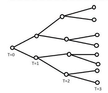
As seen in Figure 1, the number of infected people after a time t is calculated by (R0)t. However, we are more interested in the number of infected people accumulated from time 0 to time t. In order to achieve this goal, we propose a method that find the total number of infected people from time 0 to time t.
(4) 
We acknowledged that the value for is different across different states. Therefore, to account for this disparity, instead of a scalar, is a  diagonal matrix, where the diagonal entries are the for the 50 states. That is, given the for state 1,
  , for state 2,
  for state i,
  , the summation for from time 0 to time t is expressed as the following equation.
(5) ![\begin{equation*}\begin{aligned} & \sum_{j=0}^t\left(R_0\right)^j=\left[\begin{array}{ccc}\sum_{j=0}^t\left(R_{01}\right)^j & 0 & \ldots 0 \ 0 & & \ \vdots & \ddots & \ 0 & & \sum_{j=0}^t\left(R_{050}\right)^j\end{array}\right]\end{aligned}\end{equation*}](https://nhsjs.com/wp-content/ql-cache/quicklatex.com-32d723237d706d8f71b72899c33d3590_l3.png "Rendered by QuickLaTeX.com")
This equation will only give us the growth of infected people without the consideration of the number of COVID-19 cases. In order to take the number of cases into consideration, we take the method of Markov Chain discussed above. Given a Markov Matrix of the transition rate R, the vector for the current COVID-19 population in 50 states P, the value, and the time t, the total number of COVID-19 cases accumulated after time t, F (t), is expressed as the following formula.
(6) 
It is worth noting that F (T) = 0 when  because although the summation is undefined when evaluated at negative times, still exist before the evaluated times. Since they are unimportant, our model ignores them and considers them as having zero value. This formula can be utilized to calculate the cumulative number of COVID-19 cases accumulated after time t. However, we were interested in predicting the exact number of COVID-19 cases on time t. Therefore, we need to take the recovery rate of the disease into account because in reality, a person can be more than likely to recover from the infection.
3.3.2 The consideration of the recovery and reinfection rate
The recovery rate of a disease is defined by the number of patients recovering from a disease over a time period. This rate can be calculated from a source that accounts for the number of patients recovering over time. The reason we chose to consider the rate of recovery over the total number of recoveries is that it is difficult and impossible to know the recovery number in the future time. It is possible, however, to utilize the recovery rate to predict future amount of recovery. Suppose there is the number of patients recovering from COVID-19 with respect to time t. Then the rate of recovery is the derivative  . This rate is the number of recoveries over a given time, measured in people per unit of time. The value of can be estimated by finding how many patients can recover, given a period of time. Given a time taken for a patient to recover from the disease
  , and the number of patients K at one time unit before time t.
![\[\delta (t) = \frac{K}{\omega}\]](https://nhsjs.com/wp-content/ql-cache/quicklatex.com-a76eec3b9293b8a6f3f4897cb1f7c9ac_l3.png "Rendered by QuickLaTeX.com")
(7) 
It is important to note that the recovery rate is estimated from the function that calculates accumulated number of cases F(t) to avoid using any continuously inconsistent parameters such as severity of infection, age groups, or regions. Once having the value for  , we then proposed a formula for the total number of recovery patients, G(t), accumulated from time 0 to time t.
(8) 
Since the function F(t) above is calculated discretely using the summation notation, we would like to approximate function G(t) using a discrete summation, which is the sum of the product of the recovery rate and the equally time periods, assumed to be 1. We therefore have an estimate of the function G(t),
(9) 
Although this formula is not continuous, it can estimate the total accumulated number of patients recovering from the disease at time t, assuming that the time taken for recovery ω is held constant at all times. In order to compute the accurate number of COVID-19 cases at time t, we subtract the total accumulation of COVID-19 infection from time 0 to time t with the total accumulation of COVID-19 recovery from time 0 to time t. We, therefore, constructed a formula to estimate the number of COVID-19 cases in 50 states at time t, M(t) as follows.
(10) ![\begin{equation*}\begin{aligned}& M(t) = F(t) - G(t) \\& M(t) \approx \sum_{j=0}^\iota\left[R^j\left(R_0\right)^j P\right]-\sum_{j=0}^\iota \frac{F(j-1)}{\omega} \\ & \Longleftrightarrow M(t) \approx \sum_{j=0}^\iota\left[R^j\left(R_0\right)^j P-\frac{F(j-1)}{\omega}\right]\end{aligned}\end{equation*}](https://nhsjs.com/wp-content/ql-cache/quicklatex.com-79649b3973d6a9bfc31d1de24e7506aa_l3.png "Rendered by QuickLaTeX.com")
When an entry of M(t) is negative, it means that the number of recoveries of that state is larger than the number of infections. In other words, at time t, the rate of recovery is faster than the rate of infection, meaning that all currently infected people recover from the disease. This occurrence would be impossible given that the system of states we are examining are closed because in a closed system, the number of infections must always be equal to or greater than the number of recoveries. We have proven and tested that up until t=1000, our model yields  (see in Appendix).
3.4 Variables and Assumptions for the Forecasting Model
At this stage, we wanted to verify the values that our model used that reflected its accuracy in predicting the number of COVID-19 cases. To do so, let us define some values for the necessary variables and the assumptions for the model.
![\[R=\left[\begin{array}{ccc}0.772104 & 0.001439 & \ldots 0 \ 0.001169 & & \ \vdots & \ddots & \ 0 & & 0.665897\end{array}\right]\]](https://nhsjs.com/wp-content/ql-cache/quicklatex.com-d6f54735da3d7a3b4439a98aa7f1bb77_l3.png "Rendered by QuickLaTeX.com")
Justification: This matrix is calculated from the database of United State Census Bureau for the state-to-state migration in 2022.15. The rates in this matrix are assumed to stay constant in all months as that will avoid over-complications in our model. When the matrix remains constant, the model does not have to continuously tune to change the rates every day, or every month.
![\[P=\left[\begin{array}{c}106 \ 11 \ \vdots \ 14\end{array}\right]\]](https://nhsjs.com/wp-content/ql-cache/quicklatex.com-c3ffc72e3d122f672107fb301ddb5d75_l3.png "Rendered by QuickLaTeX.com")
Justification: This vector, displaying the 7-day average number of cases in 50 states, is retrieved from USA FACTS of coronavirus cases and deaths on April 2, 202019
![\[R_0=\left[\begin{array}{ccc}1.26 & 0 & \ldots 0 \ 0 & & \ \vdots & \ddots & \ 0 & & 1.55\end{array}\right]\]](https://nhsjs.com/wp-content/ql-cache/quicklatex.com-b468dcb7621d01a811840db50fee8bee_l3.png "Rendered by QuickLaTeX.com")
Justification: This is the matrix for the R0 values of COVID-19 in 50 states on April 1 202021.
- ω= 1.5
Justification: This value is estimated from the fact that COVID-19 patients usually need one to two weeks to recover according to the Johns Hopskins Medicine22. The purpose of the model is to estimate the change of COVID-19 cases in 50 states’ population, without any focus on specific groups of people. Therefore, the model uses the value ω = 1.5 averaging from 1 and 2 weeks, as an estimation of the recovery time.
- t time is assumed to be every week after April 2, 2020, meaning each unit of t is one week after that date in the simulation.
Justification: We wanted to investigate in a small-time interval for closer examination. The short time intervals are also essential for the inclusion of the constant transition matrix R because the migration pattern changes less in a short period of time. In addition, since the vector P has the 7-day average of the number of cases of 50 states and the matrix R0 has the weekly R0’s of those states, the weekly time interval will ensure consistency in the model. The date April 2, 2020, is based on the data from the initial cases from vector P.
- We assumed that the effect of immigration is negligible, and so there would be no immigrants coming to the U.S.
Justification: This model is constructed based on the state-to-state migration, so we did not account for the immigrant’s population as that will over-complicate this model, requiring a larger matrix. The model will become more complicated if we introduce immigration because according to a previously discussed research paper on relationship between migration patterns and COVID-19 pandemic, the immigrants accounted for at least 3.7 percent of the countries with the highest number of COVID-19, including the U.S. This finding shows that immigration may increase the predicted number of COVID-19 cases in the model to some extent.
4 Results
4.1 An overall change of COVID-19 hospital admissions
| Minimum | First Quartile | Median | Third Quartile | Maximum | Mean | Standard Deviation |
| 6324 | 18082.75 | 28253 | 42632.25 | 150650 | 36570.09 | 28066.83 |
The results from Table 4 for the dataset of the number of COVID-19 hospital admissions in the U.S. from August 8, 2020, to March 9, 2024, shows that the number of reported cases ranged from 6324 to 150650, with a mean of 36570.09 and standard deviation of 28066.83.
Upon analysis, we discovered that the number of COVID-19 cases in the United States changed with different rates in four years. In other words, the number of patients fluctuated consistently throughout the period of study. In order to better visualize the data, we had constructed a graph based on the data from the CDC, as seen in Figure 2.
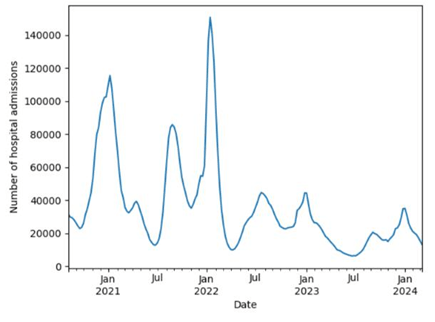
From October 2020 to January 2021, we witnessed a dramatic increase in the cases followed by a significant decrease in seven months right after that. From July 2021 to January 2022, the number of hospital admissions sky-rocketed by approximately 83 thousand patients, making it the largest number of patients in the period of four years. However, right after 3 months, the number of patients once again dropped noticeably from over 150 thousand to about 10 thousand patients. From May 2022 to March 2024, there was not any noticeable change. In those two years, the number of hospital admissions fluctuated constantly around 20 thousand cases.
One remarkable trend in this data is that the number of cases in January was the highest in each year, and that in July was the lowest, except for the case in July 2022. In other words, the local maximum and minimum of the number of patients were almost always in January and July, respectively, showing that the disease was spread the most in January and the least in July. We further recognized that the absolute maximum occurred in January 2022, indicating that the pandemic spread the most at that time throughout the studied period. On the contrary, the time the disease reached the lowest amount was in July 2023.
4.2 A closer investigation on the rate of change of COVID-19 hospital admissions
We were not only interested in investigating the amount of COVID-19 hospital admissions, but we were also intrigued by making an examination of how fast the disease changed throughout four years. In order to fulfill that goal, we decided to calculate the daily average rate of change of the number of cases. We proposed a formula based on the data we had
![\[\Delta C_n=\frac{C_{n+1}-C_n}{7}\]](https://nhsjs.com/wp-content/ql-cache/quicklatex.com-a2e06f4b49a0de60d6d558e27ba3bfc3_l3.png "Rendered by QuickLaTeX.com")
 : daily average rate of change of cases on a given date
  : the number of cases on that date
  : the number of cases one week after that date
For better visualization, we decided to construct a line graph of the average rate of change in the number of cases, from August 2020 to March 2024, as seen in Figure 3.
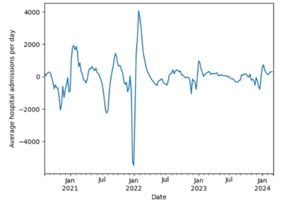
In this visualization we noticed certain trends in how fast the COVID-19 cases changed. In each year, the lowest daily rate of change was around January, showing negative rates. In fact, the graph depicts that the months preceding January (September to January) were accounted for negative changes, indicating that the number of COVID-19 cases tend to decrease in these months. While the months following January (January to July) had positive rates, showing that the number of cases increases at this time of the year.
Another pattern that we witnessed in this graph is that most of the time, the relative maximum and relative minimum, in a six-month period, were about three months apart. For example, there was a relative minimum in November 2020 (about -2000 cases per day) and a relative maximum in February 2021, three months after (about 2000 cases per day).
Based on these trends, we hypothesized that the reason for the decreasing and increasing rates in certain months is because people move more in the months near the summer and move less in the months near the winter. This hypothesis is supported by the fact that the moving season in the United States tends to be from “mid-May through mid-September”23. At the end of the moving season, which lasted about 3-4 months, people stop migrating, which leads to a turning point (relative minima and relative maxima) in the spreading speed of COVID-19. These hypotheses led us to believe that as people move from one place to the others, they spread the disease with them. This belief left us with a question on how much the movements of people will affect the spread of COVID-19, and how a model can be made to predict future changes regarding interstate migrations.
4.3 Forecasting Model results
After substituting the necessary values for the variables found in subsection 3.4, we then ran a simulation, based on the function M(t) to depict how well our model would predict the spread of COVID-19 in 50 states. We simulated the model to predict the number of cases in two weeks after April 2, 2020, meaning we evaluated the formula with 0 ≤ t ≤ 2, where t ∈ N.
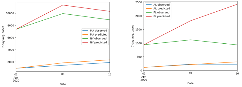

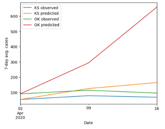
First of all, for the visualization of the accuracy of our model, we decided to plot the observed and predicted value of the cases from April 2, 2020, to April 16, 2020. We randomly selected two states from the northeast, southeast, northwest, southwest, and Midwest of the United States (as seen in Figure 4).
At the first glance, it is noticeable that the prediction tends to be more accurate at time t = 1 (besides at t = 0) than at time t = 2. This trend is supported by the evidence that as time proceeds, the gap between the observed and predicted values tends to get larger. Another remark we observed through this simulation was that the overall change of the prediction is similar to the observed change in terms of the speed and net change.
However, the visualization from these ten states does not ultimately depict the accuracy of our entire model. In order to achieve this goal, we estimated the error from our predictions from 50 states based on the mean absolute error (MAE) and the mean absolute percentage error (MAPE). Given the observed values xi, the MAE and MAPE of the predicted values M(t)i is calculated as the following.
![\[\begin{gathered}M A E_t=\frac{\sum_{i=1}^n\left|x_i-M(t)i\right|}{50} \\ M A P E_t=\frac{100 \%}{50} \sum{i=1}^n\left|\frac{x_i-M(t)_i}{x_i}\right|\end{gathered}\]](https://nhsjs.com/wp-content/ql-cache/quicklatex.com-49a2477fad225e4aff649d5b65773d47_l3.png "Rendered by QuickLaTeX.com")
We then evaluated these two functions for t = 1 (April 9) and t = 2 (April 16).


These values indicate that when predicting from t = 0 to t = 1, our model’s prediction was 82.46 cases and 28.95% off from the observed values. Similarly, when simulating from t = 0 to t = 2, our model tends to be 194.65 cases and 71.65% off. We therefore concluded that the model is best used to forecast the number of cases in about two months from the initial time.
As discussed above, we acknowledged that this model works better at t = 1 than at t = 2. We further wanted to examine the accuracy of the predictions by calculating the magnitude of the spread of COVID-19 in 50 states on April 9. In order to achieve this goal, we compare the  norm of the predicted and observed values. The magnitudes of the spread or the L2 norms,
  and
and  , are calculated as the following.
![\[|p|=\sqrt{\sum_{i=1}^{50}\left|x_i\right|^2}\]](https://nhsjs.com/wp-content/ql-cache/quicklatex.com-cf7d57f87104cf5058e0755e5227702c_l3.png "Rendered by QuickLaTeX.com")
: the magnitude of the observed cases : the observed cases
![\[|M(1)|=\sqrt{\sum_{i=1}^{50}\left|a_i\right|^2}\]](https://nhsjs.com/wp-content/ql-cache/quicklatex.com-5dc267a9de69ff9bf36ecb1c26cd235c_l3.png "Rendered by QuickLaTeX.com")
: the magnitude of the predicted cases at 
 : the predicted cases at
After evaluated those two values, we got  and
and  .
.
By definition, these norms reflect the magnitudes of the spread of COVID-19 in 50 states. A large value of norm, for example, indicates that there is a high spread of the disease. As seen in the values of and , our model overall underestimated magnitude of the spread of COVID-19 in April 9, 2020.
4.4 Models comparison
In this section, we compare our forecasting model’s performance with that of the ARIMA(11,1,9) and ARIMA(2,1,0) in predicting the COVID-19 cases in 50 states 04/09/2020 and 04/16/2020. We trained each of the ARIMA models up until before 04/09/2020 and up until before 04/16/2020.
Table 7 shows that the number of COVID-19 cases by state from 1/22/2020 to 6/1/2022 ranged from 0 to 159937 cases with a mean of 1088.88 and a standard deviation of 6911.56.
| Minimum | First Quartile | Median | Third Quartile | Maximum | Mean | Standard Deviation |
| 0 | 0 | 0 | 136 | 159937 | 1088.88 | 6911.56 |
Table 8 shows that the number of COVID-19 cases by state from 01/22/2020 to 04/16/2020 ranged from 0 to 222284, with a mean of 1948.62 and a standard deviation of 10922.95.
| Minimum | First Quartile | Median | Third Quartile | Maximum | Mean | Standard Deviation |
| 0 | 0 | 1 | 344 | 222284 | 1948.62 | 10922.95 |
We evaluated the two ARIMA models’ performance and compared that with our model, in terms of mean absolute error (MAE) and mean percentage error (MAPE). According to Table 7, our model did better than ARIMA(11,1,9) and ARIMA(2,1,0) in the performance for 04/09/2020, while our model only did better than ARIMA(11,1,9) in the performance for 04/16/2020.
| Performance for 04/09/2020 prediction | Performance for 04/16/2020 prediction | |||
| Model type | MAE | MAPE | MAE | MAPE |
| Our model | 111.83 | 38.15% | 280.55 | 107.48% |
| ARIMA(11,1,9) | 146.53 | 38.45% | 700.02 | 129.64% |
| ARIMA(2,1,0) | 125.00 | 30.40% | 181.77 | 62.55% |
According to the Table 9, our model did better than ARIMA(11,1,9) and ARIMA(2,1,0) in performance for 04/09/2020 prediction, in terms of MAE, while our model only did better than ARIMA(11,1,9) in the performance for 04/16/2020, in terms of MAE. While our model did better than the ARIMA(2,1,0) model in terms of MAE for 04/09/2020, its MAPE was higher than that of the ARIMA(2,1,0). One reason for this counterintuitive result is because of the dataset’s strong positive skewness (the means in Table 7 and 8 are much larger than the median), meaning there are more small values than large ones. Therefore, just a small absolute error (MAE) in the small values might lead to an extremely large percentage error (MAPE). We hypothesized that our model made small absolute errors (MAE) in the small values, but because the dataset has a lot of small values, our model’s predictions turned out to have higher MAPE. To avoid misleading results for comparison between these forecasting models, we chose to normalize our dataset according to the log-transformation technique introduced in section 3.2. We then evaluated the forecasting models again in terms of MAPE as the only metric with the sole purpose of deciding which one is better than the others. Note that this time, we replaced ARIMA(2,1,0) with ARIMA(0,1,1) because the normalized dataset has different distribution than the original one, and using Auto-ARIMA, we found that ARIMA(0,1,1) is the best ARIMA model for dataset (discussed in section 3.2).
| Performance for 04/09/2020 prediction | Performance for 04/16/2020 prediction | |
| Model type | MAPE | MAPE |
| Our model | 18.68% | 69.54% |
| ARIMA(11,1,9) | 69.47% | 110.67% |
| ARIMA(0,1,1) | 59.56% | 77.22% |
The result from Table 10 indicates that the best model among the three for 04/09/2020 and 04/16/2020 prediction is our model, with the lowest MAPE (18.68% and 69.54%, respectively).
5 Further Research Directions
After examining the accuracy of our model, we were interested in researching the correlation between the COVID-19 mortality (or death rate), spread, and three factors: air quality, mean income, and case distribution in 50 U.S. states. The reason we investigate those three factors is to verify and explore the correlations that are mentioned in the literature review (section 2). By definition, the mortality of a disease is the rate of patients dying from that disease in a population; in this data, it is calculated by finding the number of deaths from that disease over 100,000 total population.
The descriptive statistics for the disease’s mortality in 50 U.S. states in 2021 shown in Table 11 show that it ranged from 29.5 to 158.8, with a mean of 99.32 and a standard deviation of 33.85. The median (101.5) and mean (99.32) are approximately equal, indicating an approximate normal distribution.
| Minimum | First Quartile | Median | Third Quartile | Maximum | Mean | Standard Deviation |
| 29.5 | 71.13 | 101.5 | 133.85 | 158.8 | 99.32 | 33.85 |
5.1 Air quality
To begin, we examined the extent to which air quality could lead to the increase in COVID-19 mortality. To achieve this goal, we took the data of the 2024 air quality by state24 and the 2021 COVID-19 mortality25. In this investigation, we assumed that the air quality by state in 2024 did not change significantly compared to 3 years before, so it can be utilized for correlation with the COVID-19 mortality in 2021. By definition, the air quality is calculated by measuring the air quality index. As the air quality index increases, the air quality of an area decreases.
The descriptive statistics in Table 12 show that the air quality index for 50 states in 2024 ranged from 21.20 to 51.20, with a mean of 42.21 and a standard deviation of 5.26. The median (43.55) and mean (42.21) are approximately equal, indicating an approximate normal distribution.
| Minimum | First Quartile | Median | Third Quartile | Maximum | Mean | Standard Deviation |
| 21.20 | 39.53 | 43.55 | 45.90 | 51.20 | 42.21 | 5.26 |
After that, we performed a regression analysis on those variables. As seen in Figure 5, the graph depicts a weak positive correlation between the mortality rate and the air quality index, with a 95% confidence interval. This correlation indicates that as the air quality index increases (gets more polluted), the mortality tends to increase.
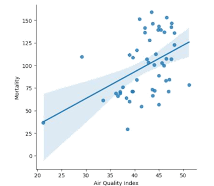
As observed, there are about 12 states that fall within the confidence interval band, meaning they are close to the regression prediction, having the air quality index between 37 and 47. However, the majority of the states’ mortality and air quality tend to scatter far from the line of best fit. This leads to the correlation coefficient of only about 0.458, which is considered as a weak to moderate correlation.
From the correlation, we also investigated whether the correlation coefficient is statistically significant. We decided to perform a t-test on the correlation26, which has the following assumptions:
- Linearity
- Normality of residuals
- Homoscedasticity
The t-test is performed, with the null hypothesis that there is no clear linear relationship between mortality and air quality index. After calculating, the p-value of the t-test is approximately 0.0008 < 0.05, which rejects the null hypothesis, indicating that the correlation coefficient calculated above is statistically significant.
To verify that the calculated t-test is valid, we employed the following diagnostics tests for the above assumptions:
- For linearity, we already assumed that the two variables (mortality and air quality index) are in a linear relationship.
- For normality, we employed the Shapiro-Wilk test27. If the p-value of the test is greater than 0.05, it rejects the null hypothesis, indicating a normal distribution of the residuals.
- For Homoscedasticity, we employed the Breusch-Pagan Test28. If the p-value is greater than 0.05, it supports homoscedasticity.
| Tests | Results |
| Shapiro-Wilk Test | p-value = 0.2203 |
| Breusch-Pagan Test | p-value = 0.4951 |
The results from Table 13 suggest that the t-test for the correlation coefficient between COVID-19 mortality and air quality index is valid (Shapiro-Wilk Test p-value > 0.05 and Breusch-Pagan Test p-value > 0.05).
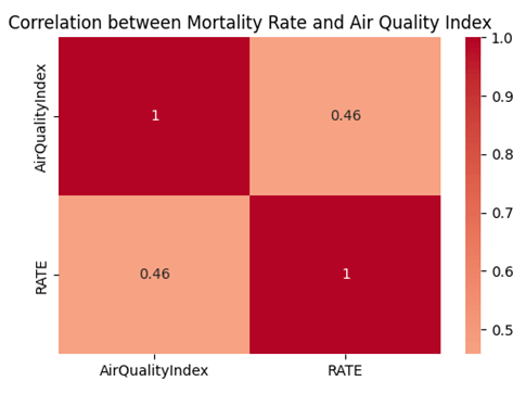
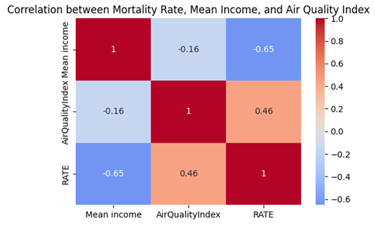
The heat map in Figure 6 is graphed for the visualization of the correlation.
Therefore, we conclude that although the air quality could have an impact on the COVID-19 morality, there remains some uncertainty.
At this stage, we were also interested in constructing a formula to predict the mortality given the air quality index in a state. According to the Gauss-Markov theorem, under certain conditions, the ordinary least squares (OLS) is the best linear estimator (BLUE) for the coefficients of a linear regression, with the least variance29. The conditions are based on the following assumptions:
- Linearity
- Independence
- Homoscedasticity
- No Perfect Multicollinearity
Given the air quality index α, the mortality µ(α) is predicted linearly using OSL by the following formula,
![\[\mu\left(a_i\right)=\beta a_i+C+\epsilon_i\]](https://nhsjs.com/wp-content/ql-cache/quicklatex.com-1bed687801b2c95c0a3e8539663b537f_l3.png "Rendered by QuickLaTeX.com")
where
![\[\begin{aligned}& \beta=\min \beta \sum{i=1}^n\left(\mu\left(a_i\right)-\beta a_i-C\right)^2=\min <em>\beta \sum</em>{i=1}^n \epsilon_i^2 \\& C=\min C \sum{i=1}^n\left(\mu\left(a_i\right)-\beta a_i-C\right)^2=\min <em>C \sum</em>{i=1}^n \epsilon_i^2 \\& \mu(a)=2.944 a-24.968\end{aligned}\]](https://nhsjs.com/wp-content/ql-cache/quicklatex.com-9f2f227cbd745b799efd4c45dac66f7d_l3.png "Rendered by QuickLaTeX.com")
To verify that the OLS in this correlation is BLUE, we employed the following diagnostic tests to test for the conditions above:
To verify that the OLS in this correlation is BLUE, we employed the following diagnostic tests to test for the conditions above:
- For linearity, we already assumed that the two variables (mortality and air quality index) are in linear relationship.
- For independence, we utilized the Durbin-Watson Test30. If the Durbin-Watson Statistic is close to 2, the BLUE condition is supported.
- For Homoscedasticity, we utilized the Breusch-Pagan Test28. If the p-value is greater than 0.05, the BLUE condition is supported.
For No perfection multicollinearity, we utilized Variance Inflation Factor (VIF)31. If the VIF is less than 5, the BLUE condition is supported
| Tests | Results |
| Durbin-Watson | Durbin-Watson Statistic = 1.7423 |
| Breusch-Pagan Test | p-value = 0.4951 |
| VIF | VIF = 1 |
The results shown in Table 14 indicate that they support the condition for OLS to be BLUE in this correlation (Durbin-Watson Statistic close to 2, p-value > 0.05, and VIF <5).
The margin of error for this formula can be calculated as the following where M.O.E is margin of error, z is the z-index, and SE is the standard error,
![\[\text { M.O.E }=z \times \sqrt{\frac{\sum_{i-1}^n\left(\mu_{\text {observed } i}-\mu_{\text {predicted} i}\right)^2}{n-k}}\]](https://nhsjs.com/wp-content/ql-cache/quicklatex.com-91105e59ae065edd4c9f5d48b7932fb3_l3.png "Rendered by QuickLaTeX.com")
 -index is 1.96 assuming that it has
  confidence interval.
  : observed value of the mortality for state
  .
.  : predicted value of the mortality for state .
  : number of states.
  : number of parameters which is 2 in this case.
By substituting the required values, we obtain the margin of error M.O.E for the formula  to be about
  59.611. From this observation, we conclude that although a linear prediction of mortality can be established using the air quality index, there remains some uncertainty to the formula because of the huge margin of error.
5.2 Mean income
Another factor that can have an impact on the mortality of the COVID-19 is the mean income by states. To examine the extent to which the mean income can influences the death rate, we retrieved the data of the mean annual income by state in 202132 and the 2021 COVID-19 mortality by state16. By definition, the mean income is the total income of a state over the total population of that state. The descriptive statistics shown in Table 15 show that the mean annual income for 50 states in 2021 ranged from 68048 dollars to 124951 dollars, with a mean of 93757.30 dollars and a standard deviation of 14708.30 dollars. Although the median (89764) is slightly less than the mean (93757.3), according to the Central Limit Theorem, this distribution of mean income in 50 states is considered normal because of its large sample size (n = 50 > 30).
| Minimum | First Quartile | Median | Third Quartile | Maximum | Mean | Standard Deviation |
| 68048 | 85213.25 | 89764 | 102608.50 | 124951 | 93757.30 | 14708.30 |
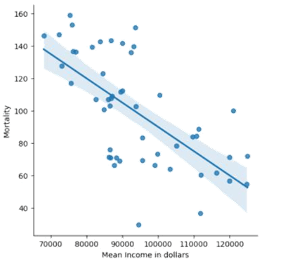
After that we perform a regression analysis by plotting a graph seen in Figure 8. As observed in the graph, we noticed that the COVID-19 mortality and the mean income by state have a moderate negative correlation. This means that as the mean income increases, the mortality tends to decrease. There are about 17 states that fall within the 95% confidence interval band, indicating that they are close to the correct estimate by the line of best fit. The majority uncertainty appears to be in the states with the mean income range from 80,000 to 100,000 dollars, where they are scattered the most from the line of best fit. All the trends above lead to the correlation coefficient of about -0.652, which is considered a moderate negative correlation.
For the t-test, the p-value is approximately 2.97 x 10⁻⁷ < 0.05, indicating that the correlation coefficient is statistically significance.
To verify that the calculated t-test is valid, we performed the diagnostics tests found in subsection 5.1.
| Tests | Results |
| Shapiro-Wilk Test | p-value = 0.6505 |
| Breusch-Pagan Test | p-value = 0.8160 |
The results from Table 16 suggest that the t-test for the correlation coefficient between COVID-19 mortality and mean income is valid (Shapiro-Wilk Test p-value > 0.05 and Breusch-Pagan Test p-value > 0.05).
The heatmap in Figure 7 is graphed to visualize the correlation.

Therefore, we conclude that the COVID-19 mortality in those states can possibly be estimated by their mean income, particularly those having the mean income ranging from 70,000 to 80,000 and 100,000 to 120,000 dollars.
At this stage, we were also interested in finding a formula that can be utilized to predict the mortality of COVID-19 given the mean income in a state. By employing a similar OLS estimator as in subsection 5.1, we get the following equation.
Given the mean income ν, the mortality µ(ν) is predicted linearly by the following formula with slope β, y-intercept C and error ε,
![\[\mu\left(\nu_i\right)=\beta \nu_i+C+\epsilon_i\]](https://nhsjs.com/wp-content/ql-cache/quicklatex.com-4fab25b6b8011d9c8aaa9a40c2aa6312_l3.png "Rendered by QuickLaTeX.com")
where
![\[\begin{aligned}& \beta=\min <em>\beta \sum</em>{i=1}^n\left(\mu\left(\nu_i\right)-\beta \nu_i-C\right)^2=\min <em>\beta \sum</em>{i=1}^n \epsilon_i^2 \\& C=\min <em>C \sum</em>{i=1}^n\left(\mu\left(\nu_i\right)-\beta \nu_i-C\right)^2=\min <em>C \sum</em>{i=1}^n \epsilon_i^2 \\& \mu(\nu)=-0.00150 \nu+239.941\end{aligned}\]](https://nhsjs.com/wp-content/ql-cache/quicklatex.com-340ad33b6ff8b0b57839dd47cb0f9a38_l3.png "Rendered by QuickLaTeX.com")
To test if this OLS is BLUE, we also employed the similar diagnostic tests as in subsection 5.1.
| Tests | Results |
| Durbin-Watson | Durbin-Watson Statistic = 2.3326 |
| Breusch-Pagan Test | p-value = 0.8160 |
| VIF | VIF = 1 |
The results shown in Table 17 indicate that that they support the condition for OLS to be BLUE in this correlation (Durbin-Watson Statistic close to 2, p-value > 0.05, and VIF <5).
The margin of error (M.O.E) of this formula is approximately ±50.852 using the similar method as in subsection 5.1. From this observation, we conclude that the prediction of mortality based on the mean income is more accurate than that based on the air quality index.
A heat map in Figure 9 for the correlation between mortality rate, Mean Income, and Air Quality Index is also graphed to visualize their correlations. Since the correlation between the mortality rate and air quality index is insignificant (-0.16), it shows that they are less likely to be confounding variables to each other in predicting the mortality rate, which rules out the potential for the omitted variable bias syndrome, reinforcing the reliability of the above OSL models.
5.3 Case distribution
The last factor that correlates with the impact of COVID-19 is the disease’s distribution among 50 states. To be specific, a certain distribution would give rise to the most spread of COVID-19. To corroborate what kind of distribution that is, we utilized the eigenvalues and eigenvectors. When multiplied by a Markov matrix, an eigenvector will be the vector that gets stretched out without changing its direction, meaning it changes its norms more than other vectors. This eigenvector, associated with the largest eigenvalue, will be the population distribution that changes its norm the most. In other words, it will give rise to the most spread of COVID-19.
Given the Markov matrix for the transition rate of people in 50 states R, eigenvalue  , and eigen-vector
  , we have

The eigenvectors in this case cannot be negative because the number of COVID-19 cases is the quantity that can only be greater than or equal to 0. To avoid any negative eigenvectors, we changed them into 0, considering only positive ones. In addition, since those eigenvectors are much smaller than 1 when calculated, we decided to time them by 1000 to better see the differences of cases within the distribution.
We called the COVID-19 case distribution that gives rise to the most spread among 50 states the “max spread distribution”. Let that be ; then the max spread distribution will be calculated as the following
![\[\overrightarrow{p_n}= \begin{cases}1000 \overrightarrow{v_n} & \overrightarrow{v_n}>0 \ 0 & \overrightarrow{v_n} \leq 0\end{cases}\]](https://nhsjs.com/wp-content/ql-cache/quicklatex.com-8478e05a8f272d618d3bb48ac5eef1c7_l3.png "Rendered by QuickLaTeX.com")
When evaluating the function, we got a vector that holds the max spread distribution that goes from Alabama to Wyoming, in alphabetical order of states’ names.
![\[\vec{p}=\left[\begin{array}{c}402.7 \\0 \\74.45 \\\vdots \\0\end{array}\right]\]](https://nhsjs.com/wp-content/ql-cache/quicklatex.com-f09dcb957d5a5fed9906c30f3fbfe229_l3.png "Rendered by QuickLaTeX.com")
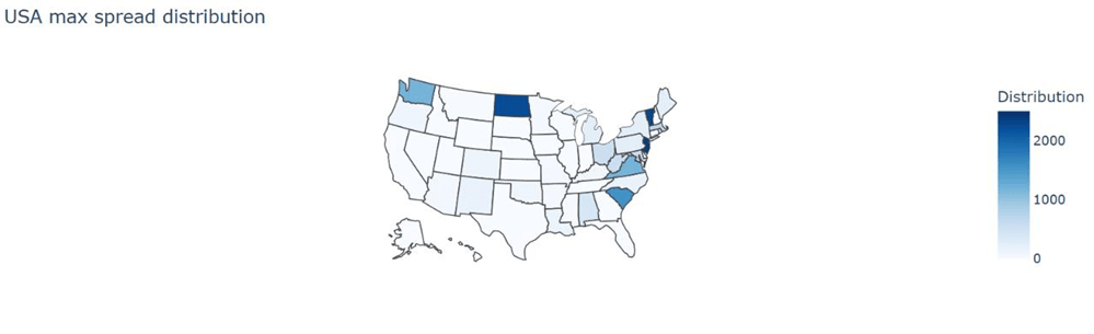
In order to better visualize the distribution, we plotted it on the map of the USA (Figure 10).
Based on this map, we noticed that the distribution tends to be clustered among the East Coast of the U.S with New Jersey and Vermont as the most concentrated states. This pattern reveals that as there are more COVID-19 cases in the East Coast (concentrated in New Jersey and Vermont), it will lead to the rapid spread of the disease. In order to prevent the disease from spreading exaggeratedly, we suggest increasing healthcare facilities in those states, which have high spread distribution as seen in Figure 10.
6. Discussion
6.1 Forecasting Model’s strengths
Based on the results from our model, we would like to evaluate its strengths and weaknesses. Starting with the first strength, it is noticeable that our model does not require past trend in the number of cases. In other words, it does not need to be trained the past data about the number of cases to predict future results. The most crucial factors this model needs are just the state-to-state transition matrix and the initial vector of cases in 50 states. Another advantage we saw in our model is its ability to predict future cases without the use of a plethora of variables. Aside from the time needed to evaluate the function, our model only requires the transition matrix, initial cases vector, the R0 value, and the time taken for a patient to recover and get reinfected, and probability of recovery and reinfection from the disease. Most of these variables can be readily found in several sources and research.
To our knowledge, those reasons explain the relatively small MAEs and MAPEs of our forecasting model compared to those of the ARIMA models, especially when forecasted for one week. The ARIMA models relied on the past trend of the dataset without considering the factors such as migration patterns, the R0 value, and the time taken for a patient to recover to recover, the probability of recovering, the time taken to get reinfected, and the probability of getting reinfected by COVID-19. A disadvantage of time series forecasting models is that they are poor at predicting turning points33. If there is a sudden change in the number of cases, such as changing from increasing to decreasing abruptly because of migration patterns, the ARIMA model might not be able to accurately predict the near future number of cases, because they are fitting the dataset with an increasing trend. However, since our model considers the migration patterns and only focuses on the current state, it can better predict the near future number of cases from that current time.
Moreover, another disadvantage of the ARIMA models is that they are sensitive to outliers, which lie outside the trend of the dataset, resulting in large residuals34. Consider Table 7 and Table 8 about the descriptive statistics of the number of COVID-19 cases by U.S. states from 01/22/2020 to 04/09/2020 and from 01/22/2020 to 04/16/2020, respectively. One of the methods that can be used to test outliers is by using the Interquartile range (IQR)35. The following equations calculate the lower outlier boundary and upper outlier boundary for the dataset from 01/22/2020 to 04/09/2020 (referred to Table 7).
![\[\text { lower outlier boundary } y_1=Q 1_1-1.5 I Q R_1\]](https://nhsjs.com/wp-content/ql-cache/quicklatex.com-a4d996055cc564032697ca14aba023d1_l3.png "Rendered by QuickLaTeX.com")
![\[\begin{aligned}& =Q 1_1-1.5\left(Q 3_1-Q 1_1\right) \\& =0-1.5(136-0) \\& =-204\end{aligned}\]](https://nhsjs.com/wp-content/ql-cache/quicklatex.com-ba5bfdb33bbeade879a01d6cd292300d_l3.png "Rendered by QuickLaTeX.com")
![\[\text{upper outlier boundary} { }_1=Q 3_1+1.5 I Q R_1\]](https://nhsjs.com/wp-content/ql-cache/quicklatex.com-058f92d7dc0fb18ecbce7d0257f1fd19_l3.png "Rendered by QuickLaTeX.com")
![\[\begin{aligned}& =Q 3_1+1.5\left(Q 3_1-Q 1_1\right) \\& =136+1.5(136-0) \\& =340\end{aligned}\]](https://nhsjs.com/wp-content/ql-cache/quicklatex.com-1479c40e14d743d7c374efb77fc3c548_l3.png "Rendered by QuickLaTeX.com")
Since the minimum value is 0, which is greater than the lower outlier  , there are no lower outliers. However, since the maximum value is 159937, which is greater than the upper outlier , there are upper outliers.
The following equations calculate the lower outlier boundary and upper outlier boundary for the dataset from 01/22/2020 to 04/16/2020 (referred to Table 8).
lower outlier boundary 
![\[\begin{aligned}& =Q 1_2-1.5\left(Q 3_2-Q 1_2\right) \\& =0-1.5(344-0) \\& =-516\end{aligned}\]](https://nhsjs.com/wp-content/ql-cache/quicklatex.com-8ea36805bfaae11723d766017b445239_l3.png "Rendered by QuickLaTeX.com")
upper outlier boundary

![\[\begin{aligned}& =Q 3_2+1.5\left(Q 3_2-Q 1_2\right) \\& =344+1.5(344-0) \\& =860\end{aligned}\]](https://nhsjs.com/wp-content/ql-cache/quicklatex.com-44bdd55777dd36490b92f25d10c3e80d_l3.png "Rendered by QuickLaTeX.com")
Since the minimum value is 0, which is greater than the lower outlier  , there are no lower outliers. However, since the maximum value is 222284, which is greater than the upper outlier , there are upper outliers.
These tests for outliers concluded that the dataset for the number of COVID-19 cases by U.S. states from 01/22/2020 to 04/09/2020, and from 01/22/2020 to 04/16/2020, has outliers, which affected the accuracy of the predictions made by the ARIMA and SARIMA models. Our forecasting model, in contrast, is not affected by outliers because it does not consider the past trend of the dataset, in terms of the number of infected cases, but only the current number of cases.
6.2 Forecasting Model’s weaknesses
Despite such strengths, our model still holds several weaknesses. We first acknowledge that our model predicts the number of cases discretely. In other words, it does not consider the continuous characteristic of the disease. The reason why this is a downside is because the number of cases changes every second. Our model might not capture the short-term changes in the number of cases due to its discrete nature. Our model is only designed to estimate the data discretely every week, which can be seen in the increase in the inaccuracy as the evaluated time increases. Another disadvantage we observed in our model is its preliminary assumptions. In order for the function to work without complexity, we assumed that several variables are held constant. For example, the state-to-state transition matrix and the time taken to recover from the disease ω are held constant throughout the evaluation. In real life scenario, however, those variables could change from time to time, and they also depend on different groups of people, population density, public health interventions, and regions, etc.
We also acknowledge that our choice for a weekly interval will miss the important dynamic changes, such as changes in public policies or short-term spikes in the number of infections. Aside from those factors, it is worth noting that our model cannot feasibly make frequent updates for the state-to-state migration patterns because of the lack of a readily dataset for such patterns daily, weekly, or monthly. For such reasons, our model should not be regarded as optimal in forecasting the number of COVID-19 cases in situations where migration patterns change drastically, such as during the beginning or the end of lockdowns.
Another drawback that we observed in our model is that it requires the data to be normalized. Although our model is resistant to outliers, it requires the dataset to be normalized so that the evaluated MAE and MAPE will not be misleading (discussed in section 4.4).
6.3 Limitations of prediction formulas for mortality
In subsections 5.1 and 5.2, we discussed the two factors that correlate with COVID-19 mortality rate: air quality and mean income. In examination of 50 U.S. states, we found a weak to moderate positive correlation between mortality and air quality, measured by air quality index. In addition, we also found a moderate negative correlation between mortality and mean income. Although the formulas for predicting such relationships are based on OLS, which is found to be BLUE, the margins of errors for both equations are relatively high, ±59.611 and ±50.852, respectively. For this reason, those two prediction formulas should not be over-emphasized in terms of their accuracy. Those formulas were to investigate the ability to predict the COVID-19 mortality given the air quality and given the mean income in a state.
6.4 Limitations of case distribution
In subsection 5.3, we discussed a method that predicts the case distribution in 50 states that would result in the most spread of the disease in terms of cases number. The method is based on the idea of eigenvector and the Markov Matrix. In particular, the eigenvector is the case distribution that gives rise to the most disease spread, and the Markov matrix is the state-to-state transition rates13 shown in subsection 3.4. We acknowledge that the Markov Matrix for the state-to-state transition rates could change from time to time. Therefore, it is worth noting that the case distribution that gives rise to the most disease spread also changes from time to time.
7. Conclusion
In this research paper, we investigated how COVID-19 cases have changed in the USA in terms of hospital admissions, formulated a model to predict the number of cases in 50 states, and sought factors that correlate with the disease mortality and spread. In order to achieve those goals, we examined the trend in the COVID-19 hospital admissions change from August 8, 2020, to March 9, 2024, utilized the idea of Markov Matrix for the model, and employed linear regression and eigenvectors for the factors correlated with the disease’s impacts.
We first analyzed the brief overall change in the number of hospital admissions of COVID-19 in the U.S. from August 8, 2020, to March 9, 2024. In examining it, we observed a periodic fluctuation of the number of cases over the studied time. To be specific, January tends to hold the greatest number of cases, while July tends to have the least. For deeper investigation, we calculated the daily rate of change of the number of cases. We noticed that the months preceding January had a decrease in the number of cases, while those following January tended to have an increase in that amount. In addition, we observed that the relative maximum and minimum of such number tend to be about three months apart.
Once having a scope for how COVID-19 has changed over time, we were interested in creating a model to predict the number of cases in 50 states. We constructed that model based on the idea of a Markov Matrix, in which the transition matrix was the rate of migration within the 50 states and the vector held the initial number of cases in 50 states. From the estimation of cumulative cases and recovery, we modeled a function that predicts the number of cases in 50 states. After the validation, we noticed that the model works best when evaluated in the first two months. In comparison to the ARIMA(11,1,9) and ARIMA(2,1,0), our model was proven to have less errors in terms of MAEs, for original dataset, especially for one week prediction. For normalized dataset, our model was proven to have less errors in terms of MAPEs.
At the last stage of the research paper, we were interested in examining the three factors that are correlated with COVID-19’s mortality and spread: air quality, mean income, and cases distribution. Through the use of linear regression method, we observed that the air quality has a weak to moderate positive correlation with the disease’s mortality. While the mean income negatively correlated with the disease’s death rate. We then utilized statistical methods to verify the two correlation’s accuracy and to model a simple function that linearly predicts the COVID-19’s mortality based on the two factors. As for the relationship between the cases distribution among 50 states and the spread of the disease, we employed the idea of eigenvalues and eigenvectors. The max spread distribution, which is the eigenvector corresponding to the highest eigenvalues of the state-to-state transition matrix, was chosen to represent the cases distribution that could give rise to the highest spread of the disease. After computing such distribution, we plotted it on the map of the United States and found out that the disease will spread the most rapidly when the cases tend to cluster around the East Coast of the country.
8. Appendix
All matrices and vectors are stored in Google Sheets and all codes are performed using the programming language Python-3.
Refer to the state-to-state Markov Matrix using this link. https://docs.google.com/spreadsheets/ d/1O2PL62SKglaOSrtosxfnT33wf1hvUlTZGulgWd9r0Fs/edit?usp=sharing
Refer to the vector for the number of COVID-19 cases of 50 states on April 1 2022 using this link. https://docs.google.com/spreadsheets/d/1xpY1r74jXfFNxK0-A63RZA8J4zgOCMQC/edit?usp=sharing& ouid=112674581627271822389&rtpof=true&sd=true Refer to the vector for the max spread distribution using this link. https://docs.google.com/spreadsheets/d/1Pm5OQP-rKoILOstQcW-gwzTD06QLEcBZS79DuLsVY7s/edit?usp=sharing
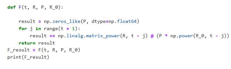

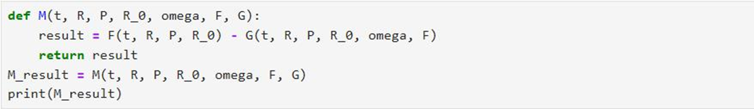
Proof of biconditional for 
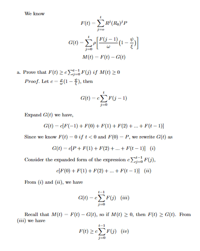
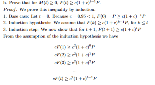
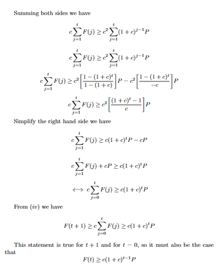
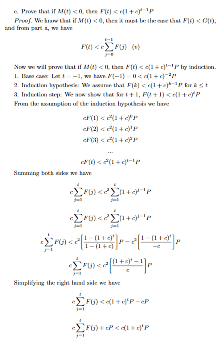
Code that tests for  .
.
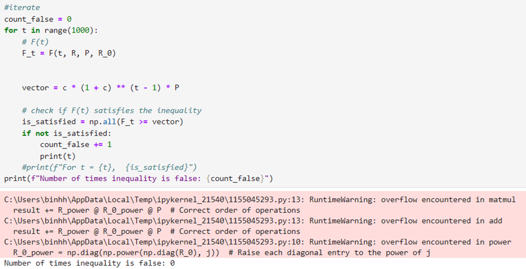
References
- Centers for Disease Control and Prevention (CDC), Symptoms of COVID-19. (June 25 2024). https://www.cdc.gov/covid/signs-symptoms/index.html. [↩]
- Wikipedia, COVID-19. (6 June 2024). https://en.wikipedia.org/wiki/COVID-19. [↩]
- Adam Hayes, Autoregressive Integrated Moving Average (ARIMA) Prediction Model, (July 31, 2024). https://www.investopedia.com/terms/a/autoregressive-integrated-moving-average-arima.asp. [↩]
- Joseph E. Cavanaugh, Andrew A. Neath, The Akaike information criterion: Background, derivation, properties, application, interpretation, and refinements (January 28 2019). https://iowabiostat.github.io/research-highlights/joe/Cavanaugh_Neath_2019.pdf. [↩]
- Everette S. Gardner Jr., Exponential Smoothing: The State of Art, Vol. 4, 1-28 (1985). https://www.bauer.uh.edu/gardner/Exp-Sm-1985.pdf. [↩]
- Migration data portal, Migration data relevant for the COVID-19 pandemic (July 11 2023). https://www.migrationdataportal.org/themes/migration-data-relevant-covid-19pandemic#:~:text=Assuming%20zero%2Dgrowth%20in%20the,(UN%20DESA%2C%202020). [↩]
- SHOKO Claris and NJUHO Peter, ARIMA MODEL IN PREDICTING OF COVID-19 EPIDEMIC FOR THE SOUTHERN AFRICA REGION, 17(1): 1–9 (2023). https://www.ncbi.nlm.nih.gov/pmc/articles/PMC9885024/#:~:text=Amongst%20all%20the%20ARIMA%20models,million%20for%20the%20SADC%20region. [↩]
- https://galton.uchicago.edu/~lalley/Courses/312/MarkovChains.pdf [↩]
- https://www.medrxiv.org/content/10.1101/2022.09.23.22280294v1.full [↩]
- Ireri Hernandez Carballo, Maria Bakola, and David Stuckler, The impact of air pollution on COVID-19 incidence, severity, and mortality: A systematic review of studies in Europe and North America, 215: 114155 (December 2022). https://www.ncbi.nlm.nih.gov/pmc/articles/PMC9420033/. [↩]
- Tsikata Apenyo, Antonio Elias Vera-Urbina, Khansa Ahmad, Tracey H. Taveira, Wen-Chih Wu, and Robert Jeenchen Chen, Association between median household income, state Medicaid expansion status, and COVID-19 outcomes across US counties, 17(8): e0272497(2022). https://www.ncbi.nlm.nih.gov/pmc/articles/PMC9371257/#:~:text=Conversely%2C%20there%20was%20a%20significant,in%20the%20highest%20income%20quartile. [↩]
- Sarah L. Jackson, Sahar Derakhshan, Leah Blackwood, Logan Lee, Qian Huang, Margot Habets, and Susan L. Cutter, Spatial Disparities of COVID-19 Cases and Fatalities in United States Counties, 18(16): 8259 (August 2021). https://www.ncbi.nlm.nih.gov/pmc/articles/PMC8394063/#:~:text=Regionally%2C%20the%20Southeast%2C%20Southwest%20and,other%20US%20regions%20%5B23%5D. [↩]
- Centers for Disease Control and Prevention, Trends in United States COVID-19 hospitalizations, deaths, emergency department (ED) visits, and test positivity by geographic area, (June 7 2024). https://covid.cdc.gov/covid-data-tracker/#trends_weeklyhospitaladmissions_ select_00. [↩]
- https://pmc.ncbi.nlm.nih.gov/articles/PMC7920817/. [↩]
- United States Census Bureau, State-to-state migration flows. (September 21 2023). https://www.census.gov/data/tables/time-series/demo/geographic-mobility/ state-to-state-migration.html. [↩] [↩]
- Centers for Disease Control and Prevention (CDC), COVID-19 mortality by state(15February2023). https://www.cdc.gov/nchs/pressroom/sosmap/covid19_mortality_final/ COVID19.htm. [↩] [↩]
- World Population Review, Air quality by state 2024 (2024). https://worldpopulationreview. com/state-rankings/air-quality-by-state. [↩]
- United States Census Bureau, Income in the past 12 months (in 2018 inflation-adjusted dollars)(2021). https://data.census.gov/map/0400000US01,02,04,05,06,08,09,10,12, 13,15,16,17,18,19,20/ACSST1Y2021/S1901?q=S1901: %20INCOME%20IN%20THE%20PAST%2012%20MONTHS%20(IN%202018%20INFLATION-ADJUSTED% 20DOLLARS)&y=2021&layer=VT_2021_040_00_PP_D1&loc=34.3659,-21.2851,z0.3809&g= 040XX00US51,50,55,12,56,53,10,54,15,16,13,19,17,18,40,41,44,45,01,42,48,04,49, 05,02,46,47,08,09,06,30,33,34,31,32,37,38,35,36,39,22,23,20,21,26,27,24,25,28, 29,72&tid=ACSST1Y2021.S1901. [↩]
- USA FACTS, US COVID-19 cases and deaths by state. (July 2023). https://usafacts.org/ visualizations/coronavirus-covid-19-spread-map/. [↩] [↩]
- Dr. Osman Shabir, PhD, What is R0?, https://www.news-medical.net/health/What-is-R0.aspx#:~:text=R0%2C%20or%20the%20basic,or%20global%20pandemics)%20are%20controlled. [↩]
- Douglas D. Gunzler, PhD and Ashwini R. Sehgal, MD, Time-Varying COVID-19 Reproduction Number in the United States( 15 April 2020). https://www.medrxiv.org/content/10.1101/2020.04.10.20060863v1.full.pdf. [↩]
- Johns Hopkins Medicine, COVID-19. https://www.hopkinsmedicine.org/health/conditions-and-diseases/coronavirus#:~:text=Active%20illness%20can%20last%20one,severe%20cases%20can%20last%20months. [↩]
- Tamara Jude, Architectural Di-gest., When is the best time to move? (2024 Guide) (31 October 2023). https://www.architecturaldigest.com/reviews/moving/ when-is-the-best-time-to-move#:~:text=Most%20Americans%20move%20from%20mid, is%20mid%2DSeptember%20through%20April. [↩]
- World Population Review, Air quality by state 2024 (2024). https://worldpopulationreview. com/state-rankings/air-quality-by-state. [↩]
- Centers for Disease Control and Prevention (CDC), COVID-19 mortality by state(15February2023). https://www.cdc.gov/nchs/pressroom/sosmap/covid19_mortality_final/ COVID19.htm. [↩]
- JMP Statistical Discovery, The t-Test, https://www.jmp.com/en_us/statistics-knowledge-portal/t-test.html#:~:text=t%2DTest%20assumptions&text=The%20data%20are%20continuous.,The%20distribution%20is%20approximately%20normal. [↩]
- S. S. Shapiro and M. B. Wilk, An Analysis of Variance Test for Normality (Complete Samples), Vol. 52, No. 3/4 (Dec., 1965), https://www.jstor.org/stable/2333709. [↩]
- Wikipedia, Breusch–Pagan test (July 02, 2024). https://en.wikipedia.org/wiki/Breusch%E2%80%93Pagan_test. [↩] [↩]
- Wikipedia, Gauss–Markov theorem (August 15, 2024). https://en.wikipedia.org/wiki/Gauss%E2%80%93Markov_theorem. [↩]
- Will Kenton, Durbin Watson Test: What It Is in Statistics, with Examples (September 08, 2024). https://www.investopedia.com/terms/d/durbin-watson-statistic.asp#:~:text=The%20Durbin%20Watson%20statistic%20is,above%202.0%20indicate%20negative%20autocorrelation. [↩]
- THE INVESTOPEDIA TEAM, Variance Inflation Factor (VIF) (June 27, 2024). https://www.investopedia.com/terms/v/variance-inflation-factor.asp#:~:text=A%20variance%20inflation%20factor%20(VIF)%20is%20a%20measure%20of%20the,adversely%20affect%20the%20regression%20results. [↩]
- United States Census Bureau, Income in the past 12 months (in 2018 inflation-adjusted dollars)(2021). https://data.census.gov/map/0400000US01,02,04,05,06,08,09,10,12,13,15,16,17,18,19/ACSST1Y2021/S1901?q=S1901: %20INCOME%20IN%20THE%20PAST%2012%20MONTHS%20(IN%202018%20INFLATION-ADJUSTED% 20DOLLARS)&y=2021&layer=VT_2021_040_00_PP_D1&loc=34.3659,-21.2851,z0.3809&g=040XX00US51,50,55,12,56,53,10,54,15,16,13,19,17,18,40,41,44,45,01,42,48,04,49, 05,02,46,47,08,09,06,30,33,34,31,32,37,38,35,36,39,22,23,20,21,26,27,24,25,28, 29,72&tid=ACSST1Y2021.S1901. [↩]
- Neha Bora, Understanding ARIMA Models for Machine Learning (November 08, 2021). https://www.capitalone.com/tech/machine-learning/understanding-arima-models/. [↩]
- Lilis Laome, Gusti Ngurah Adhi Wibawa, Rasas Raya, Makkulau, and Abdul Rahman Asbahuna, Forecasting time series data containing outliers with the ARIMA additive outlier method, Conf. Ser. 1899 012106 (2021). https://iopscience.iop.org/article/10.1088/1742-6596/1899/1/012106. [↩]
- Penn State University, Elementary Statistics, 3.2 – Identifying Outliers: IQR Method. https://online.stat.psu.edu/stat200/lesson/3/3.2. [↩]


