
Abstract
Air pollution is a growing issue in the world, causing cancer, asthma, and overall mortality rates to increase, as a result of increased burning of fossil fuels and released toxins from human activity. In order to prevent more people from health deterioration from air pollution, awareness about it must be raised in daily life. This leads to the argument of this paper, which is that awareness must be spread about air pollution, and, in order to do that, this paper has the goal of using machine learning to predict air pollution, specifically carbon dioxide, in the future in Cupertino, California. To develop the machine learning model, a dataset recording air pollutants from 2013 to 2018 was used. Then, we created a convolutional neural network, a Long Short-Term Memory model, and a Gated Recurrent Unit model for forecasting. By experimenting with hyperparameter numbers in the neural networks, we were able to create a machine learning model that was able to accurately predict carbon dioxide levels years well into the future. The model predicted a continuous rise of carbon dioxide, forecasting that in 2030, carbon dioxide levels will rise to around 450 to 525ppm. This suggests that, without interference, carbon dioxide levels will only rise and cause more harm.
Keywords: air pollution, air quality prediction, convolutional neural network, machine learning
Introduction
With climate change rapidly changing the earth’s environment, air pollution and its threats to the environment and population are becoming clearer annually. Scientifically, air pollution is the contamination of air from harmful or toxic substances. This can refer to a number of different pollutants, including organic compounds and chemicals, like carbon monoxide (CO) or ground-level ozone1. Different pollutants pose different effects on human health, but all are dangerous. For example, particulate matter 2.5 (PM2.5) is linked to cancer, while CO is linked to pneumonia2.
Throughout the years, the cause of air pollution has been repeatedly linked to human activity3. Such activities include driving, cement production, and agriculture. These not only cause air pollution by releasing toxins, but also by destroying plants, which help filter air by absorbing carbon dioxide (CO2).
Additionally, climate change leads to severe weather changes and natural disasters, which can contribute to even more air pollution. For example, forest fires are becoming more frequent as global temperatures warm, which further destroy plants and release many toxins into the air as well4.
Air pollution causes a multitude of problems for human health. This is especially prominent in places with higher levels of air pollution, such as large cities due to high human activity or agricultural areas due to farm emissions5.
Areas like these see higher rates of respiratory disease, cardiovascular disease, inflammation, asthma and overall higher mortality rates in populations6. Worldwide, air pollution is the cause of 3.7 premature deaths yearly7.
In the past century, scientists have been innovating ideas to prevent and improve air pollution, along with protecting humans from it. After discovering the direct link between certain activities—such as burning fossil fuels—and air pollution, scientists have started encouraging mitigation and adaptation. Regarding mitigation, actions include reducing fossil fuel consumption or using more energy efficient resources8. For adaptation against air pollution, solutions such as wearing masks and staying aware of air quality are extremely useful.
Efforts in informing populations about air pollution have been successful, however, many people still overlook it or are not fully aware of its impact9. This is widely due to many people not being directly affected by air pollution, but with air quality worsening in many parts of the world, this ignorance may become dangerous.
This study focuses on taking data from the previous decade to predict future air quality in California, specifically CO2 levels, using machine learning, so that people will not only be aware of the current air quality in their area, but also future air quality and how to prepare for it.
Other research papers that have discussed this topic include the following: A Machine Learning Approach to Predict Air Quality in California, Short‑term Air Quality Prediction Based on EMD‑transformer‑BiLSTM, and Image-based Air Quality Prediction Using Convolutional Neural Networks and Machine Learning. All of these research papers surround using types of machine learning to forecast air quality.
The first research paper, A Machine Learning Approach to Predict Air Quality in California, uses support vector regression models and radial basis functions to predict pollutant concentrations in California. The study utilized support vector regression models because of its advantages in forecasting such as faster training and smaller number of free parameters. While not named, the dataset used in this paper is extracted from EPA’s air quality, and contains hourly measurements of CO, sulfur dioxide (SO2), nitrogen dioxide (NO2), ground-level ozone, PM2.5, temperature, humidity, and wind in California from January 1, 2016 to May 1, 2018. This paper measures all of the pollutants in the dataset: CO, SO2, NO2, ground-level ozone, and PM2.5. It does not measure CO2, like in our paper. The results show a prediction of CO, SO2, and ground-level ozone staying constant and NO2 and PM2.5 decreasing. It is important to note that this study’s machine learning model’s predictions are hourly and short-term10.
Short‑term Air Quality Prediction Based on EMD‑transformer‑BiLSTM, on the other hand, used different types of machine learning models: empirical mode decomposition (EMD) transformers and bi-directional long short-term memory (BiLSTM) networks. The overall goal, though, is similar to the previous paper’s with short term predictions rather than long term ones. Both types of machine learning models have their own role. The EMD is used to obtain intrinsic mode functions and balance performance stability with computational complexity while the BiLSTM is used to prevent gradient disappearance, forget nonessential information, and retain critical information. The dataset used here contains the air quality index (AQI) of Patna, India from 6:00am on October 3, 2015 to 12:00 pm on July 1, 202011.
Finally, for Image-based Air Quality Prediction Using Convolutional Neural Networks and Machine Learning, instead of using number values as data, the paper predicts air quality based on image data. This research paper utilizes convolutional neural networks (CNN) in their machine learning, along with structural equation modeling-partial least squares analysis. This technique was chosen in order to optimize the variance of latent criterion variables, expounded through latent predictor variables. Rather than focusing on a specific pollutant, this paper focuses on overall air quality, temperature, and humidity. The data of this paper is self-collected, with thousands of photos taken from mobile phones and then processed to remove noise or filters. The study is able to create a reliable image-based model that can accurately predict air quality12.
All three of these papers, along with this paper, have a common goal of spreading awareness and informing the public on air quality. However, this research paper is intended to be local and city-specific, so that predictions are not only more personal, but also more accurate. This will allow more people to understand air pollution as a whole, how it directly affects them, and how to act accordingly.
Regarding the methodology, for the machine learning model, this study used a one-dimensional sequential CNN, one-dimensional LSTM, and a one-dimensional gated recurrent unit (GRU). CNNs are comprised of neurons that self-optimise through learning. In a CNN, every neuron receives an input and, based on that input, “learns” and makes a change to the model. This style of self-optimization makes CNNs a strong choice for prediction machine learning models13. LSTMs work differently by remembering data and filtering out irrelevant data. While they are more complex and take longer to train, this ability to retain critical information allows LSTMs to be one of the most preferred machine learning model types for time-series forecasting14. GRUs are similar to LSTMs but merge the forget gate and the input gate, so that the network is much simpler and efficient. This makes LSTMs a popular choice in time-series forecasting as well14.
Methodology
In order to predict future trends in air quality, this study utilized dataset machine learning. The study’s structure was longitudinal, using previous data to predict future behaviors and trends.
The dataset used for this study is titled Raw EPA California Air Quality (Daily: 2013-2024) from kaggle.com15. In the dataset, there are measurements of different types of pollutants at different times in different cities of California from 2013 to 2024. This is a considerably recent dataset and will enable accurate prediction of air quality. It is formatted as a CSV, or comma-separated values dataset.
There are a total of 11 total column types in the dataset: latitude, longitude, parameter (pollutant type), sample duration (time period), pollutant standard (measurement metric), date local, units of measure, arithmetic mean (average measurement), first max value (maximum recorded measurement), state, and city.
In total there are 8,214,128 entries, giving a wide selection of places, times, and pollutants to choose from when working on machine learning. However, there are many duplicate entries, having up to 63485.
The trends that seemed to have the most duplicated data was in 1-hour measurements, microgram measurements, and during the COVID-19 pandemic, or 2020 to 2023. The duplicity percentages for all these categories was around 1-2%, while all other categories consistently stayed under 1%. When comparing all the duplicate data in the dataset to the dataset as a whole, the percentage is quite small, taking up only 0.77%. However, to prevent temporal weight bias, we averaged the data into weekly data to naturally average out duplicate data. While this significantly reduced the number of datapoints, the number was sufficient for this research.
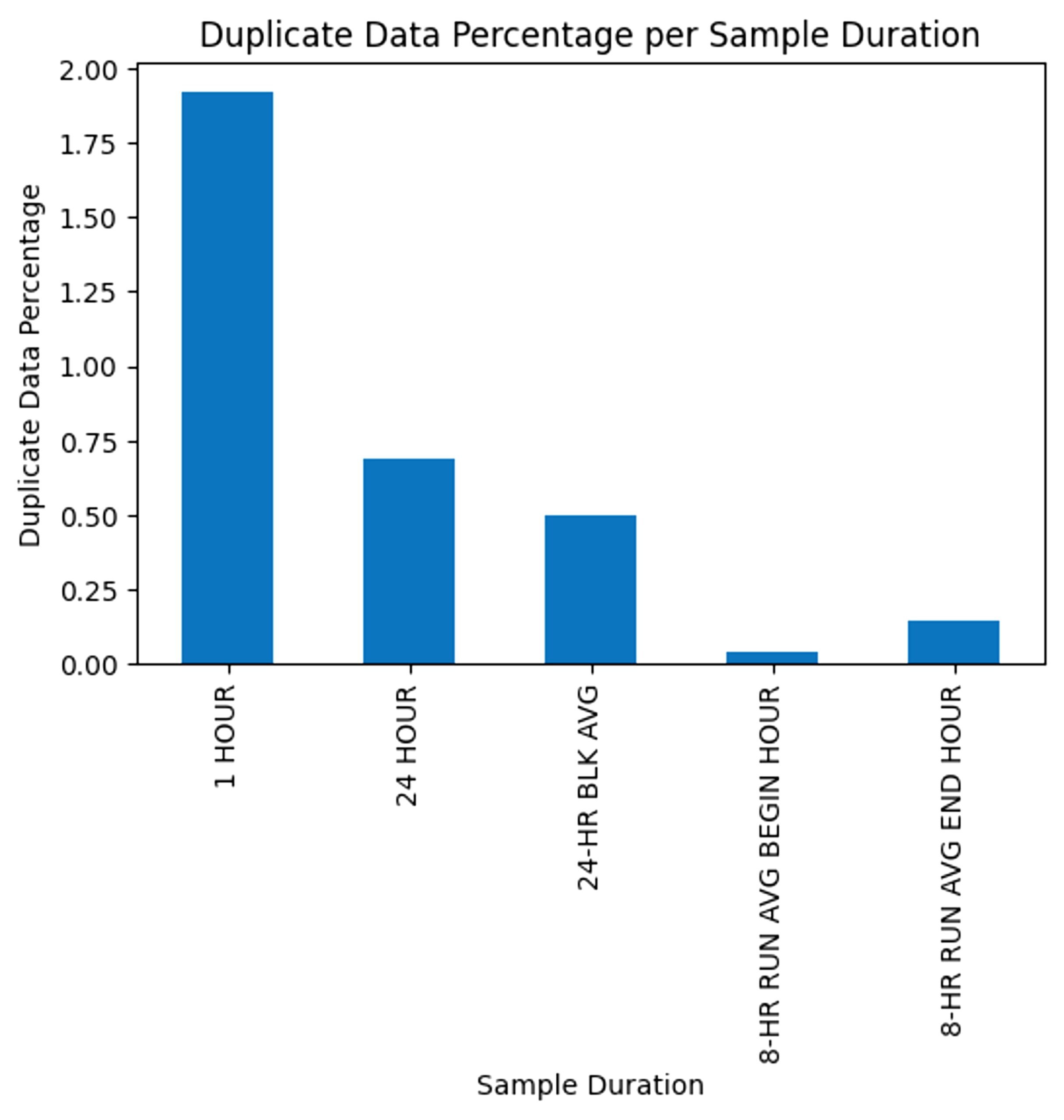
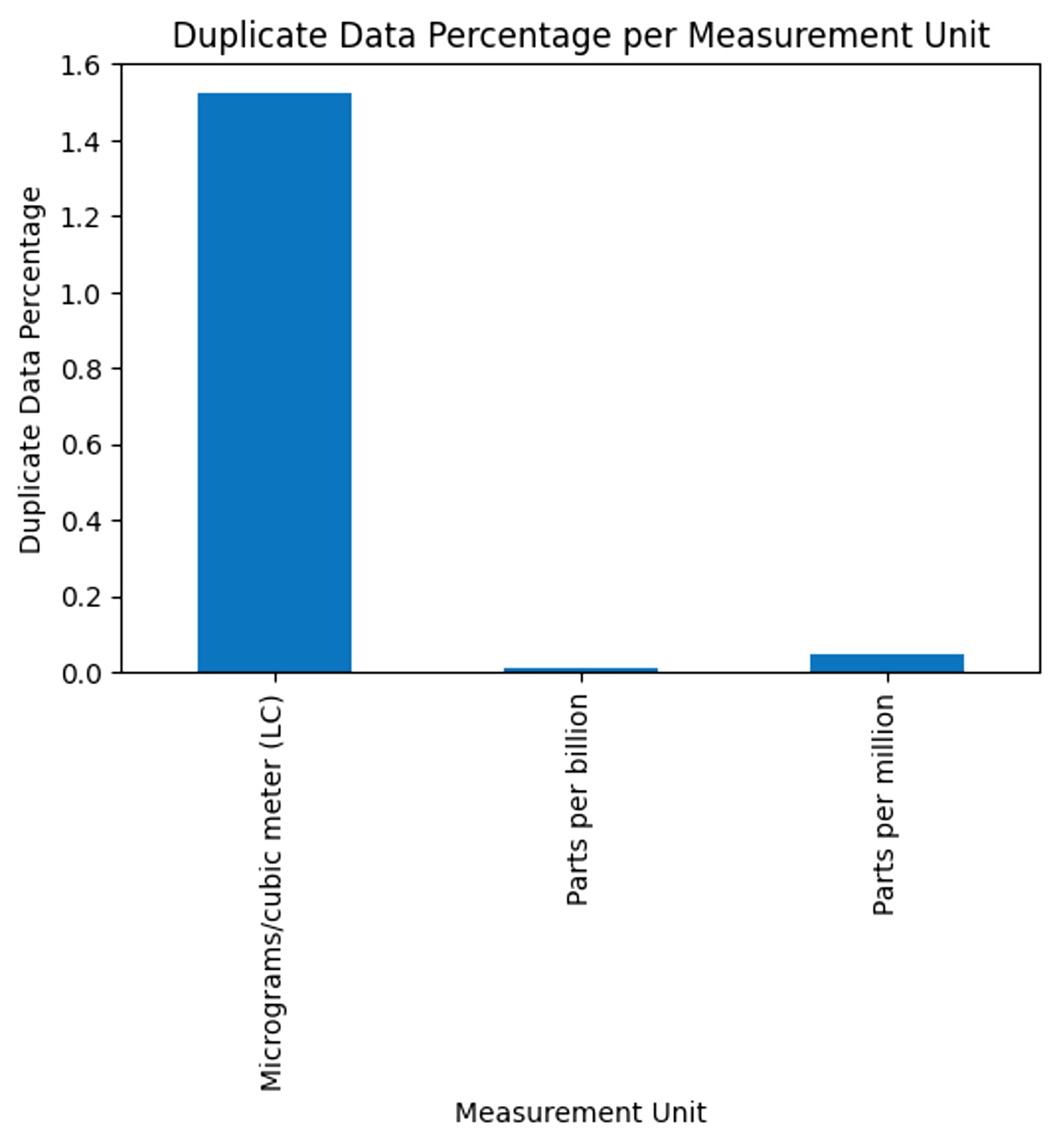
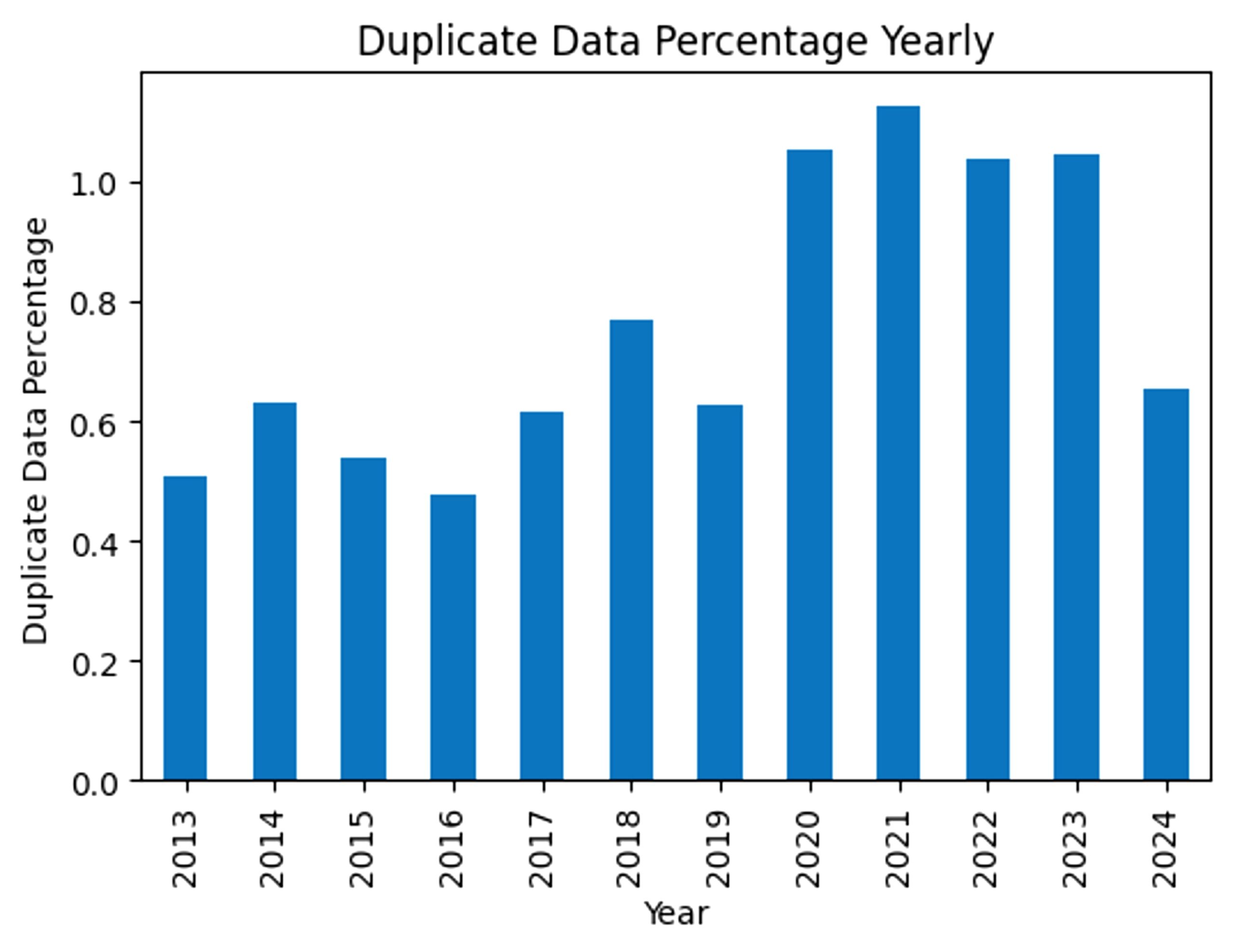
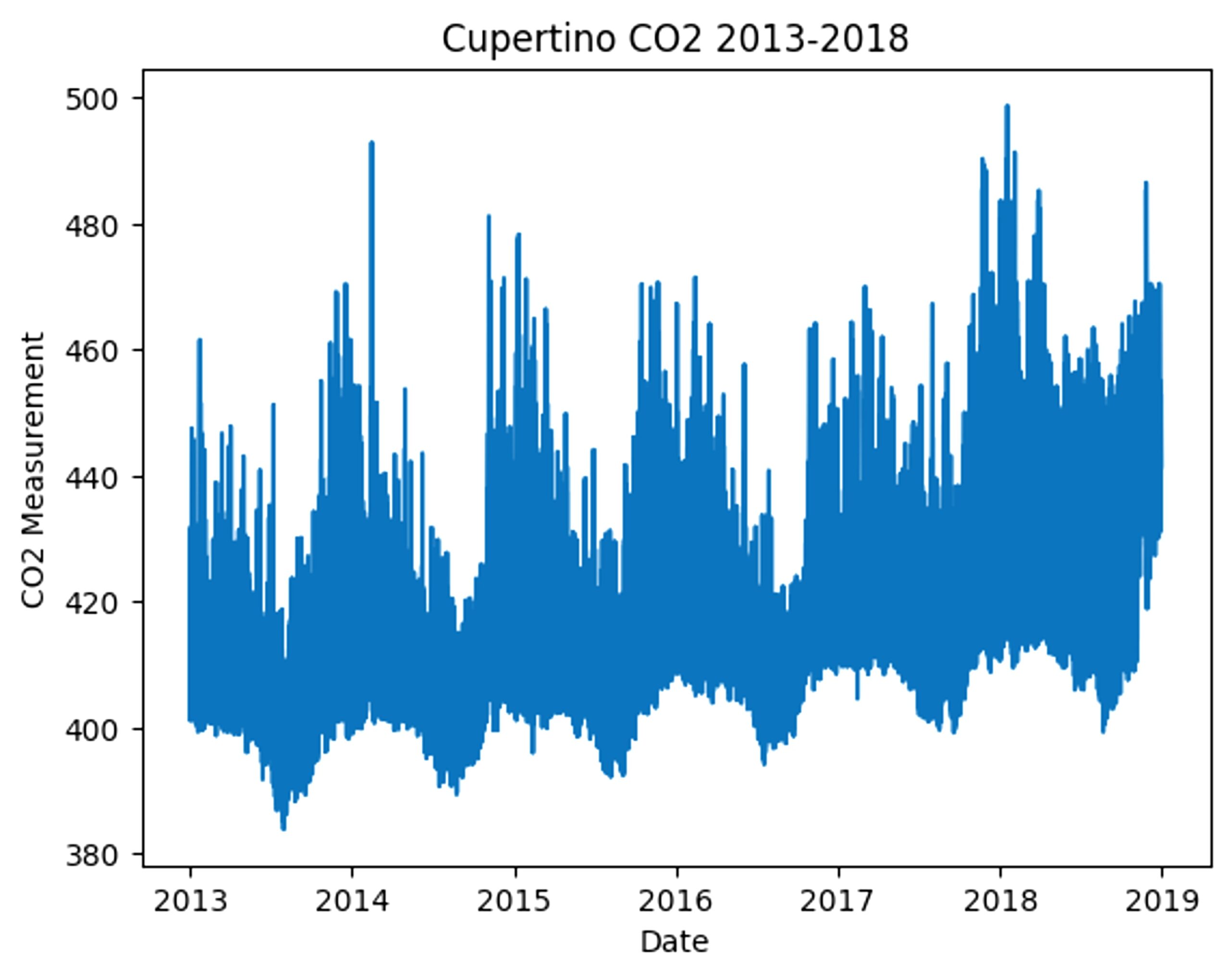
We decided to focus on CO2 levels in the city of Cupertino, so from the 11 columns of variables, many were dropped for our models, leaving only the amount of CO2 and date. In this situation, the independent variable would be the date, while the dependent variable is the CO2 level. This selection of data only had data running from January 1st of 2013 until December 31st of 2018, with any continuation of CO2 measurements missing. The remaining data had 10090 datapoints. Because we had averaged the data into weekly data to naturally average out duplicates, the amount of data points had been reduced significantly compared to the original hourly dataset. Fig 4 visualizes the levels of CO2 from 2013 to 2018 in Cupertino.
From the graph alone, a visible trend can already be identified, allowing us to estimate our results. Not only is there a visible exponential increase, there are also visible seasonal patterns, which show a rise in CO2 in the winter and a decrease in the summer.
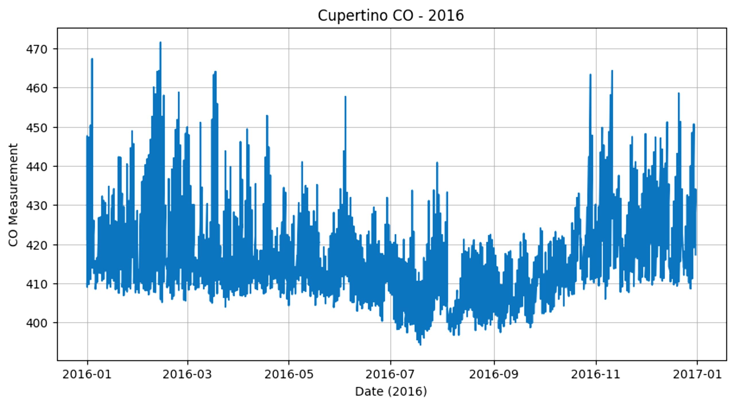
For example, Fig 5 displays the seasonal changes in 2016, which shows a clear peak in February and drop in July. For 2016 specifically, the lowest amount of CO2 is 394.300435ppm on July 19th, and the highest amount is 471.507083ppm on February 14th.
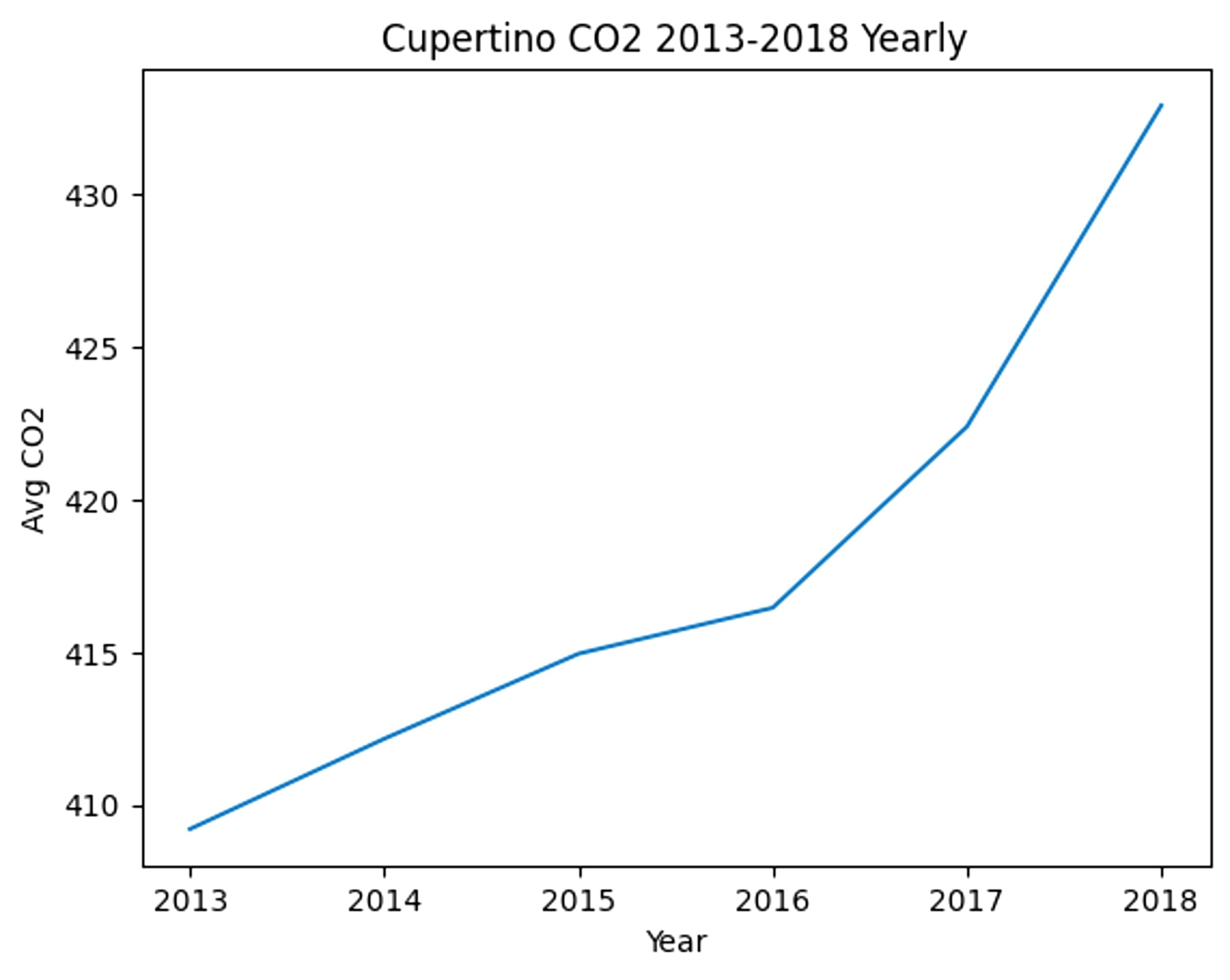
On the other hand, one could also ignore seasonal changes by averaging all the data points in an entire year. When plotted, a rising—and almost exponential—trend is very clear.
To create the machine learning models, we used the following libraries: TensorFlow, NumPy, TimeSeriesSplit, logging, kagglehub, and pandas. After that, we created a sliding window with the size of 90, and split the x and y variables using a train test split. To ensure the integrity of the time-series forecasting task and prevent temporal data leakage, we utilized a chronological 80/20 split. By eliminating random shuffling, the model is trained strictly on historical data and evaluated on a hold-out ‘future’ period. This approach adheres to the temporal ordering required for real-world deployment of carbon emission forecasting models.
CNN
Our CNN’s first layer was 1-dimensional (1D) and activation was set to a Rectified Linear Unit activation function (ReLU). The hyperparameter numbers were set to the following numbers: filters – 64, kernel size – 7, strides – 1, as a default base. We picked 64 filters to balance complexity while avoiding overfitting, 7 kernels to fit our weekly data, and 1 stride for a detailed model. We also added a maxpooling layer to increase efficiency, a flattening layer to keep the CNN 1D, 2 dense layers, with 128 neurons and 1 neuron, respectively, and a dropout layer. The first dense layer’s activation was ReLU.
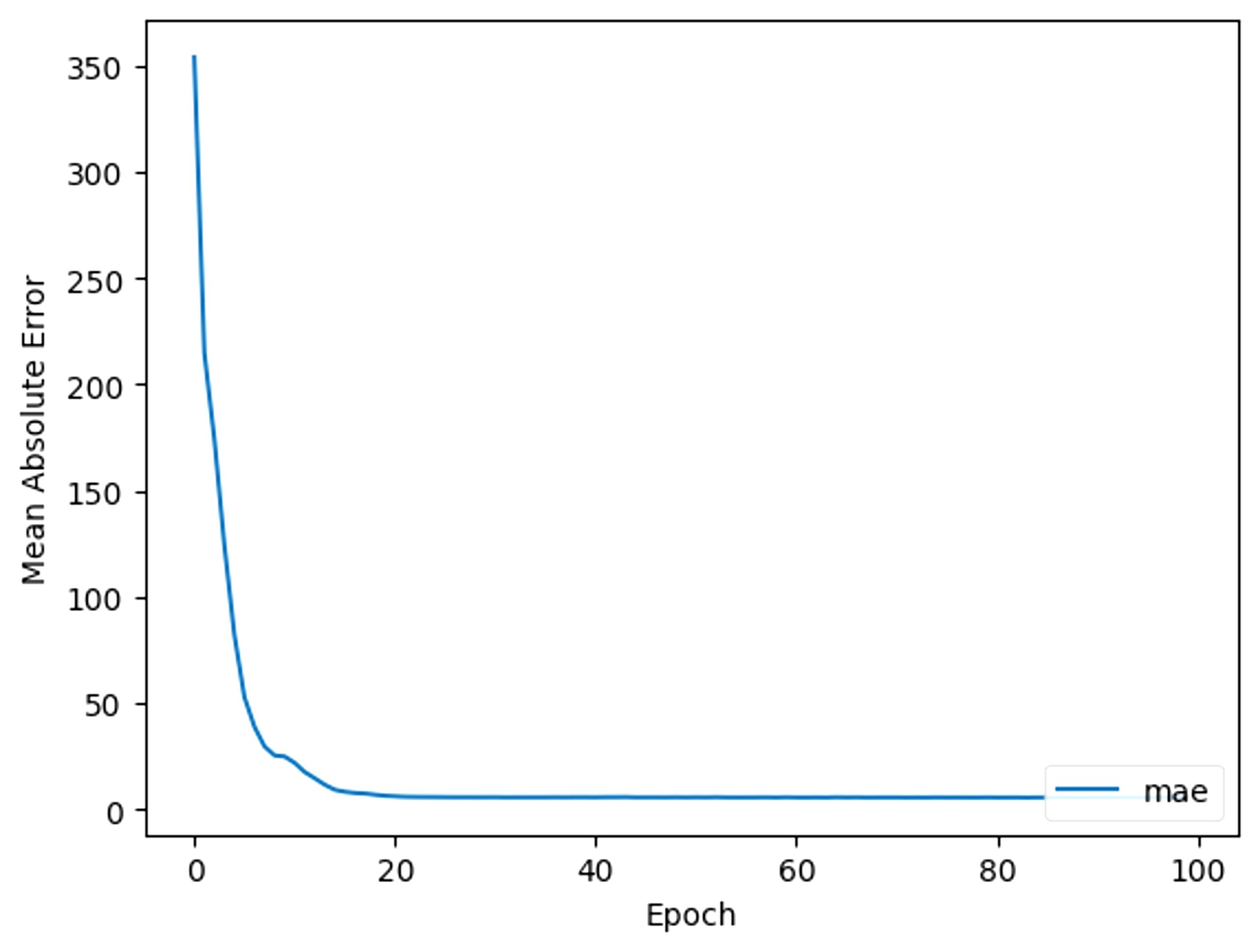
With this CNN, prediction is now possible. To train the model for the most accurate optimization, we ran the CNN through multiple epochs. Every epoch, the model changes certain parameters in an attempt to reduce the inaccuracy in prediction. The inaccuracy is represented by the mean absolute error (MAE), calculated by the following formula16:
Fig 7 shows the reduction of mean absolute error per epoch.
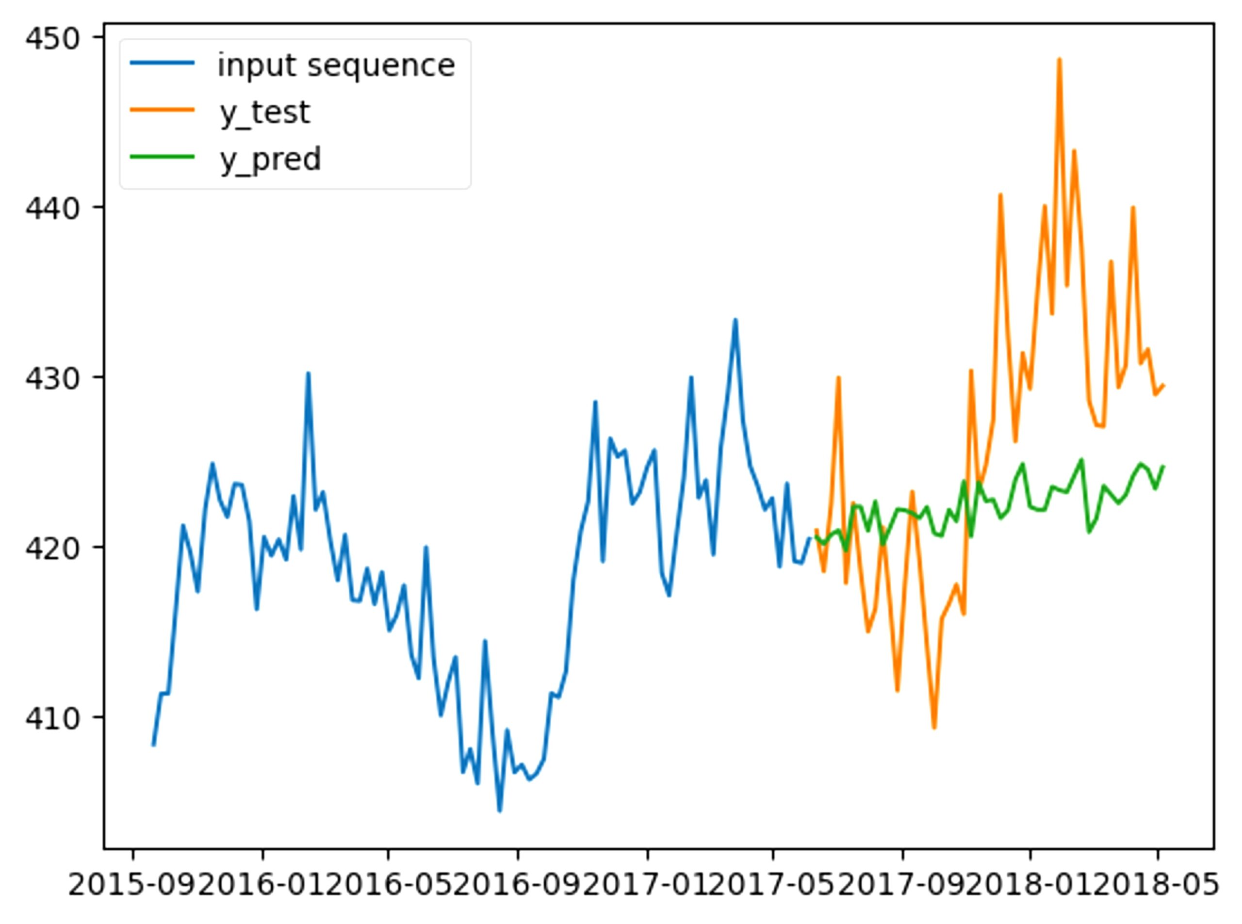
This first model has a final MAE of 9.691 and when graphed, has a significant difference from the actual data.
Our goal is to create a model that can consistently have the lowest MAE. To improve the model, we used two methods: changing the hyperparameter numbers and adding more CNN layers.
For example, for the first method, if we change the number of filters from 64 to 128, the MAE of the new model lowers to 9.155. Using the second method, we kept the first layer with the default numbers, and then added a second layer. The second layer has 8 filters and a kernel size of 3. The numbers in the second layer are lower in order to prevent overfitting in the machine model. All other details were kept the same (e.g, window size, flattening layer, dense layers). This model has an MAE of 8.859.
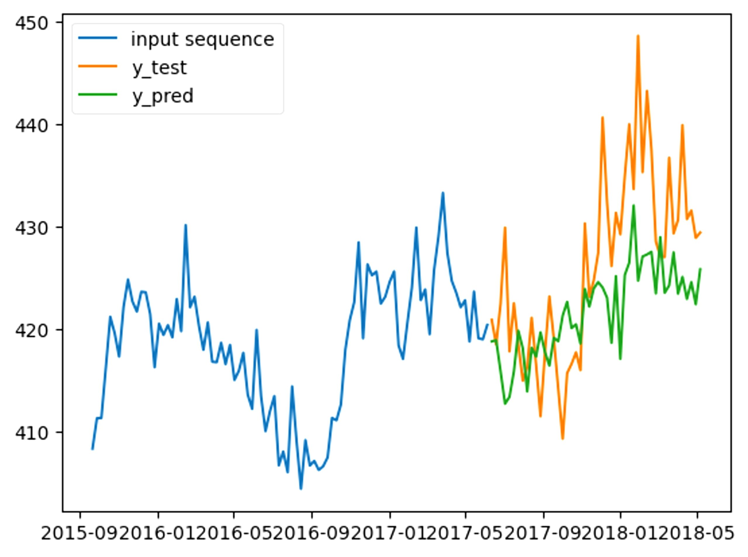
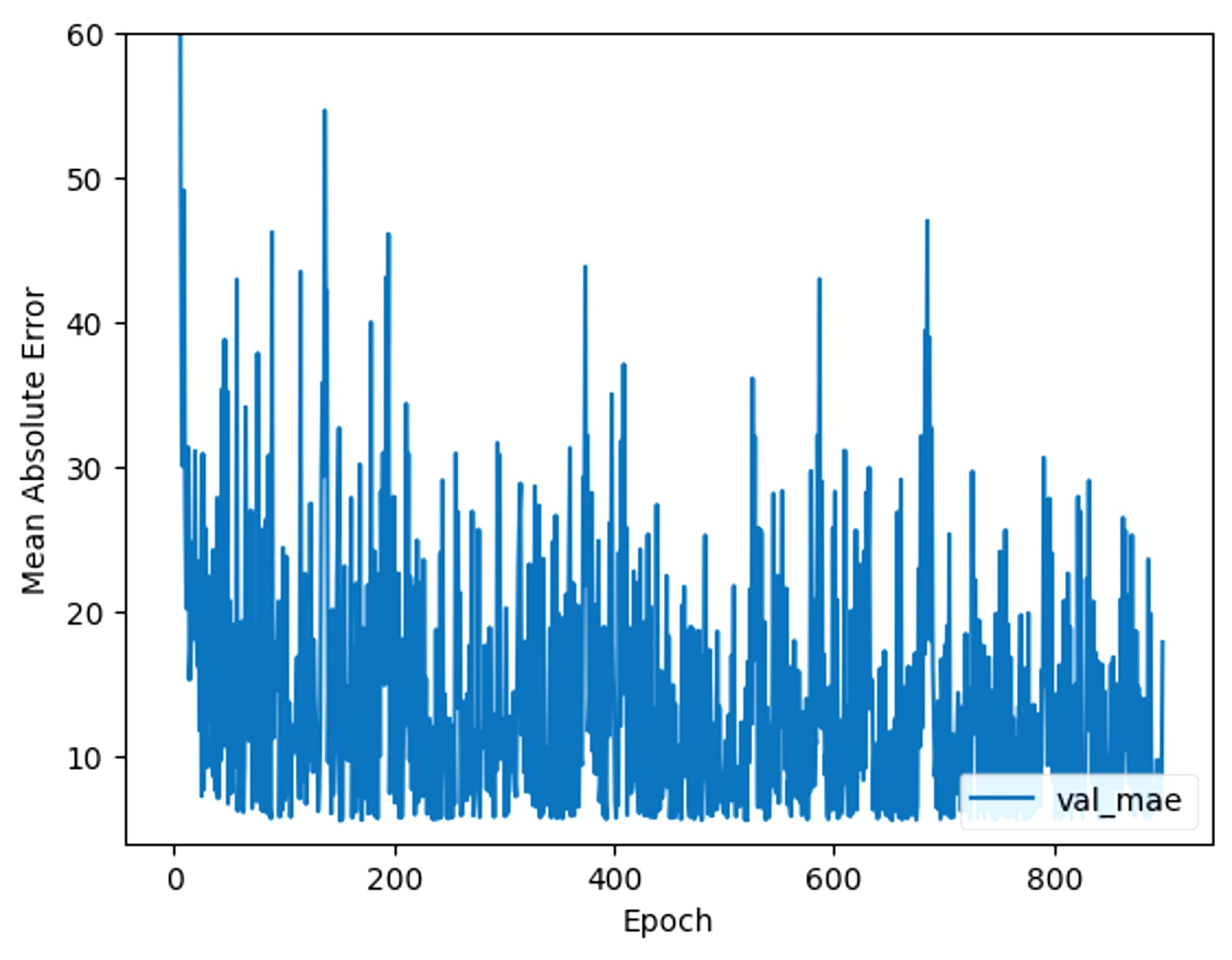
After analyzing the epochs, we realized that the MAE was actually still changing slightly, despite looking like it had already reached convergence. This was because the MAE was not decreasing linearly and the machine learning model was learning extremely slowly. So we increased the number of epochs until actual convergence, giving us 900 epochs. Towards the end, the MAE started becoming more inconsistent, so we stopped the epochs at 900 to prevent further overfitting.
To ensure consistency in our model, different train test splits were also experimented with. In the 80/20 split, the MAE was 7.381. With a 70/30 split, the MAE is 8.337, and with a 90/10 split, the MAE is 8.590.
LSTM
Our LSTM had a different structure from the CNN. It had 2 layers, the first with 64 filters, and the second with 32 filters. We decided on the multiple layers to make the model more complex and high-performing, but avoided a high number of filters so that the model wouldn’t overfit. Additionally, it also had 2 dense layers, with 128 neurons and 148 neurons, respectively. The first dense layer’s activation was ReLU.
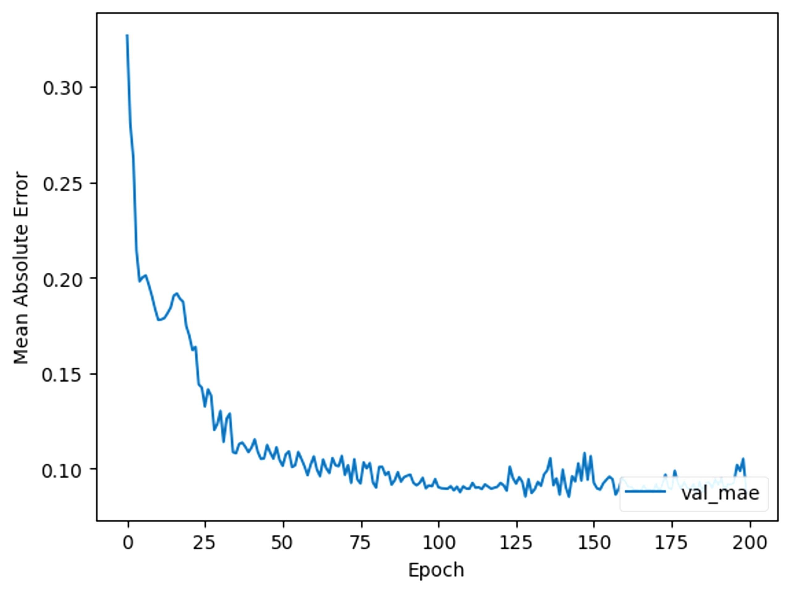
The amount of epochs for this model will begin at 900, like in the CNN, and be adjusted accordingly. Fig 9 shows the reduction of MAE per epoch.
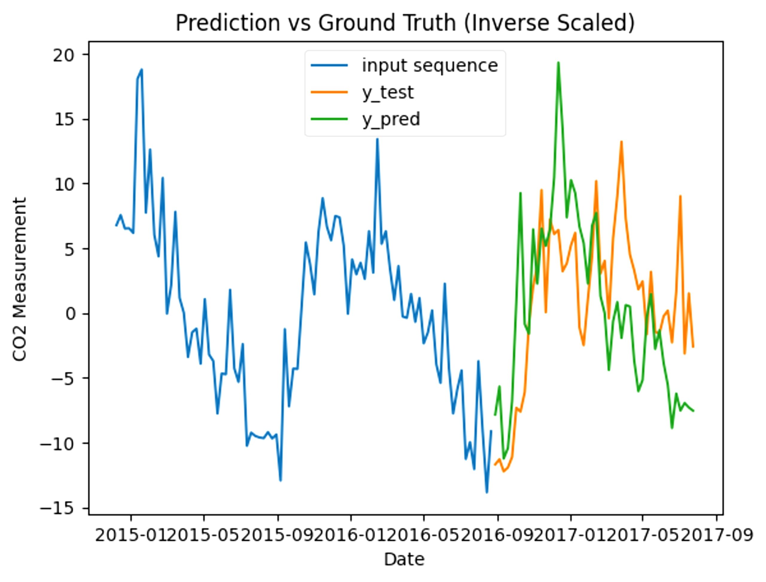
This first model has a final MAE of 0.165 and looks like this when graphed:
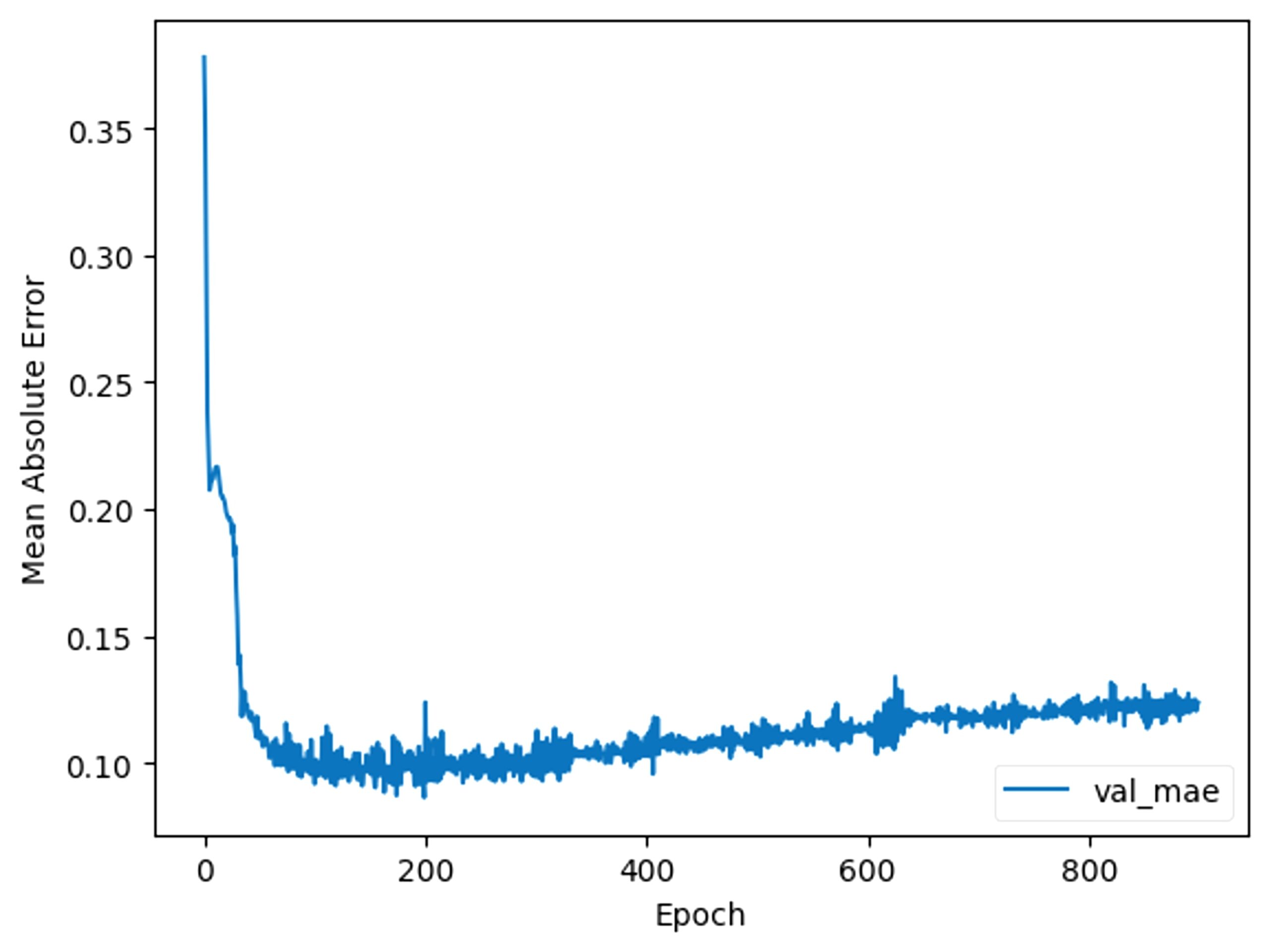
From the training data, it is clear that the MAE started rising at around 100, so we cut down the number of epochs to 200. This gives our base model an MAE of 0.130.
Like in the CNN, we will try changing the hyperparameter numbers and adding more layers to improve the model.
We first tried changing the first layer’s filters to 128, which increased the MAE to 0.1386. Then we tried lowering it to 32, which also increased the MAE to 0.148. So, we kept the filters at 64. For the second layer, we changed the filters to 64 and got 0.139. If we change it to 16, we get 0.148, so we changed it to 64.
For the second method, because the model is already prone to overfitting, we made the third layer only have 8 filters. However, this only raised the MAE to 0.150. Even with 1 filter, the MAE still increased, so we kept the 2 layers.
To ensure consistency in our model, different train test splits were also experimented with. In the 80/20 split, the MAE was 0.139. With a 70/30 split, the MAE is 0.138, and with a 90/10 split, the MAE is 0.145. This experiment not only reveals consistency in our model, but also that a 70/30 split produces a better result.
GRU
The GRU’s default structure was the same as the LSTM’s, with 2 layers, the first with 64 filters, and the second with 32 filters, and 2 dense layers, with 128 neurons and 148 neurons, respectively. The first dense layer’s activation was ReLU.
We decided that because the GRU has a similar structure to the LSTM, we would use 200 epochs.
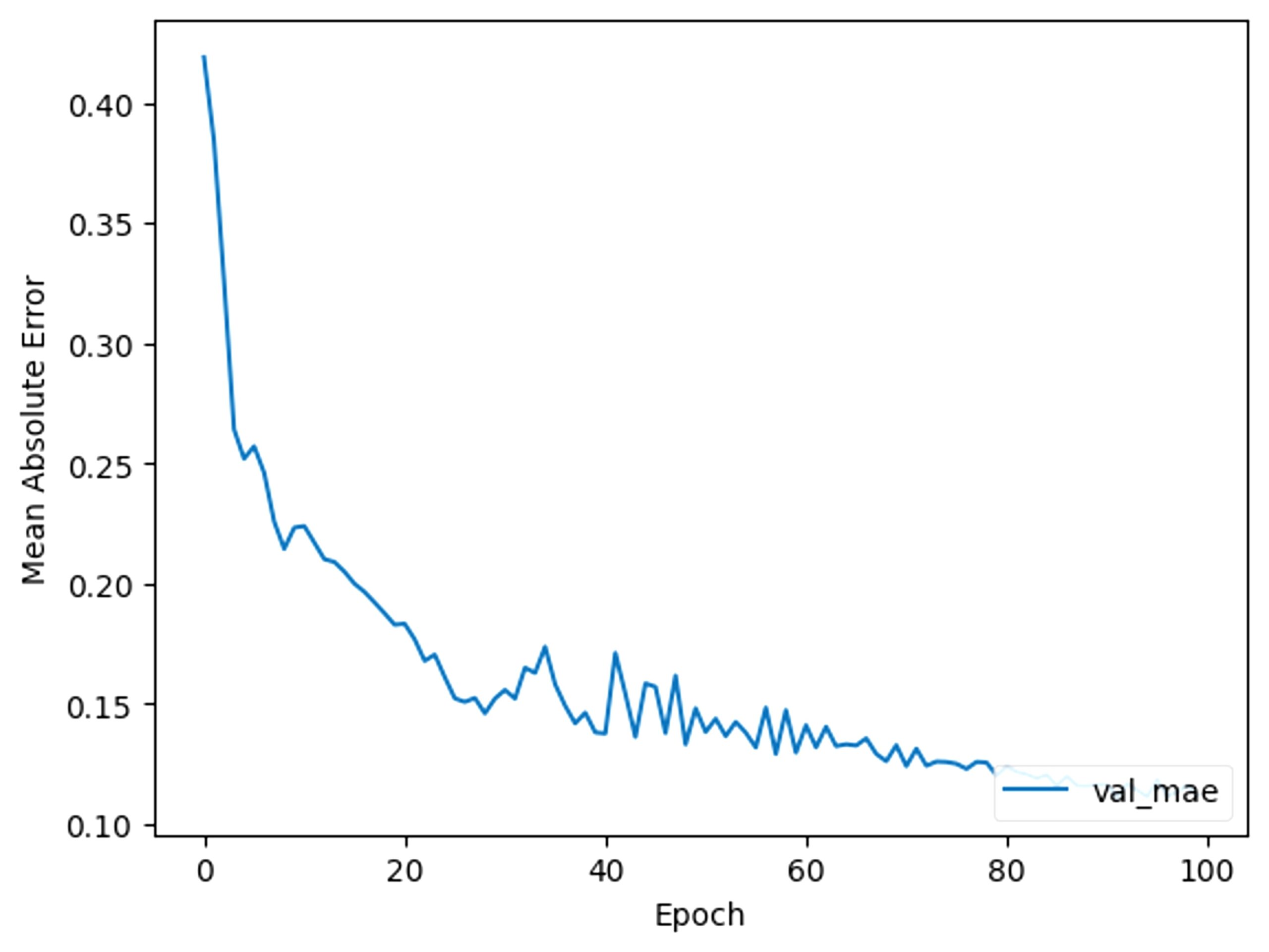
Fig 11 shows the reduction of mean absolute error per epoch.
This first model has a final MAE of 0.136 and when graphed, is considerably different from the actual data.
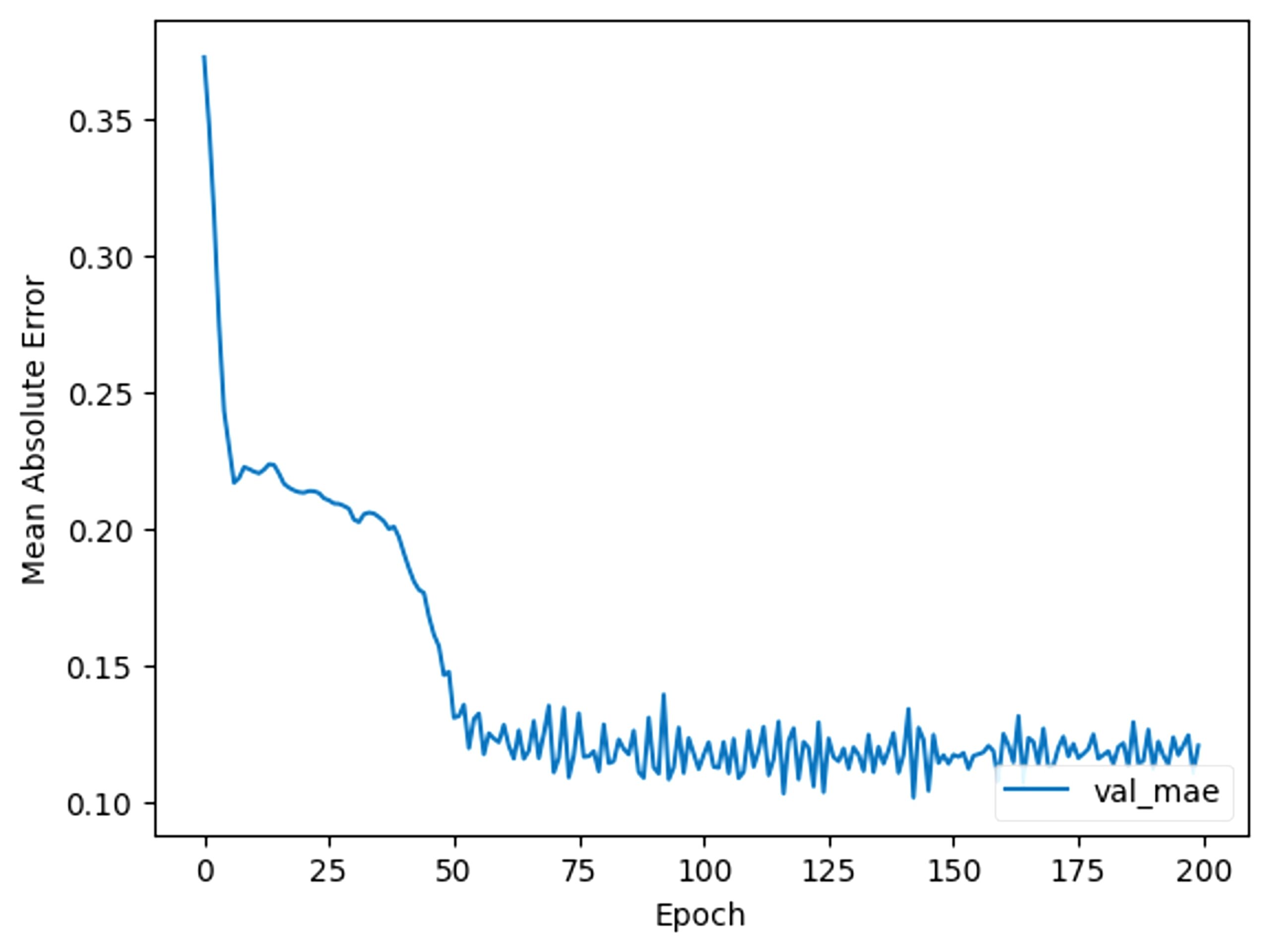
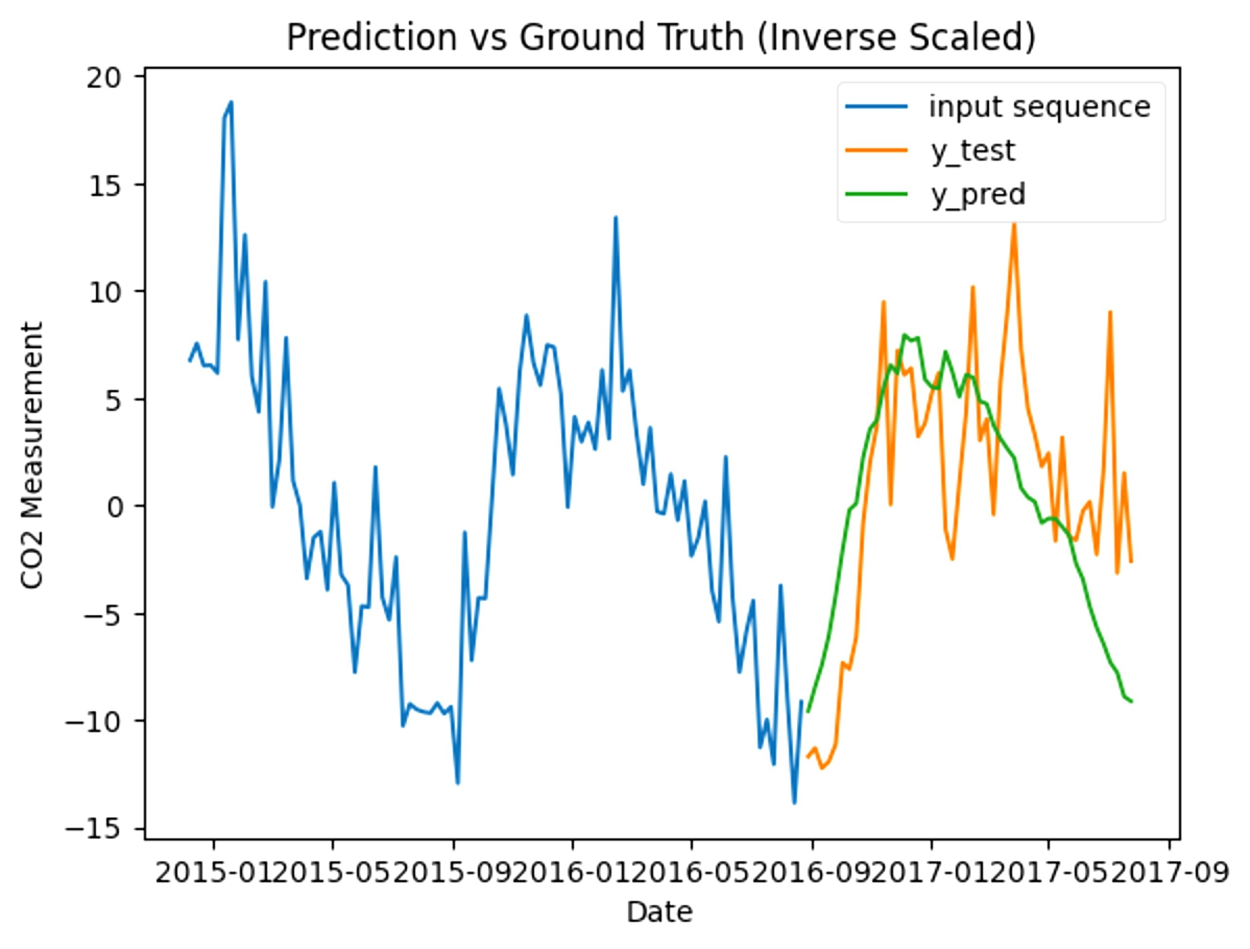
After 80 epochs, the data starts plateauing and becoming inconsistent. So, we cut the number of epochs down to 100. Despite having the same base as the LSTM, the model trains a lot differently, because of the GRU’s simpler structure.
Once again, we used the following methods to improve our model: changing the hyperparameter numbers and adding more layers.
After changing the first layer’s filters to 128, the MAE decreased to 0.1348. After lowering it to 32, the MAE increased to 0.141. So, we changed the filters to 128. For the second layer, we changed the filters to 64 and got 0.130, and then changed it to 16, we got 0.130, so we changed it to 64.
For the second method, because both layers in the model have doubled in the number of filters, to prevent overfitting, we made the third layer only have 8 filters. This still raised the MAE to 0.1392. With 4 filters, the MAE was 0.135, with 2, it was 0.140, and with 1, it was 0.163. Hence, we stuck with 2 layers.
To ensure consistency in our model, different train test splits were also experimented with. In the 80/20 split, the MAE was 0.130. With a 70/30 split, the MAE is 0.134, and with a 90/10 split, the MAE is 0.127. This experiment led us to change the split to 90/10.
Results
CNN
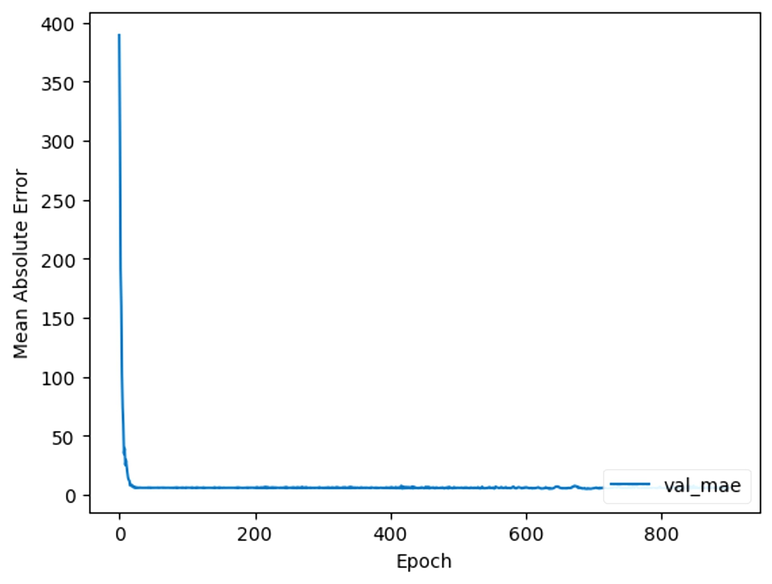
With manual tuning, the final model ended up having 1 layer with a filter size of 64, kernel size of 7, and strides as 1, and then a second layer with a filter size of 8, kernel size of 3, and strides of 1. This gives us a final MAE of 6.814. When graphed, this ends up looking like this (Fig 13).
When tested in accuracy compared to the actual CO2 levels, the model has an MAE of 6.814, and is very close to the actual values, reinforcing the reliability of the model.
To test the performance quality, we used a simple baseline comparison, which compares specific data points with the following one. By doing this, we get an MAE of 9.925. Compared to the baseline, our model’s MAE is considerably lower, reassuring the quality of this machine learning model.
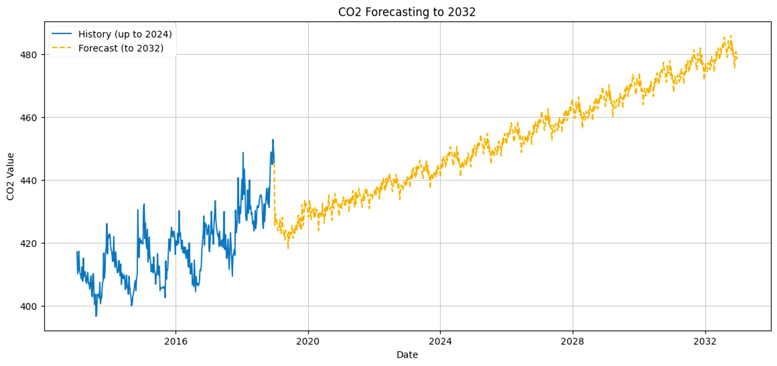
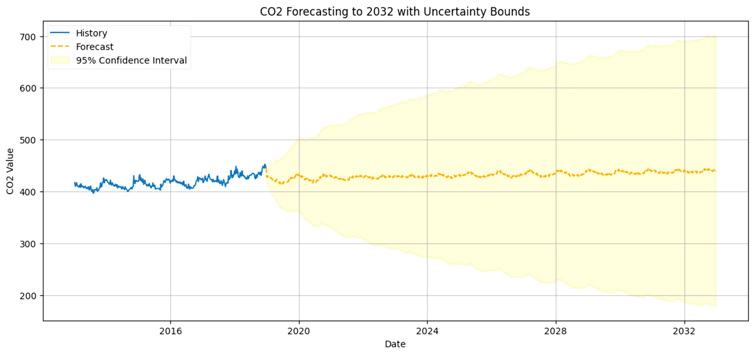
We can predict CO2 levels in the future starting from 2018 based on the previous data and visualize it with this graph. While the graph shows that in 2030, the amount of CO2 in Cupertino will rise up to around 450 to 475ppm (parts per million), representing a 95% confidence interval, this is only if historical trends continue and no major policy or technological changes occur. Due to extrapolation beyond training data, prediction uncertainty is high and CO2 levels may range from 425 to 500ppm instead. Regardless, it is clear that, at this rate, CO2 pollution will only continue rising, confirming our original prediction.
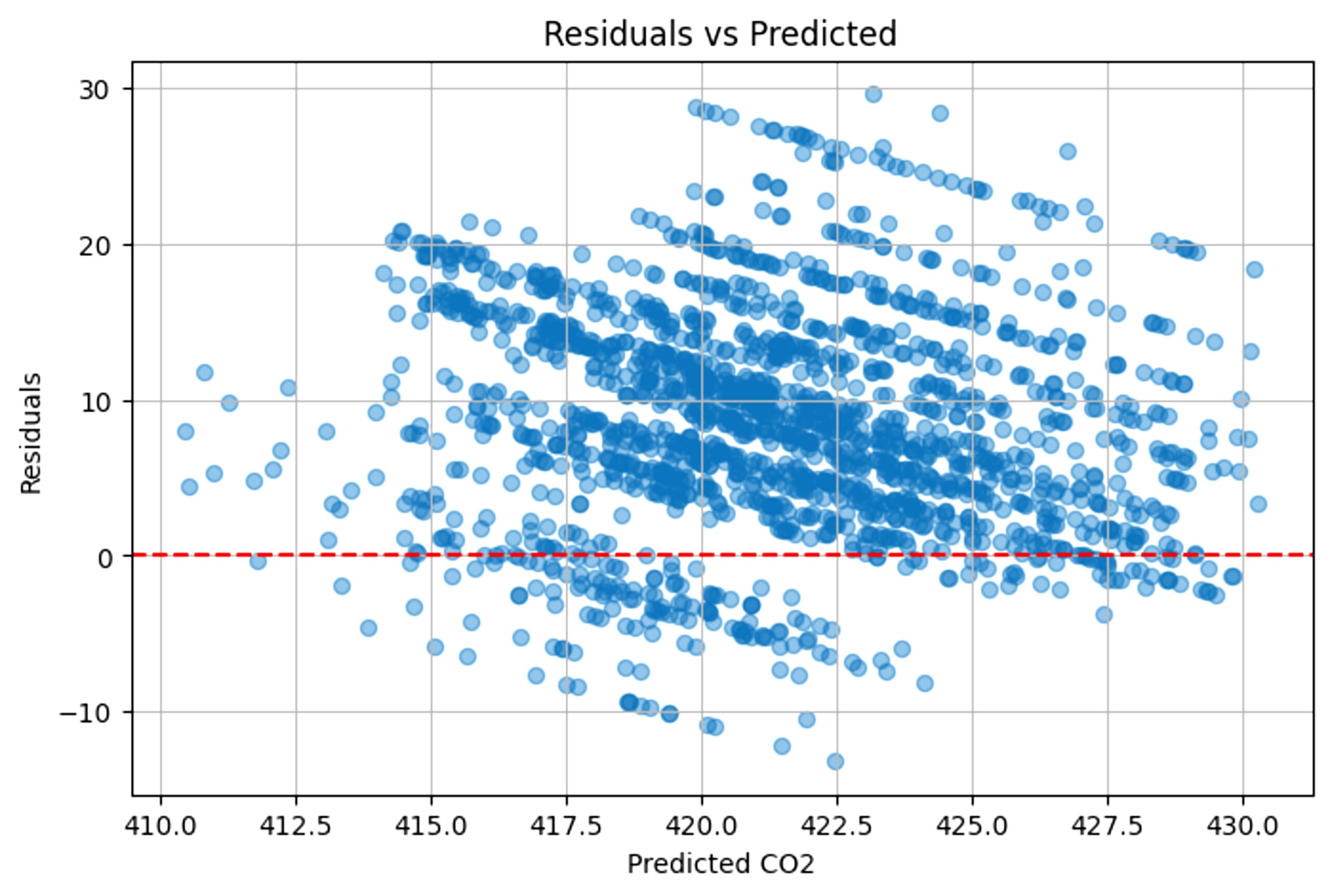
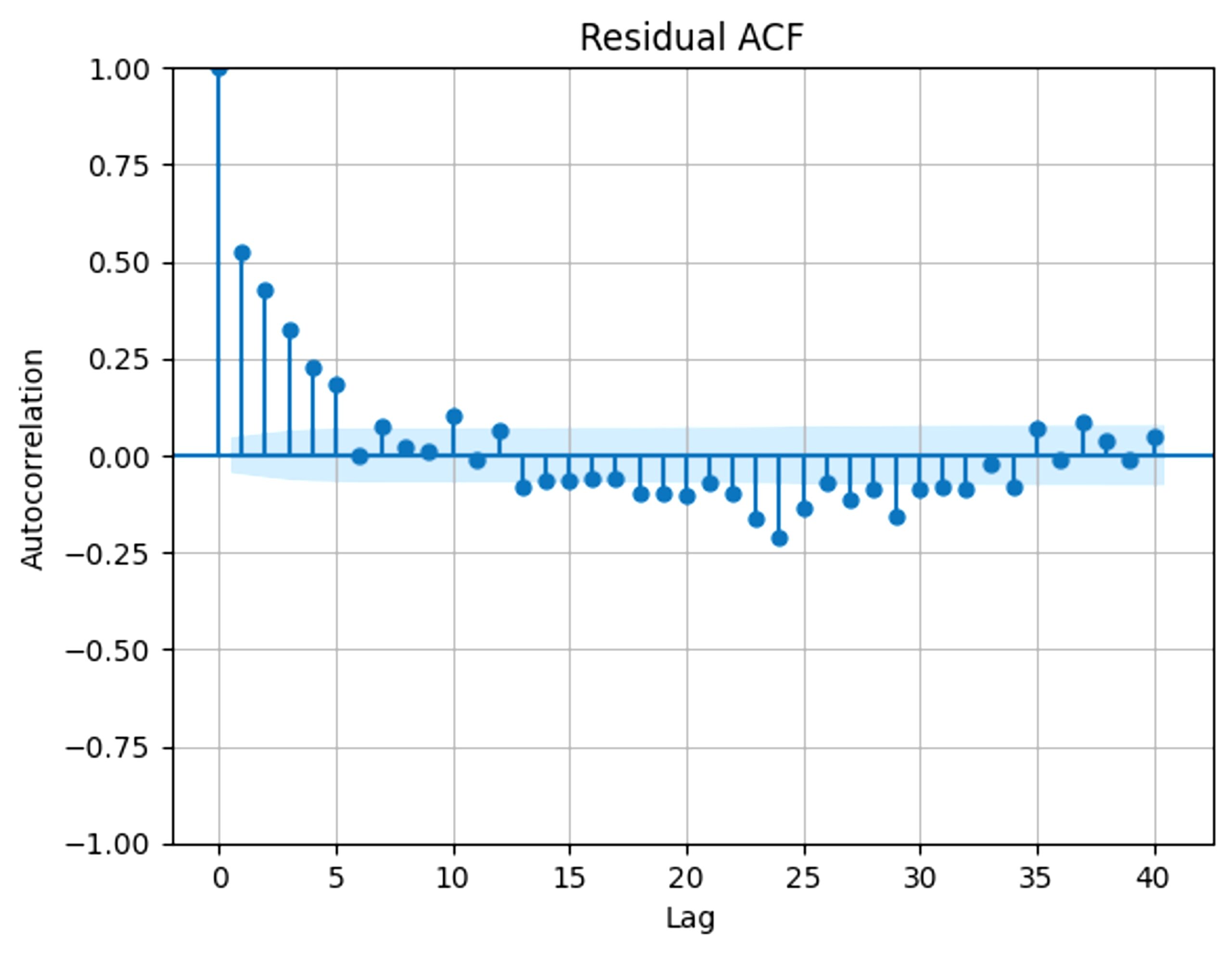
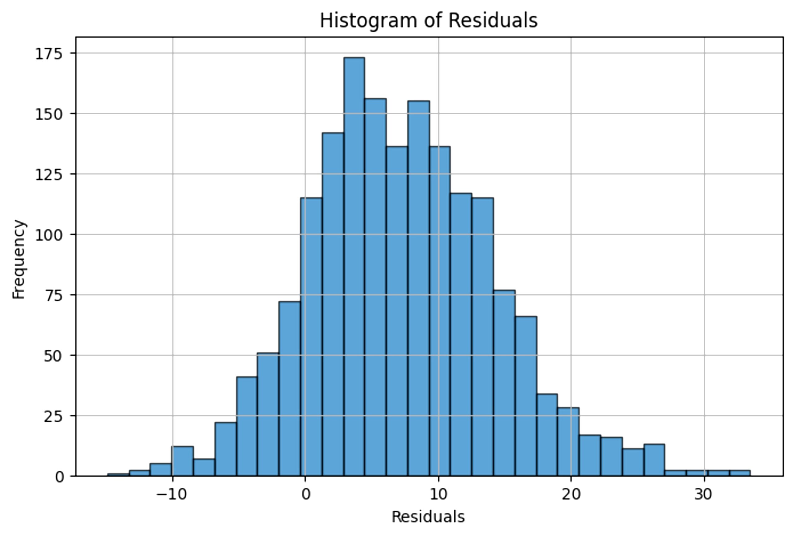
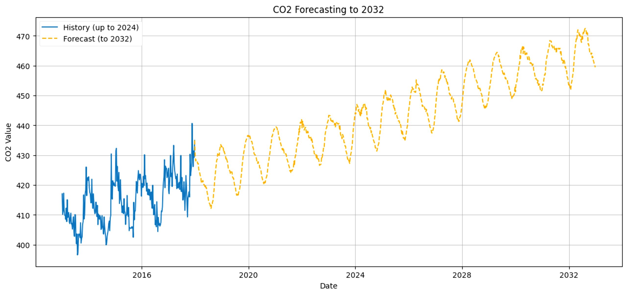
To ensure minimal bias and understand the trend of error, residuals were analyzed. A residual is the difference between the prediction and the actual data. The following graphs show the residual plots, the residual ACF, and residual histogram. Fig 17 shows the residuals plot, which reveals any bias by distributing errors. Fig 18 shows the residual ACF, which reveals auto-correlation. Fig 19 shows the residual histogram, which reveals the distribution of errors, which is a normal curve.
To analyze the robustness of the machine learning model, we also analyzed the sensitivity, by changing hyperparameter numbers and seeing how it would affect the predictions. With our original model, the MAE is 6.814. The original hyperparameters are: window size of 90, 64 filters in the first layer and 8 filters in the second, a kernel size of 7 in the first layer and 3 in the second, and 900 epochs.
If we change the window size to 30, the MAE changes to 8.084. If we change it to 60, we get 9.042878. With 120 and 150, we get 12.084 and 8.707188, respectively. From this data, it seems that the window size doesn’t necessarily decrease or increase the MAE, rather make it more inconsistent. If we change the number of filters in the first layer to 128, the MAE becomes 8.203542. If we change it to 32, we get 8.57534.
For the second layer, if we change the filters to 16, we get 9.506059. If we change it to 4, we get 7.970417. The change in filters affecting the MAE reveals overfitting and underfitting of the machine learning model. If we change the first layer’s kernel size to 9, we get a MAE of 9.134297. If we change it to 5, we get 8.795146. If we change the second layer’s kernel size to 5, we get 7.5376472. If we change it to 1, we get 8.095665. From this data, it is clear that the first layer has a greater impact on the error. For the number of epochs, we will be testing 300, 600, 1200, and 1500. For 300, we got 9.202694. For 600, we got 8.1986885. For 1200, we got 7.996142, and for 1500, we got 8.55662.
From our sensitivity analysis, it’s clear that all variables had considerable impacts on the resulting MAE, especially the window size. It is also important to note that the machine learning model is only somewhat robust.
Another way we can test the reliability of this model is by testing multiple cities rather than just one: Cupertino. The cities we tested were Los Angeles; Bakersfield, notorious for having California’s worst air quality; and Riverside.
Riverside’s predictions are not accurate and had much higher
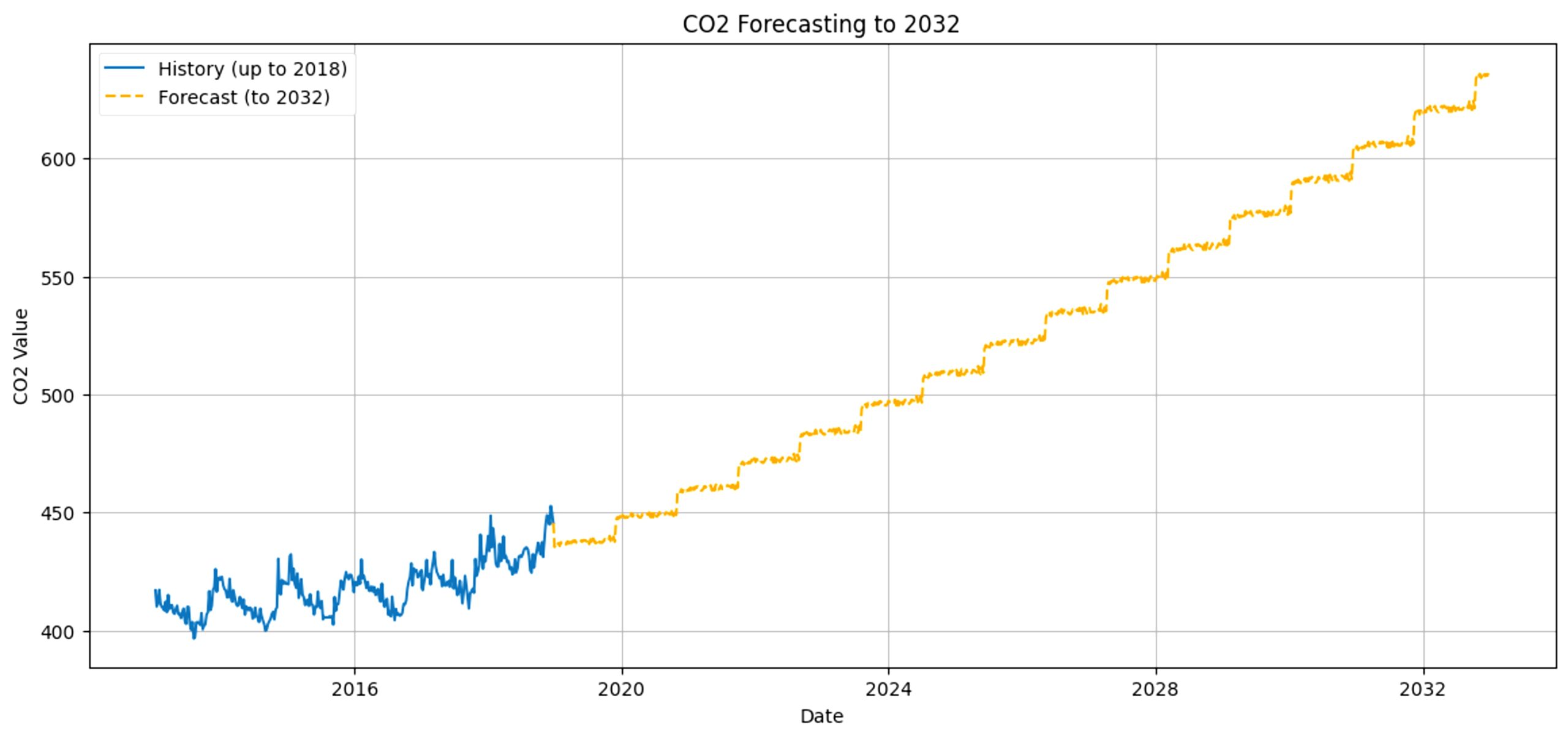
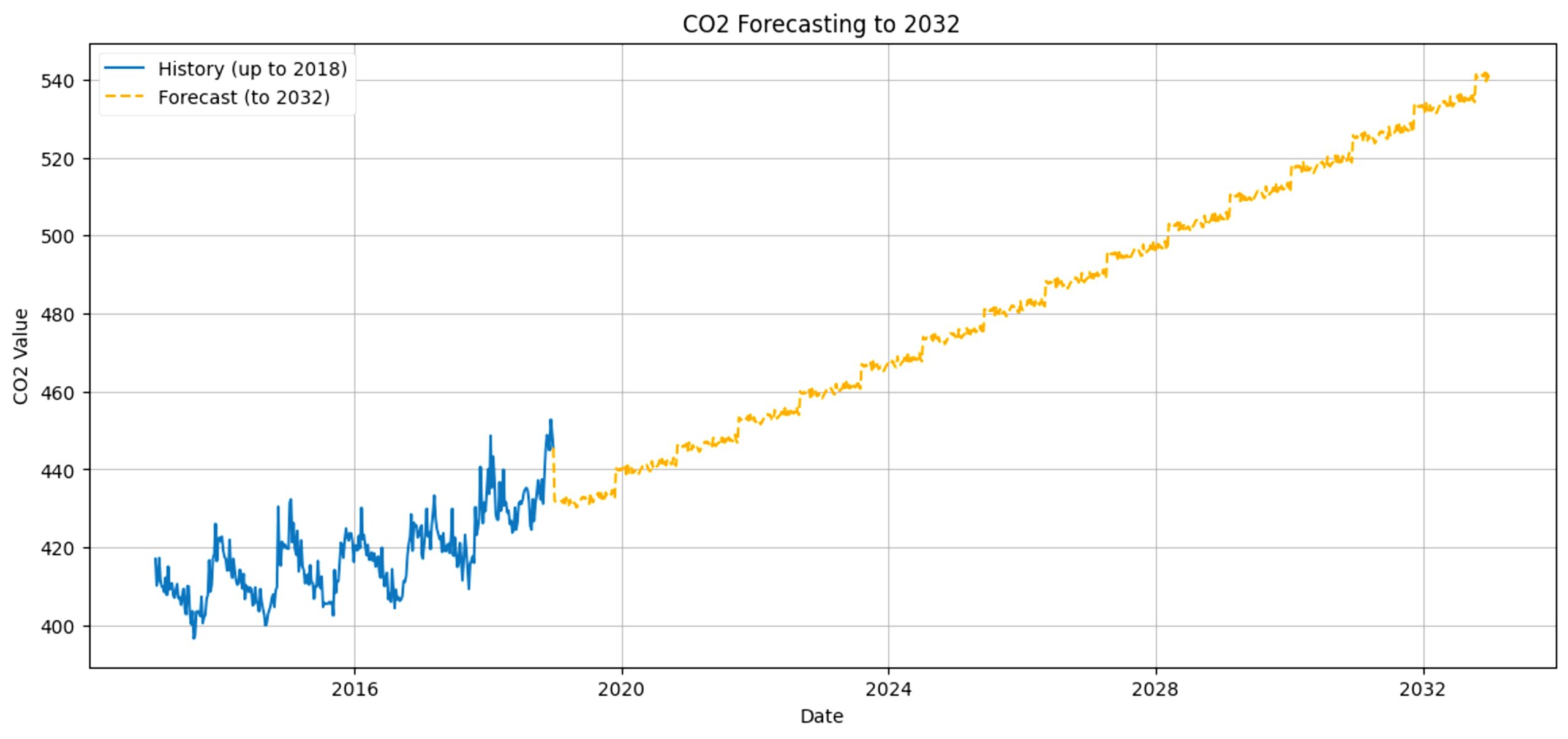
For Los Angeles, the MAE comes out as 7.8986 and the prediction looks like this (Fig 20). Bakersfield’s MAE is 5.5147, with this prediction (Fig 21) and Riverside’s MAE is 21.6104, with this forecast (Fig 22).
When looking at the different predictions, it is clear that Riverside’s predictions are not accurate and had much higher MAE. When looking into this, our research team realized that it was because the model was overfitting.
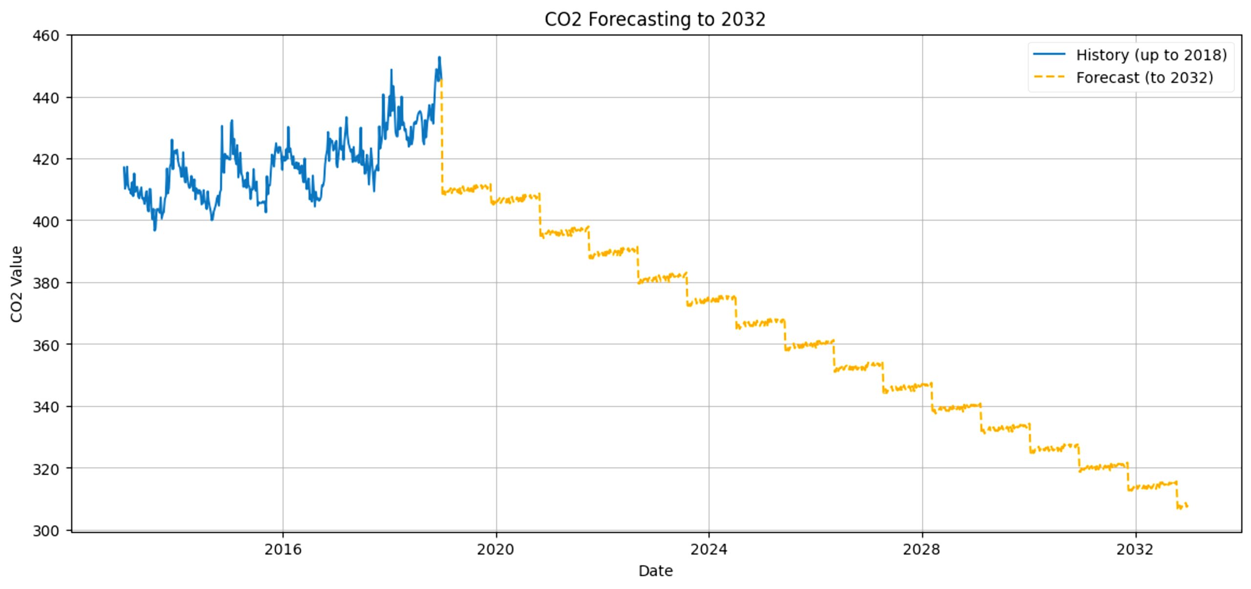
This is due to the varying amount of data points per city. For example, Los Angeles and Bakersfield have some of the highest number of data points in the dataset, with 125827 and 127208 datapoints, respectively. On the other hand, Riverside has far less datapoints, with just 3937. This makes it a lot easier for the model to start overfitting. Therefore, the ability of the model depends on the amount of data points. So, to prevent overfitting, we made the model simpler by removing the second layer. This lowered the MAE to 10.6721.
LSTM
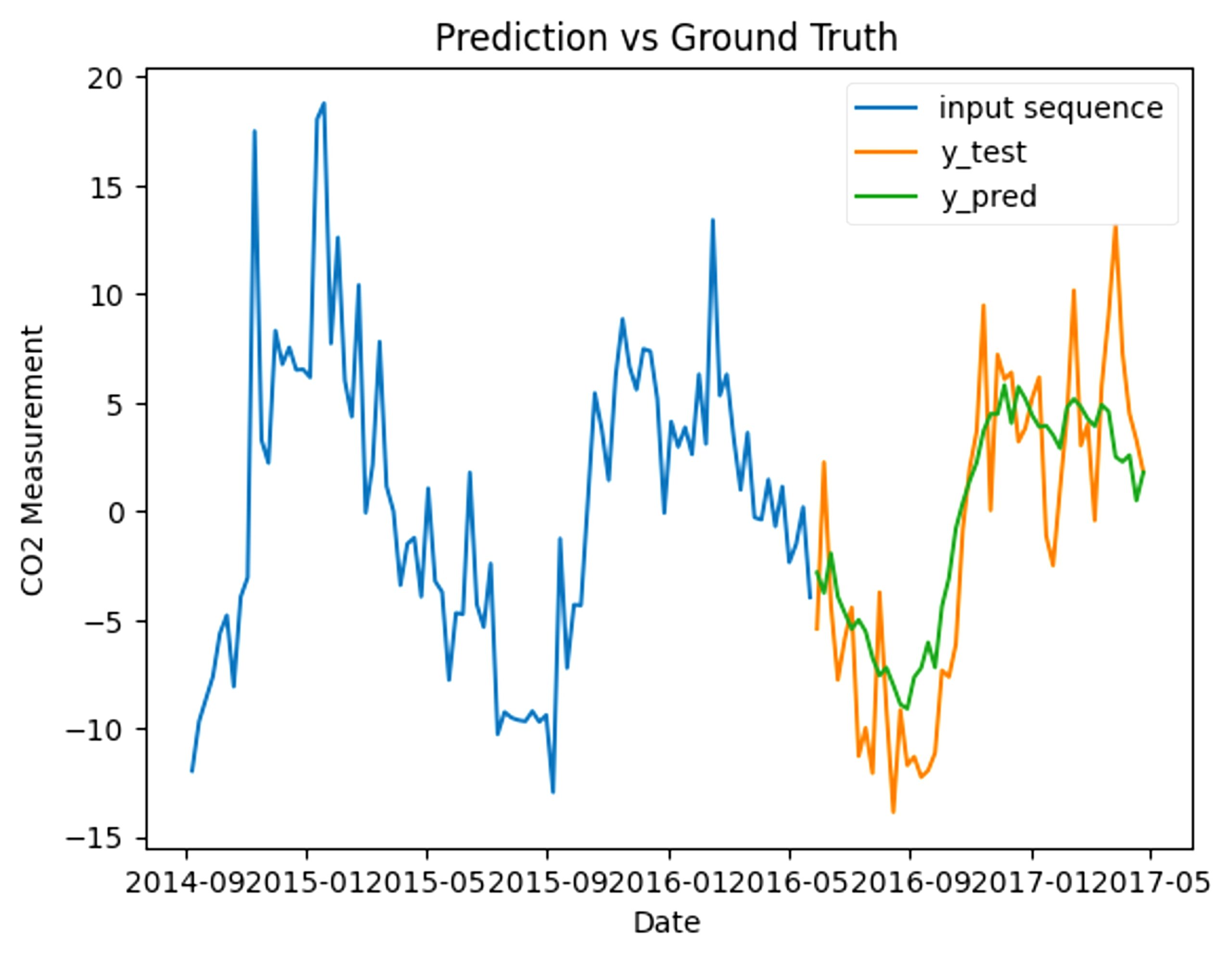
With manual tuning, the final model ended up having 2 layers with filter sizes of 64 and 32. This gives us a final MAE of 0.1141. When graphed, this ends up looking like this (Fig 24):
When tested in accuracy compared to the actual CO2 levels, the model has an MAE of 4.2681, and is very close to the actual values, reinforcing the reliability of the model.
To test the performance quality, we used a simple baseline comparison, which compares specific data points with the following one. By doing this, we get an MAE of 0.249. Compared to the baseline, our model’s MAE of 0.114 is significantly lower, reassuring the quality of this machine learning model.
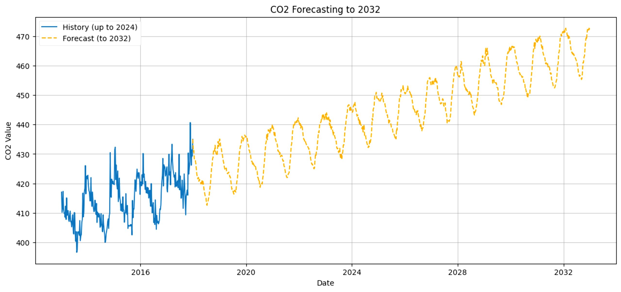
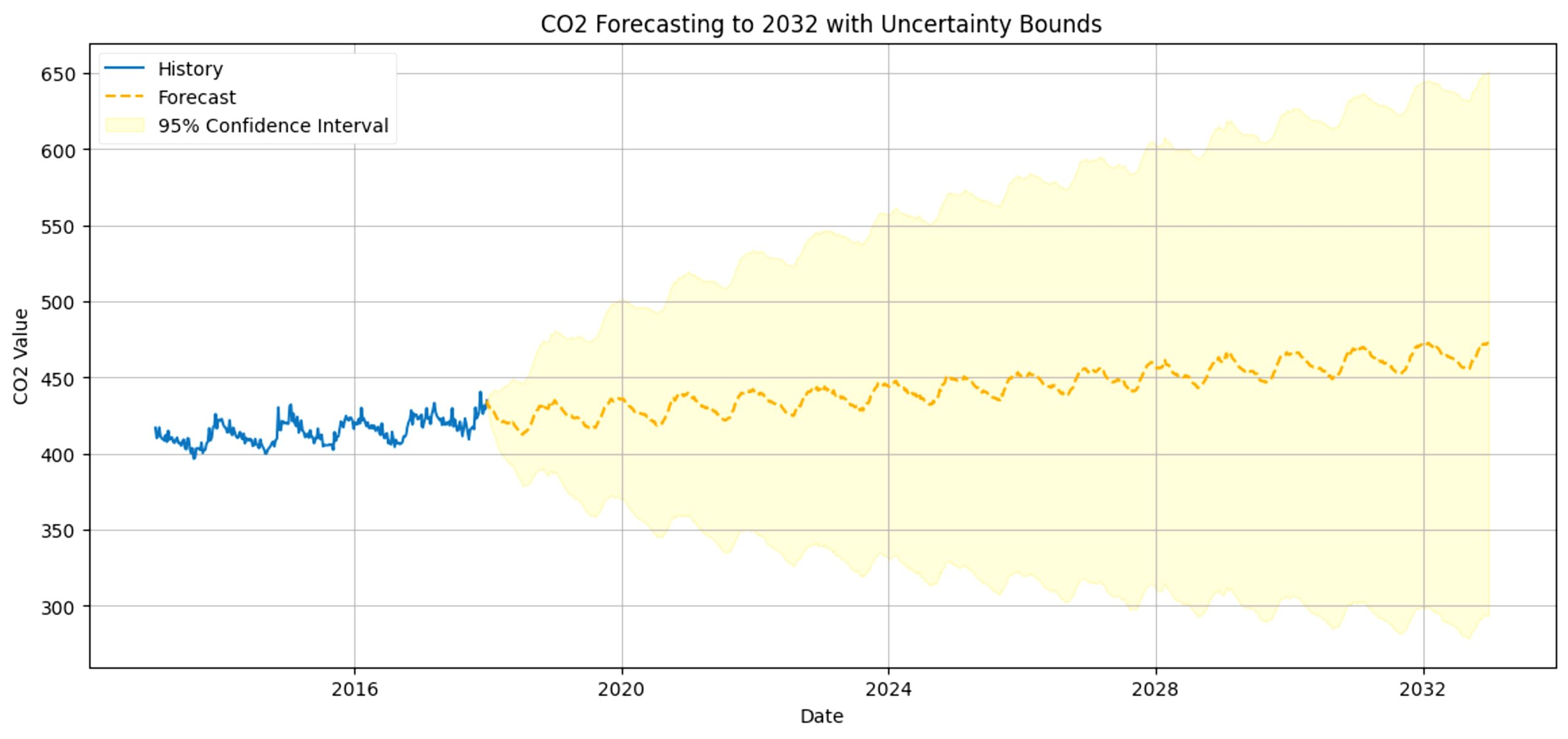
We can predict CO2 levels in the future starting from 2018 based on the previous data and visualize it with this graph. While the graph shows that in 2030, the amount of CO2 in Cupertino will rise up to around 445 to 470ppm, representing a 95% confidence interval, this is only if historical trends continue and no major policy or technological changes occur. Due to extrapolation beyond training data, prediction uncertainty is high and CO2 levels may range from 420 to 495ppm instead. It is clear that, at this rate, CO2 pollution will only continue rising, confirming our original prediction.
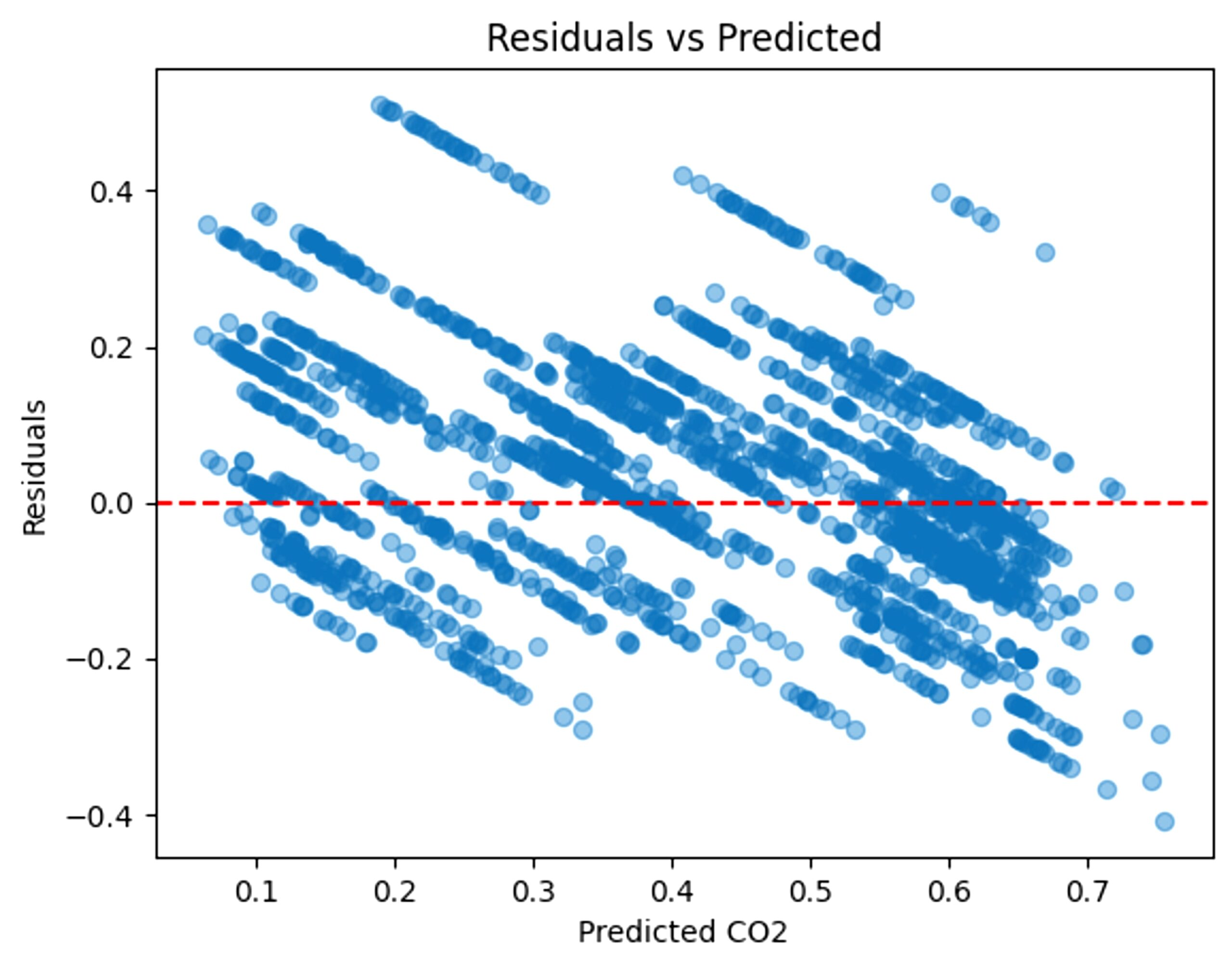
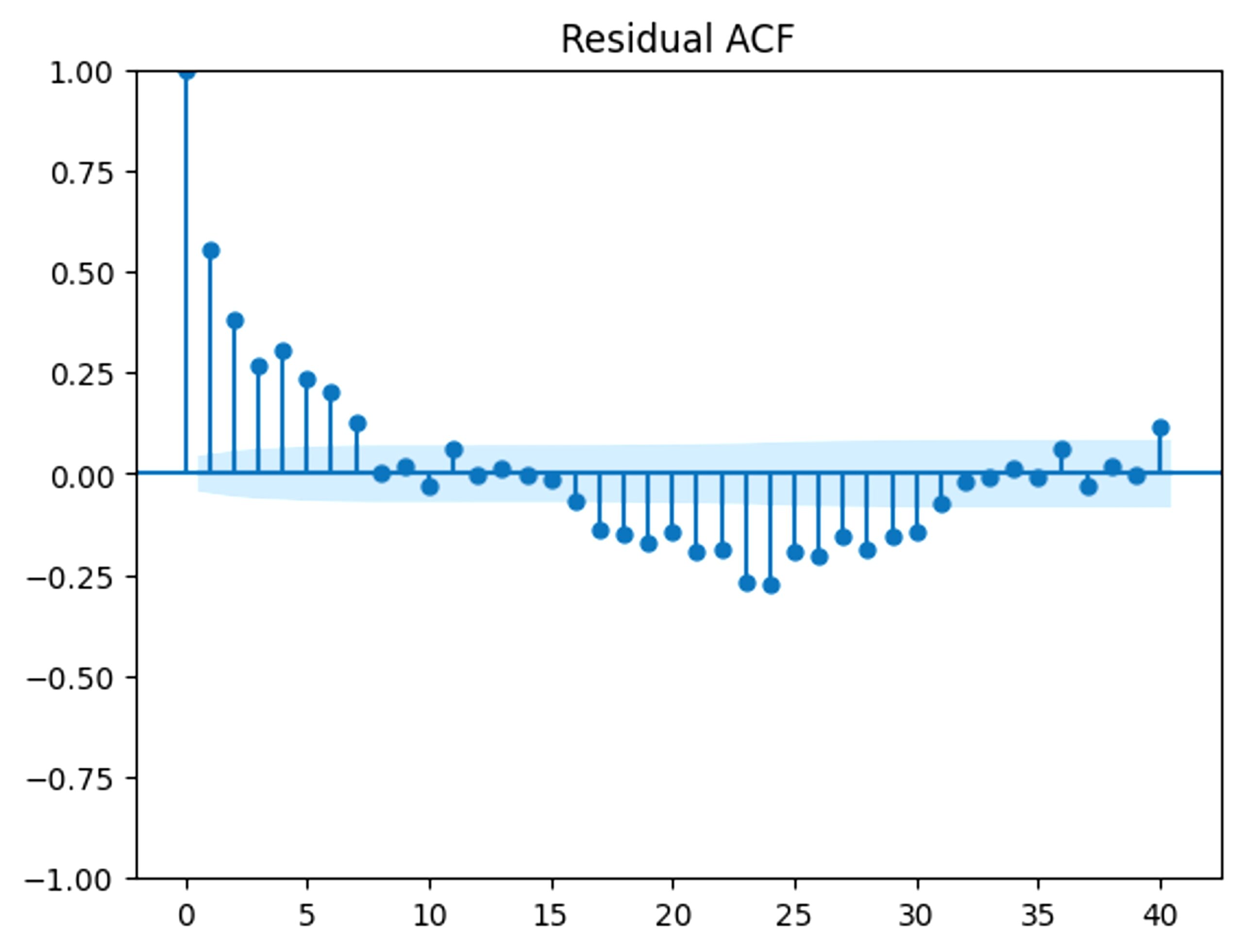
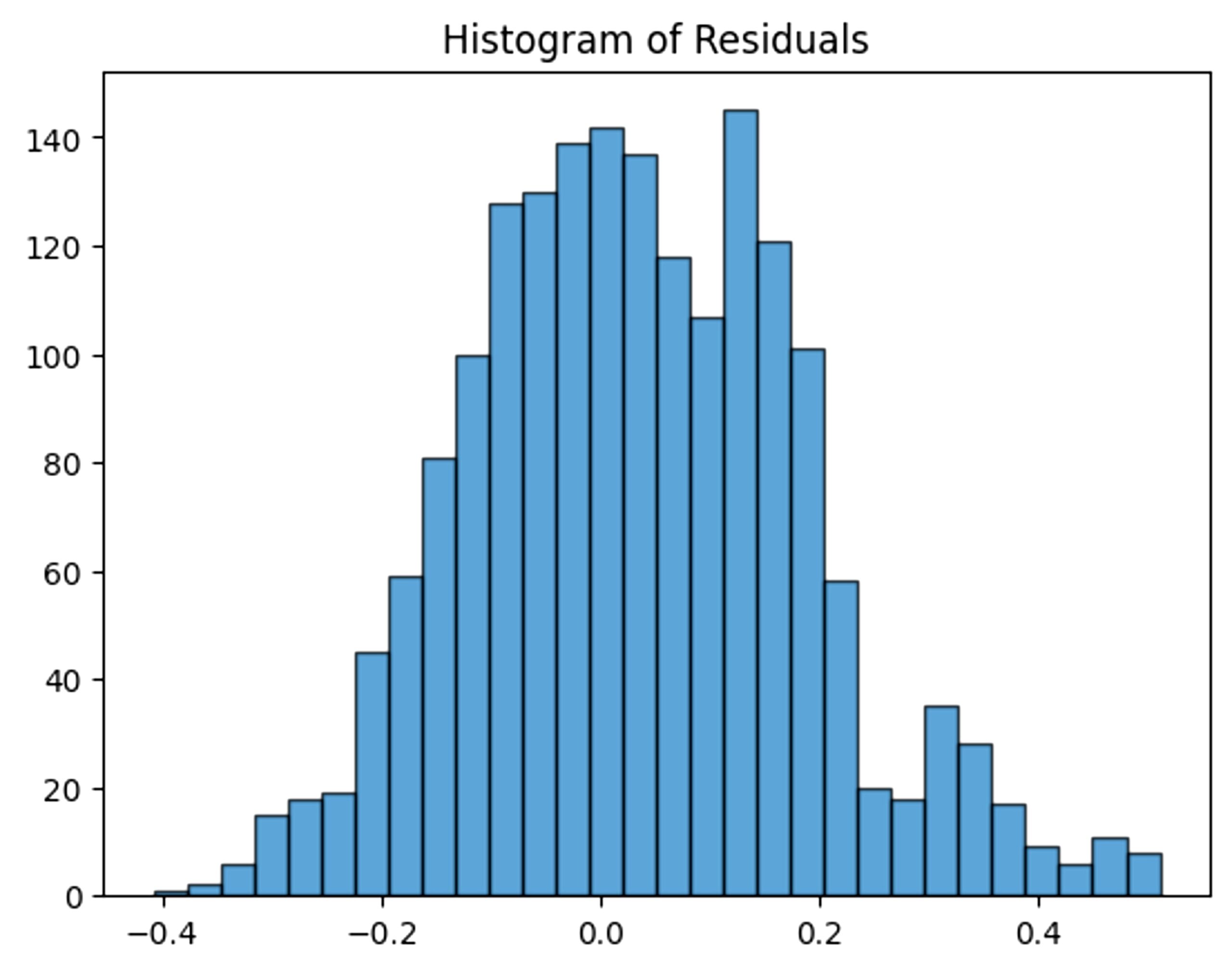
To ensure minimal bias and understand the trend of error, residuals were analyzed. The following graphs show the residual plots, the residual ACF, and residual histogram.
To analyze the robustness of the machine learning model, we also analyzed the sensitivity. With our original model, the MAE is 0.1307. The original hyperparameters are: window size of 90, 128 filters in the first layer and 64 filters in the second, and 200 epochs.
If we change the window size to 30, the MAE changes to 0.1468. If we change it to 60, we get 0.1316. With 120 and 150, we get 0.1319 and 0.1467, respectively. From this data, window sizes near 90 are very close and consistent in MAE. However, the further from 90, the less close the MAE is. If we change the number of filters in the first layer to 128, the MAE becomes 0.127. If we change it to 32, we get 0.1398.
For the second layer, if we change the filters to 64, we get 0.1330. If we change it to 16, we get 0.1325. The change in filters remains quite consistent and stays in the same range, reaffirming robustness in this model.
For the number of epochs, we will be testing 100, 150, 250, and 300. With 100 epochs, the MAE is 0.135. With 150 epochs, it is 0.130, and with 250 epochs, it is 0.126. With 300 epochs, 0.1323. This pattern of MAE shows a lowering and rising within MAE based on the number of epochs, and also shows the robustness of this model.
From our sensitivity analysis, it’s clear that this model was quite robust, with window size having the greatest impact on the results.
We also tested the reliability of this model by testing multiple cities besides Cupertino, including Los Angeles; Bakersfield, and Riverside.
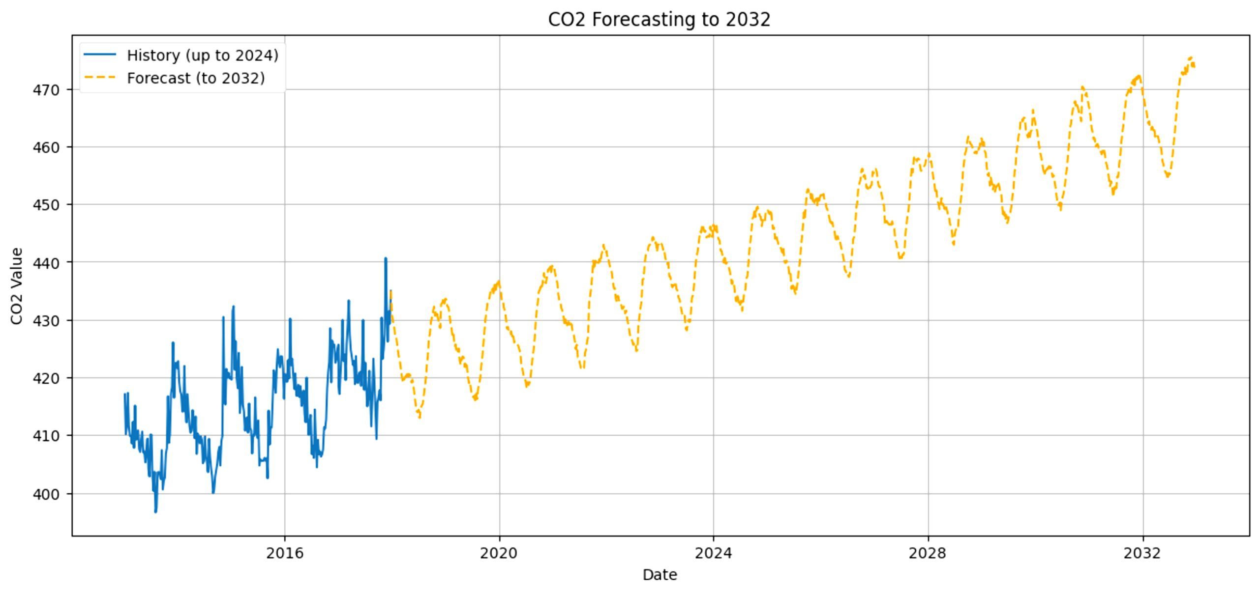
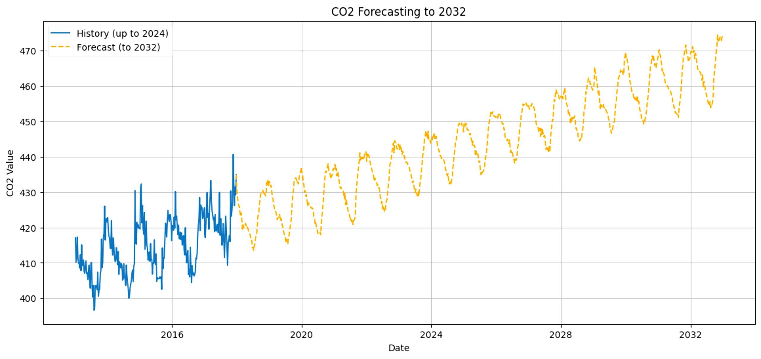
For Los Angeles, the MAE comes out as 0.1208 and the prediction looks like this (Fig 31). Bakersfield’s MAE is 0.124, with this prediction (Fig 32) and Riverside’s MAE is 0.123, with this forecast (Fig 33).
Unlike CNN, this model maintains consistent predictions based on the city despite data differences. This reassures the reliability of the LSTM.
GRU
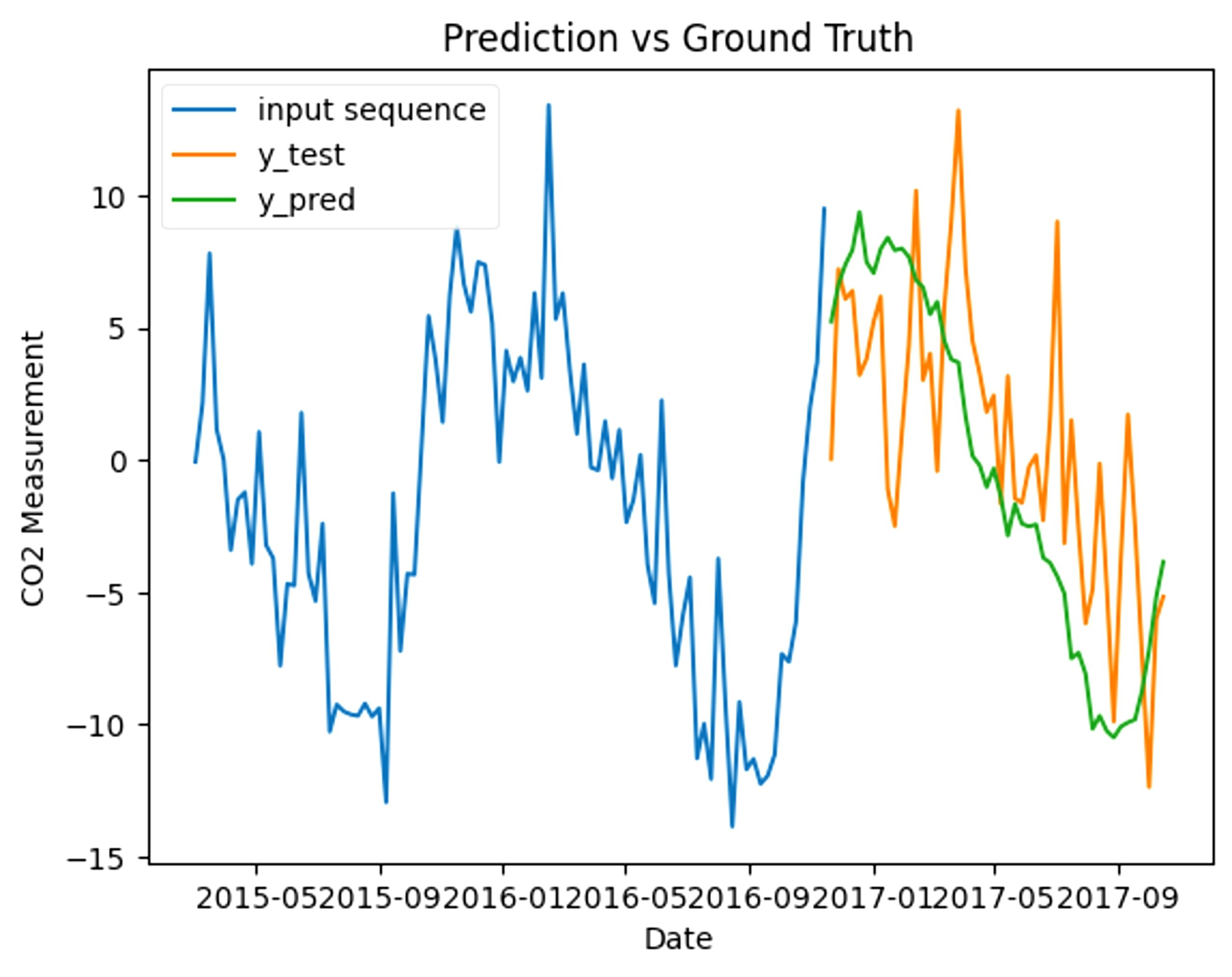
With manual tuning, the final model ended up having 2 layers with filter sizes of 128 and 64. This gives us a final MAE of 0.127. When graphed, this ends up looking like this (Fig 31).
When tested in accuracy compared to the actual CO2 levels, the model has an MAE of 4.141, and looks like this (Fig 35):
To test the performance quality, we used a simple baseline comparison, which compares specific data points with the following one. By doing this, we get an MAE of 0.181. Compared to the baseline, our model’s MAE of 0.127 is significantly lower, reassuring the quality of this machine learning model.
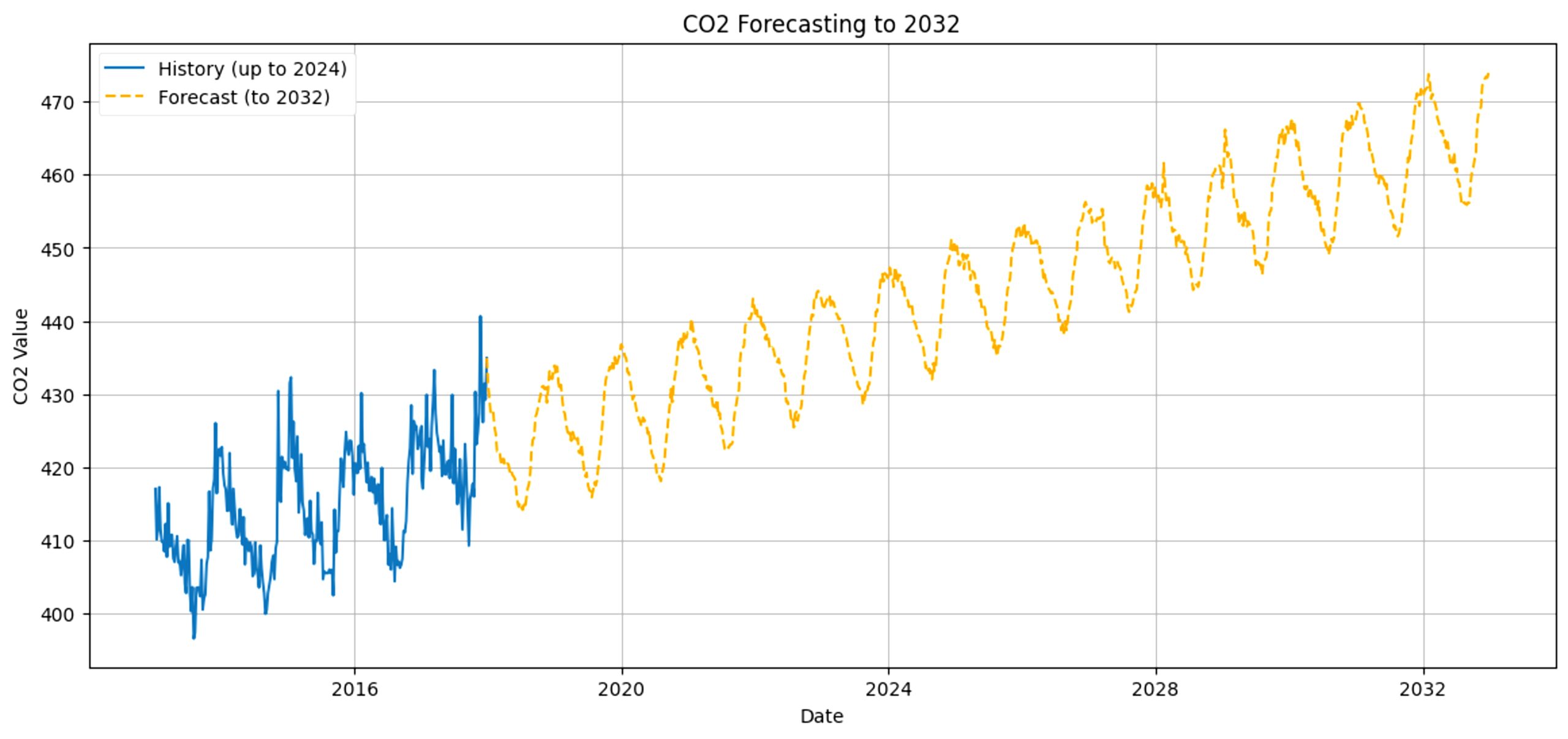
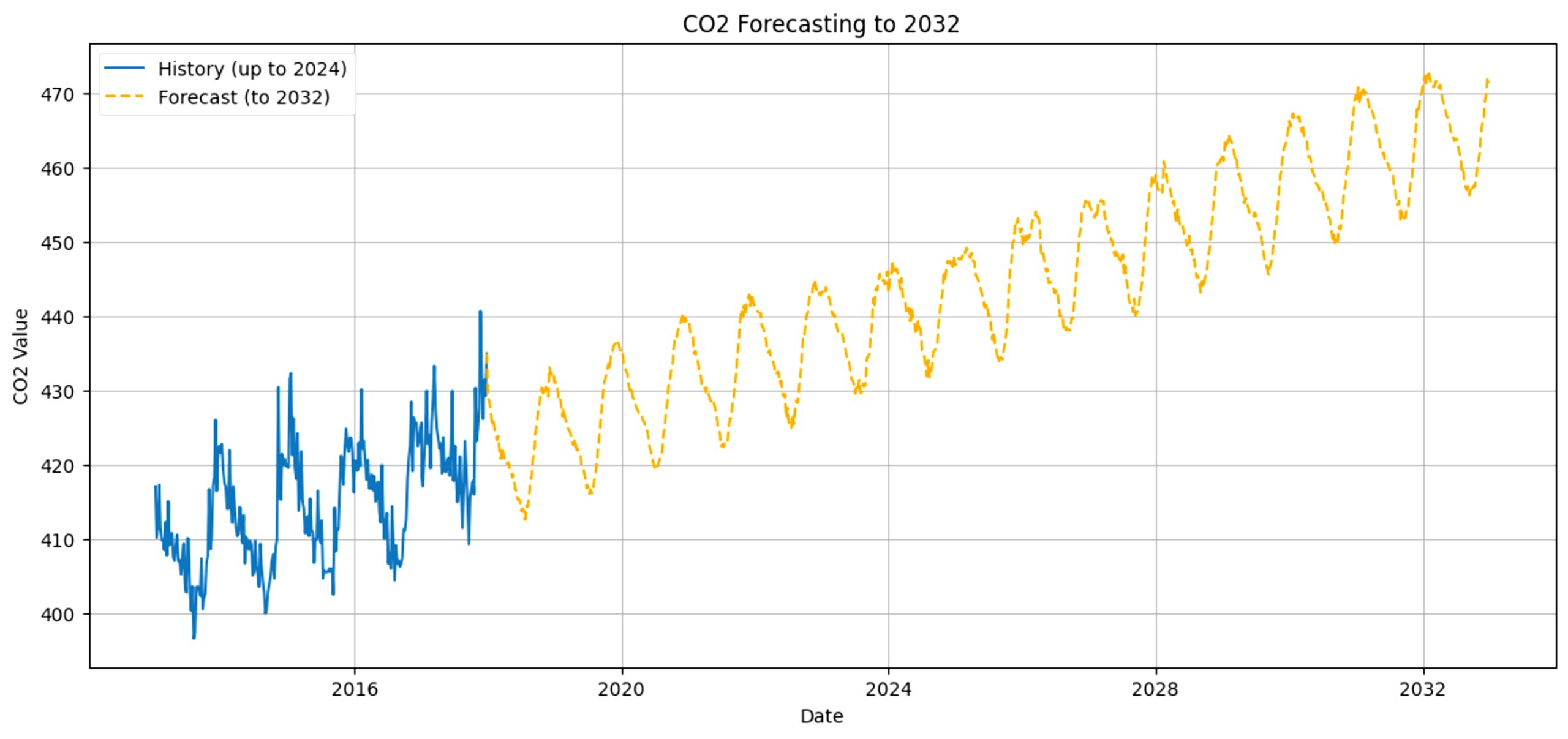
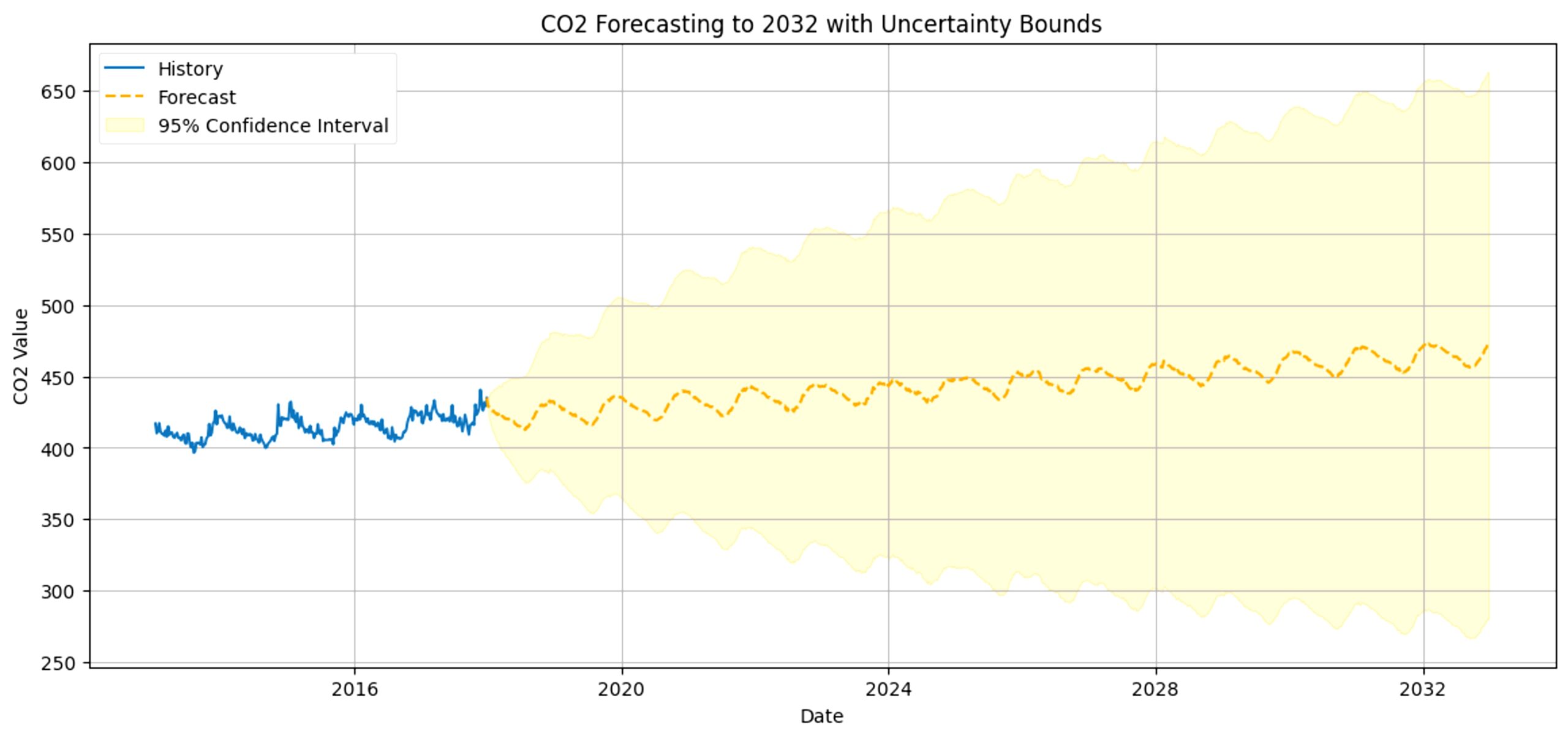
We can predict CO2 levels in the future starting from 2018 and visualize it with this graph. While the graph shows that in 2030, the amount of CO2 in Cupertino will rise up to around 445 to 470ppm, representing a 95% confidence interval, this is only if historical trends continue and no major policy or technological changes occur. Due to extrapolation beyond training data, prediction uncertainty is high and CO2 levels may range from 420 to 495ppm instead.
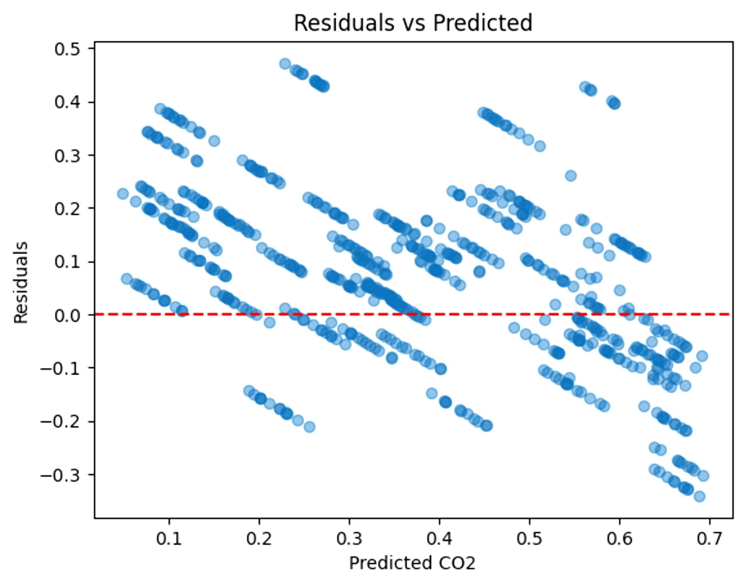
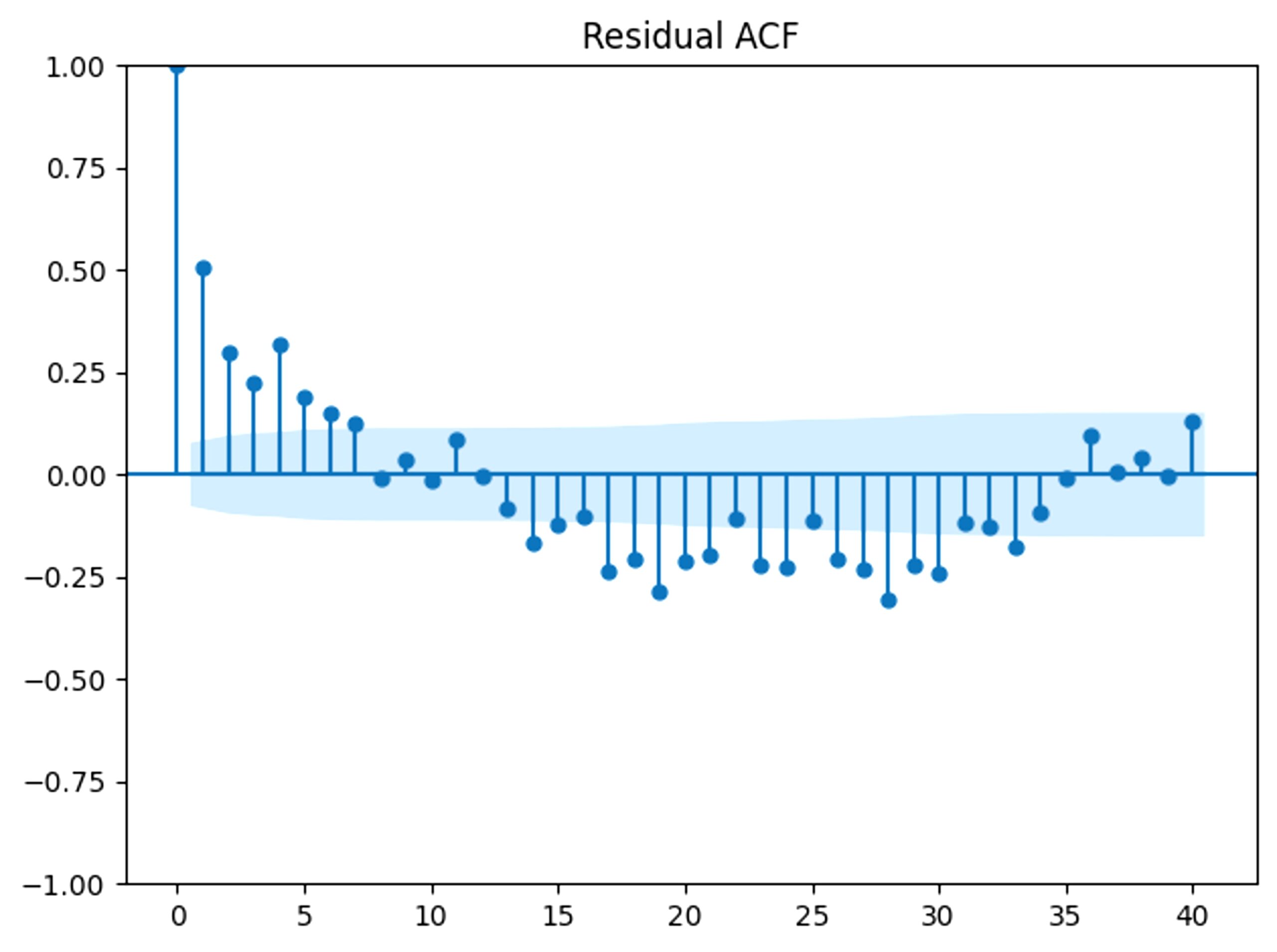
To ensure minimal bias and understand the trend of error, residuals were analyzed. The following graphs show the residual plots, the residual ACF, and residual histogram.
To analyze the robustness of the machine learning model, we analyzed the sensitivity. Our original model had a MAE of 0.127. The original hyperparameters are: window size of 90, 128 filters in the first layer and 64 filters in the second, and 100 epochs.
If we change the window size to 30, the MAE changes to 0.141. If we change it to 60, we get 0.1440. With 120 and 150, we get 0.1300 and 0.1347, respectively. Like in the LSTM, MAE’s stay in a similar range and become more inconsistent as the window size strays further from 90.
If we change the number of filters in the first layer to 256, the MAE becomes 0.146. If we change it to 64, we get 0.139. For the second layer, if we change the filters to 128, we get 0.144. If we change it to 32, we get 0.131. This reveals that when more filters are added, the model starts overfitting and is increasingly more inconsistent with the MAE. On the other hand, with fewer filters, the model only performs slightly worse.
For the number of epochs, we will be testing 50, 75, 125, and 150. With 50 epochs, the MAE is 0.143. With 100 epochs, it is 0.137, and with 125 epochs, it is 0.127. With 150 epochs, 0.140. This pattern of MAE shows a lowering and rising within MAE based on the number of epochs, and also shows the robustness of this model.
From our sensitivity analysis, it’s clear that this model was quite robust, with the number of filters having the greatest impact on the results.
We also tested the reliability of this model by testing Los Angeles, Bakersfield, and Riverside.
For Los Angeles, the MAE comes out as 0.127 and the prediction looks like this (Fig 41). Bakersfield’s MAE is 0.1297, with this prediction (Fig 42) and Riverside’s MAE is 0.129, with this forecast (Fig 43).
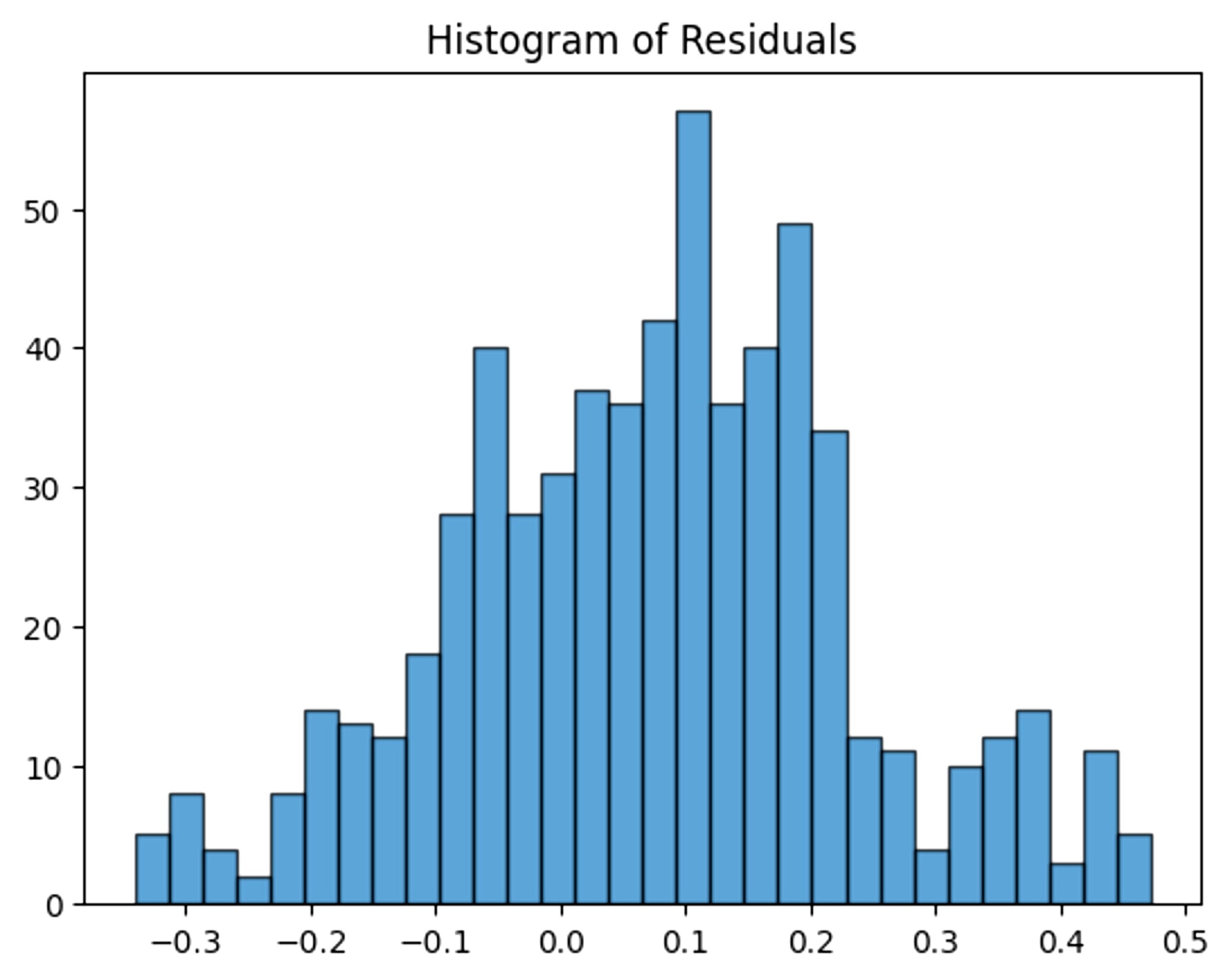
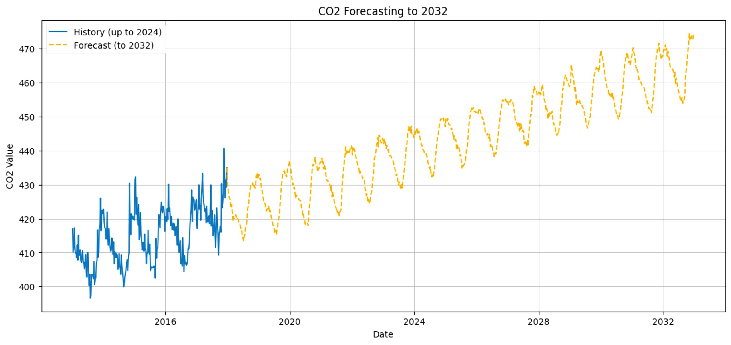
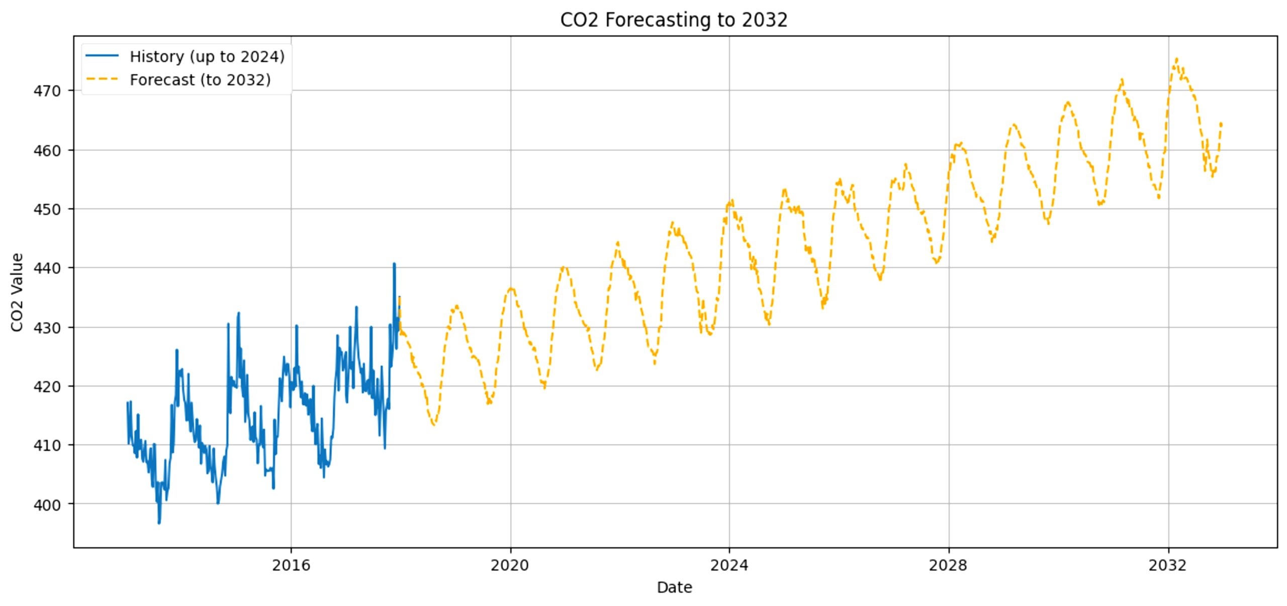
Unlike the CNN but like the LSTM, this model maintains consistent predictions based on the city despite data differences. This reassures the reliability of this model.
Additionally, we can also see how our model compares to the previous 3 research papers mentioned. All 3 research papers use different ways to measure their model’s accuracy.
A Machine Learning Approach to Predict Air Quality in California’s results show a 94.1% accuracy rate when predicting unseen data, while Short‑term Air Quality Prediction Based on EMD‑transformer‑BiLSTM used RMSE (root mean square error), MAE, and MAPE (mean absolute percentage error) to assess the reliability of multiple different models. Lastly, Image-based Air Quality Prediction using Convolutional Neural Networks and Machine Learning used Cronbach’s α to test reliability and consistently got values ranging from 0.8 to 0.9. Because of the varying forms of measurement, the results cannot be compared.
Discussion
From the results, it’s clear that air pollution and CO2 levels are on the rise, and that, without mitigation, will only get worse. While growth is gradual, increasing about 5-10ppm per year on average, it highlights the growing concern of air pollution. On the lower end, 425ppm is considered healthy and typical for outdoor air. On the higher end, while not significantly harmful, 525ppm is considered moderate and similar to CO2 levels in an urban city. While this range is typically harmless to the average person, this model is only focusing on Cupertino17. It is important to note that air pollution is affecting all places, and at different rates. Some cities today already have severe air pollution, such as Delhi, India. In Delhi, average CO2 ppm outdoors is around 550ppm, but indoors, due to poor ventilation, can reach up to 1600ppm18. This level of CO2 concentration can cause dizziness and decreased cognitive performance19. Since CO2 levels are increasing, this would lead to even more severe consequences than before, promoting respiratory, cardiovascular, and other diseases without mitigation.
Rising CO2 is due to human activity and increased energy consumption, evident in the following graphs. Using the Fuel Production and Consumption(1980-2021) dataset from kaggle.com20, we can graph the yearly gas, coal, and oil consumption in the United States.
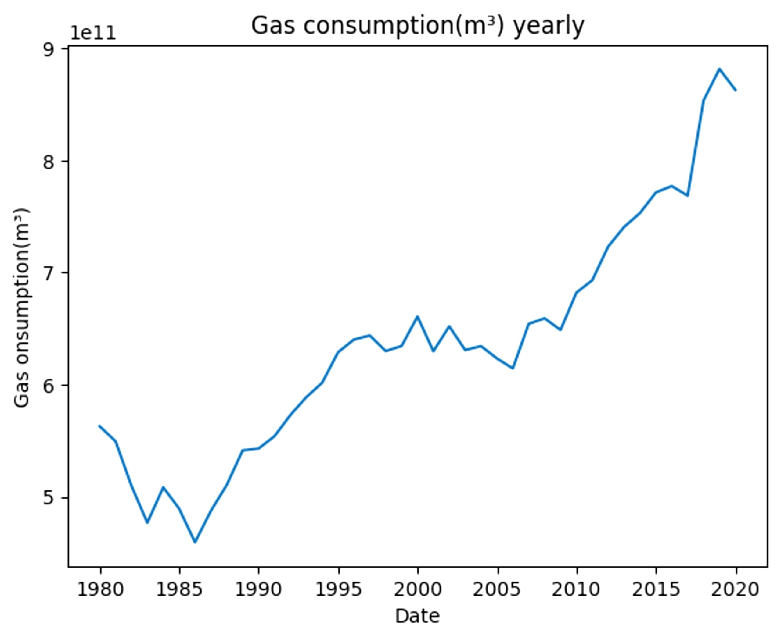
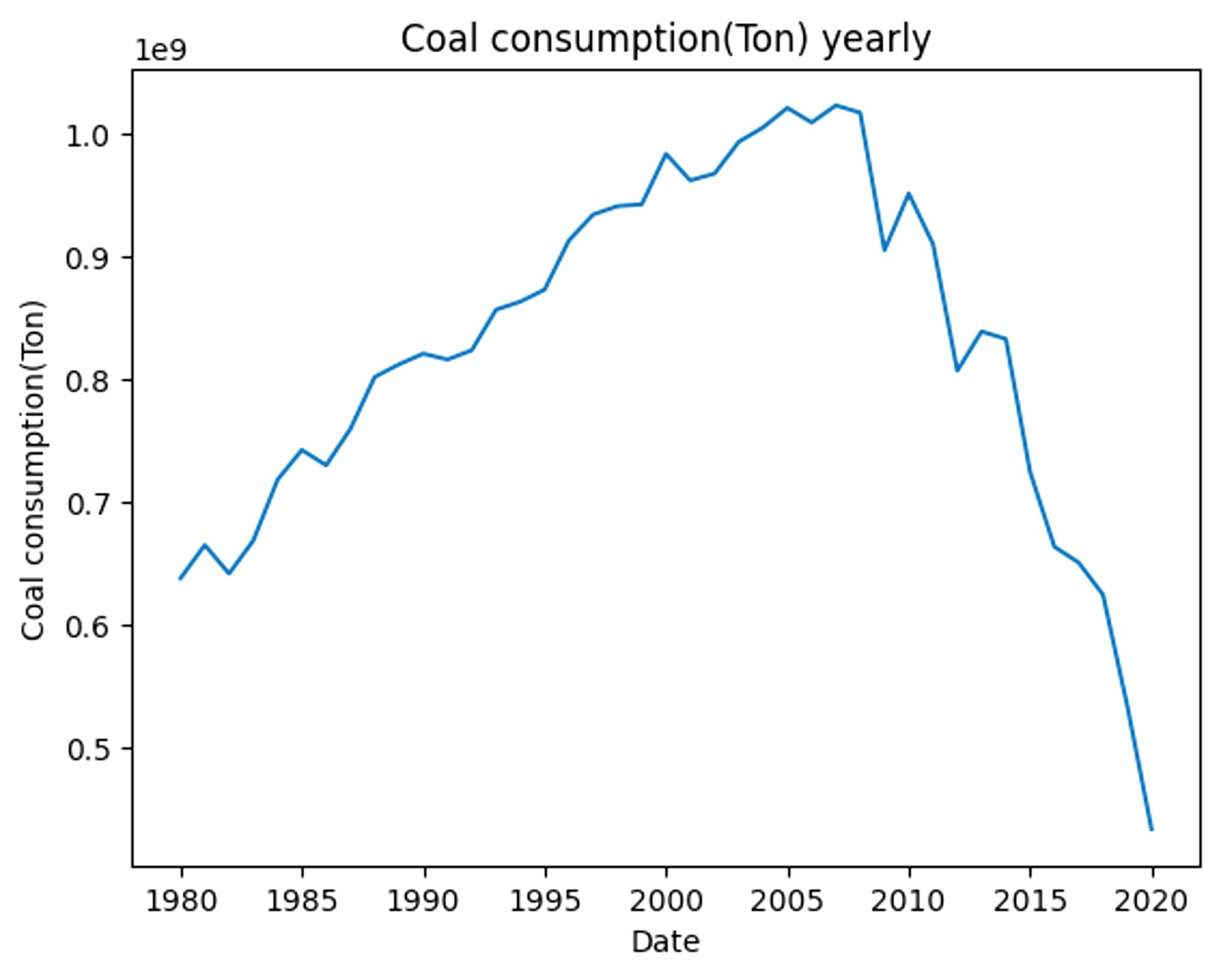
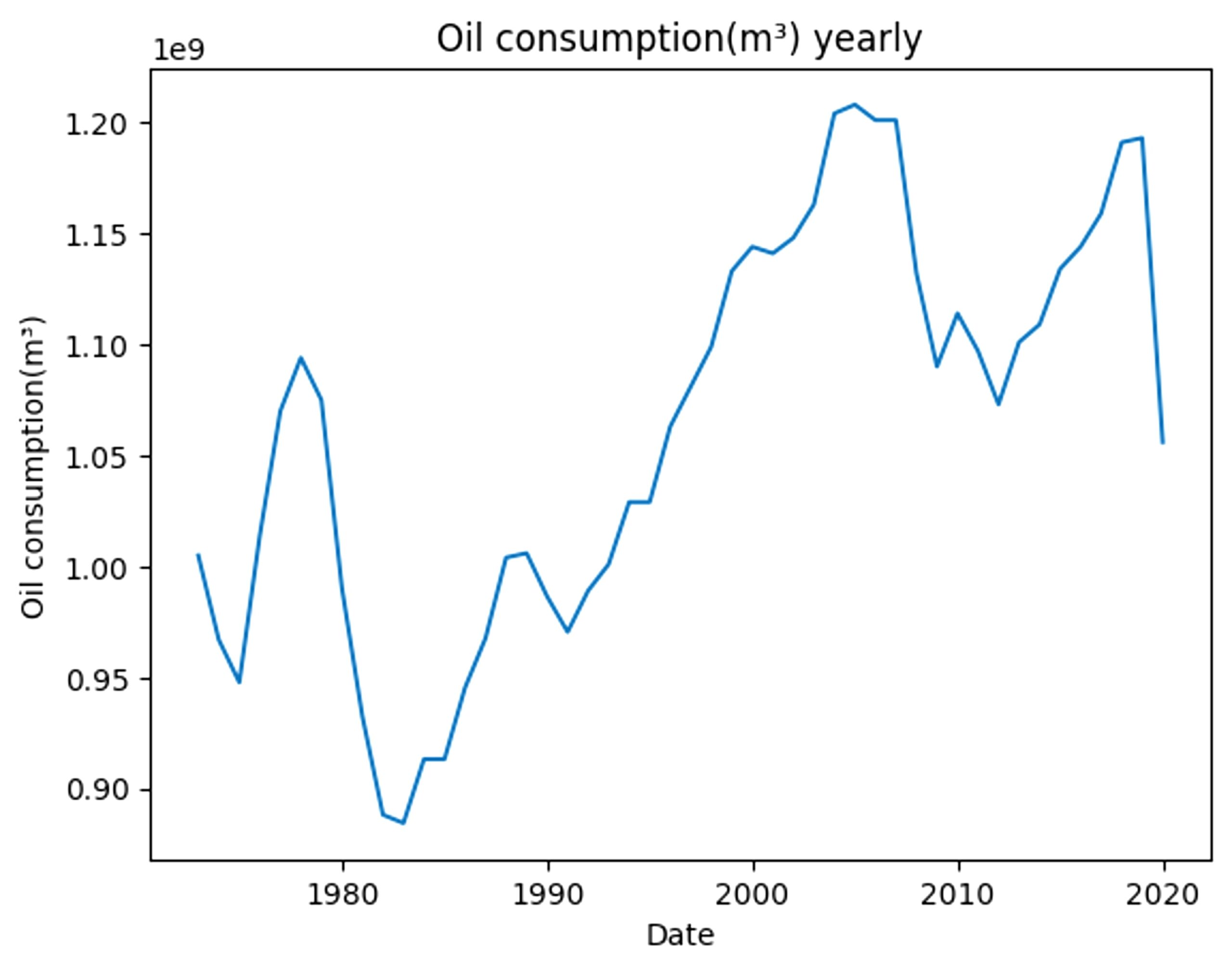
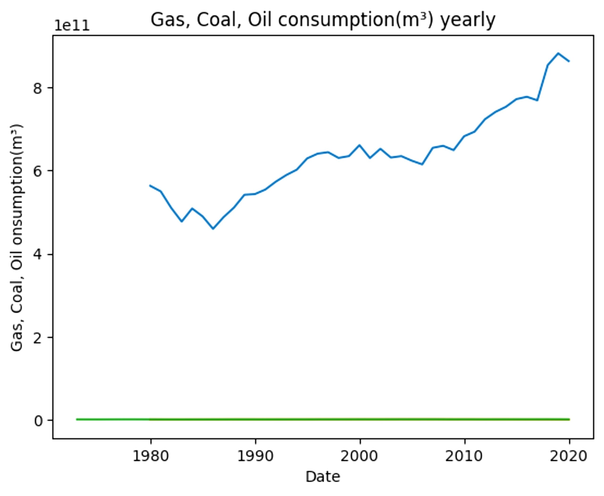
Each energy source has its own distinct growth or reduction, such as coal consumption sharply decreasing after the end of the 20th century. However, these energy sources are all scaled differently. If they are all put together, the difference in scale becomes very evident.
With the energy sources now scaled, there is clearly an overall increase in energy use between gas, coal, and oil consumption. This rise in unrenewable energy has only led to an increase in CO2.
Mitigation can be individual or community-based, such as driving less, or setting up governmental policies to combat air pollution. For example, the city of Los Angeles, California, has the goal to reach 100% clean energy by the year 2045 through the LA100 plan21. If LA100 does succeed, it can significantly change the trajectory of air quality in Los Angeles, which struggles with poor air quality and wildfires. PM2.5 concentrations are predicted to decrease 7.4% to 11.0% in disadvantaged communities and 7.3% to 11.9% in non-disadvantaged communities, both significant reductions22.
However, the feasibility of LA100 and similar policies are debated. While getting to 90% renewable energy is feasible, the last 10% will be particularly hard because of high costs and many renewable energy sources’ intermittency and dependence on weather23. Fortunately, the Los Angeles Department of Water and Power is aware of these issues and is actively working on outreach and evaluation24. This progression towards using clean energy would drastically reduce air pollution and change the predicted trend of air pollution in the future, as clean energy drastically reduces the amount of carbon molecules being emitted into the air, further reducing climate change by reducing the greenhouse effect.
Limitations
This study has several factors that limit both its scope and its accuracy. For example, it only takes data from 2013 to 2018. This is only a 6 year timeframe, and gives the model less data points to learn from. Long-term forecasts, such as forecasts up to 2030, involve more uncertainty.
Additionally, this is before COVID-19’s quarantine, which drastically changed CO2 and temperature levels. Because people had to stay indoors, human activities like driving and traveling abroad were significantly decreased, leading to lower CO2 emissions and greenhouse effect. However, while quarantine did help with CO2 rates temporarily, when it ended, CO2 rates quickly returned to what they had been previously and, in 2025, are similar—although slightly lower—than what they would have been without quarantine25.
Another limitation is that this study only focuses on California. Compared to other states, California has worse air quality. In terms of PM2.5, Califor nia has the worst air quality, having an average of 12.6 micrograms per cubic meter, compared to the United States’ 7.3.
Furthermore, the model ignores many other factors, such as other air pollutants and variables such as temperature, humidity, and season. Many mitigation efforts are planned for the future and could change the trajectory of CO2 rates26.
Conclusion
To conclude, this study aimed to take data from the previous decade to predict future CO2 levels in California, using machine learning to do so. A CNN, LSTM, and GRU were designed and adjusted for optimal accuracy in predicting future CO2 levels. The results showed that in 2030, CO2 levels will rise to around 450 to 525ppm and that CO2 levels will still continue to rise. What this means is that, without intervention, it will only become worse and cause greater catastrophes for humanity. Awareness and mitigation must happen in order to prevent further crises. For example, plans such as LA100 will help reduce air pollution and also prevent more. Actions like these will become some of the most prominent ways to prevent the trajectory of air pollution to continue at its current rate and protect people’s health.
Code available upon request.
References
- A. Daly, P. Zannetti. An introduction to air pollution – definitions, classifications, and history. The Arab School for Science and Technology. 1, 1-14 (2007). [↩]
- S. B. Sharma, S. Jain, P. Khirwadkar, S. Kulkarni. The Effects of Air Pollution on the Environment and Human Health. Indian Journal of Research in Pharmacy and Biotechnology. 1(3), 391 (2013). [↩]
- M. P. Choudhary, V. Garg, Causes, consequences and control of air pollution. ResearchGate. 1, 1 (2013). [↩]
- M. L. Fernandez-Marcos, Potentially toxic substances and associated risks in soils affected by wildfires: a review. MDPI. 10, 31 (2022). [↩]
- N. Domingo, S. Balasubramanian, J. Hill, How does farming impact air quality? Sci. J. Kids. 1, 1 (2023). [↩]
- N. Alexis, C. Barnes, I. L. Bernstein, A. Nel, D. Peden, D. Diaz-Sanchez, S. M. Tarlo, P. B. Williams, J. A. Bernstein, Health effects of air pollution. JACI. 114, 1116-1123 (2004). [↩]
- R. Russell-Jones, Air pollution in the UK: better ways to solve the problem. BMJ. 357, 2713 (2017). [↩]
- M. P. Sierra-Vargas, L. M. Teran, Air pollution: Impact and prevention. WOL. 17, 1031-1038 (2012). [↩]
- A. S. Ramírez, S. Ramondt, K. V. Bogart, R. Perez-Zuniga, Public awareness of air pollution and health threats: Challenges and opportunities for communication strategies to improve environmental health literacy. J. Health Commun. 24, 75-83 (2019). [↩]
- M. Castelli, F. M. Clemente, A. Popovič, S. Silva, L. Vanneschi, A machine learning approach to predict air quality in California. WOL. 2020, 8049504 (2020). [↩]
- J. Dong, Y. Zhang & J. Hu, Short‑term air quality prediction based on EMD‑transformer‑BiLSTM. Scientific Reports. 14, 1-17 (2024). [↩]
- M. Hardini1, M. H. R. Chakim, L. Magdalena, H. Kenta, A. S. Rafika, D. Julianingsih, Image-based Air Quality Prediction using Convolutional Neural Networks and Machine Learning. ATT. 5, 1 (2023). [↩]
- Z. Li, F. Liu, W. Yang, S. Peng, J. Zhou, A survey of convolutional neural networks: analysis, applications, and prospects. IEEE. 33, 6999-7019 (2022). [↩]
- R. C. Staudemeyer, E. R. Morris, Understanding LSTM – a tutorial into Long Short-Term Memory Recurrent Neural Networks. arXiv. 1, 1 (2019). [↩] [↩]
- WSBrown, Raw EPA California Air Quality (Daily: 2013-2024). Kaggle. (2024). [↩]
- W. Wang, Y. Lu, Analysis of the mean absolute error (MAE) and the root mean square error (RMSE) in assessing rounding model. IOP Conf. Series. 324, 012049 (2018). [↩]
- K. E. McIntush, J. E. Lundeen, K. S. Fisher, C. A. M. Beitler, When CO2 is More Hazardous than H2S. Vail. 2, 090911 (2011). [↩]
- A. Gupta, R. Goyal, P. Kulshreshtha, A. Jain, Environmental Monitoring of PM2.5 and CO2 in Indoor Office Spaces of Delhi, India. Indoor Environmental Quality, Select Proceedings of the 1st ACIEQ. 60, 67-76 (2020). [↩]
- S. D. Lowther, S. Dimitroulopoulou, K. Foxall, C. Shrubsole, E. Cheek, B. Gadeberg, O. Sepai, Low Level Carbon Dioxide Indoors—A Pollution Indicator or a Pollutant? A Health-Based Perspective. Environments. 8, 125 (2021). [↩]
- S. Sujon, Fuel Production and Consumption(1980-2021). Kaggle. (2021). [↩]
- J. Cochran, P. Denholm, The Los Angeles 100% Renewable Energy Study. NREL. 1, 1 (2021). [↩]
- Q. Yu, Y, Lin, Y. He, Y. Gu, J. Ma, Y. Zhu, LADWP LA100 Equity Strategies Chapter 15. Air Quality and Public Health. eScholarship. 15, 15 (2023). [↩]
- National Renewable Energy Laboratory (NREL), University of California, Los Angeles (UCLA). Key Findings from LA100. NREL. 1, 1 (2021). [↩]
- L. Dunlap, W. Callan, S. Smithies, R. Sheinberg, G. Pierce, Implementing LA100 Equity Strategies: Barriers, Needs, and Progress Toward an Equitable Energy Transition. 1, 1 (2025). [↩]
- A. Kaviani Rad, M. Zarei, H. R. Pourghasemi, J. P. Tiefenbacher, The COVID-19 crisis and its consequences for global warming and climate change. J. Health Commun. 27, 377-385 (2022). [↩]
- J. Son, K. C. Fong, S. Heo, H. Kim, C. C. Lim, M. L. Bell, Reductions in mortality resulting from reduced air pollution levels due to COVID-19 mitigation measures. STOTEN. 744, 141012 (2020). [↩]


