

Abstract
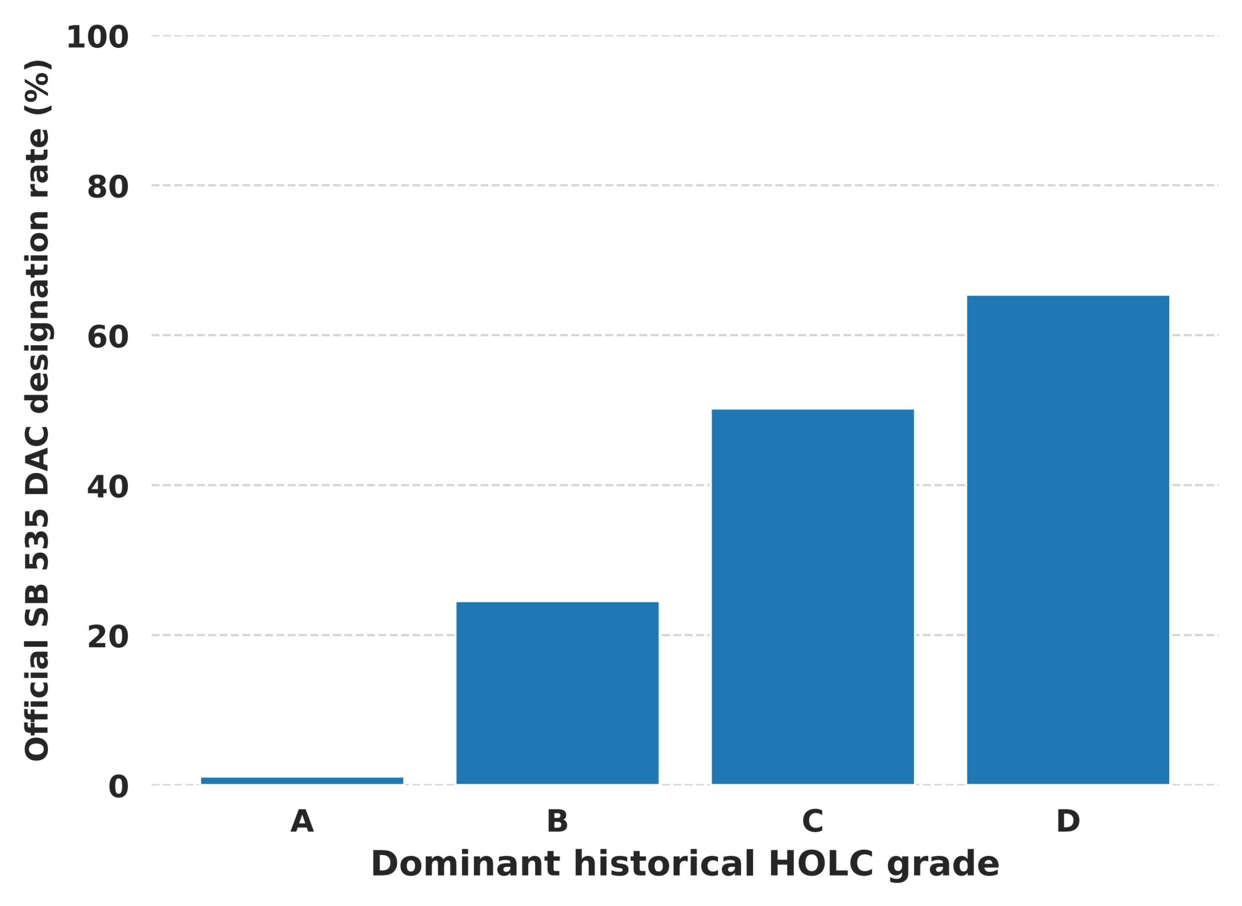
In the 1930s, Home Owners’ Loan Corporation (HOLC) residential security maps divided city neighborhoods into grades, from A (“best”) to D (“hazardous”); those lower-grade neighborhoods have been regarded as related to lasting social and environmental inequalities, although the maps were not the sole mechanism by which such inequalities arose. We examined whether historical HOLC severity is associated with today’s environmental burden and whether California SB 535 Disadvantaged Community designation aligns with this historical pattern. Our hypothesis is that tracts with lower HOLC grades would have higher CalEnviroScreen Pollution Burden percentiles, and that they are more likely to be DAC-designated. We first overlaid digitized HOLC polygons with 2010 Census tracts, calculated an area-weighted HOLC severity score; from there, we merged the data with CalEnviroScreen 4.0 and SB 535 DAC data to test our hypothesis. There are 1,713 tracts among the eight cities where we have historical HOLC records. The Pollution Burden percentile increases by 9.24 points (p < 0.001) when HOLC severity increases by one unit. After ACS adjustment, the increase is 6.42 points (p < 0.001). Diesel particulate matter and cleanup-site burden show the largest positive associations. The DAC designation percentage for HOLC A-grade tracts is about 1%, while it increases to 65% for D-grade tracts. There are 81 C/D-grade-dominated tracts that, although having Pollution Burden at or above the 75th percentile, are not DAC-designated. Overall, redlining is indeed associated with today’s environmental burden; nevertheless, redlining grade allocation information should not, by itself, be used solely as today’s environmental-justice screening.
Keywords: redlining; pollution; California; environment; equity
Introduction
During the 1930s, Home Owners’ Loan Corporation (HOLC) created Residential Security Maps for standardizing national real estate lending risk assessments, while it also became the groundwork for the discriminatory practice known as “redlining.” These maps captured patterns of local housing, infrastructure, and demographic conditions, and accordingly categorized city neighborhoods from A-grade (“best”) to D-grade (“hazardous”)1. We understand that these maps were not the only part of discriminatory housing practice. But studies show that the HOLC grades line up with long-term disinvestment in neighborhoods where people of color lived2. Over time, the term “redlining” is often referred to how residents of disfavored areas experienced very restricted access to mortgages and investment, either public or private.
In many recent studies, the associations between historically lower HOLC grades and today’s environmental conditions have been demonstrated, namely, that neighborhoods with lower HOLC grades show higher urban-heat exposure3, less greenspace4, and higher air-pollution burden5. A scoping review has assessed the current body of evidence, the range of outcomes studied, and key study characteristics, examining the direction and strength of the relationship between redlining, neighborhood environments, and health, as well as different methodological approaches6. Moreover, other work has linked historical redlining with fossil-fuel power plant siting and pollutant emissions, suggesting that historical housing and land-use decisions remain related to environmental inequality7. A recently published study also reported differences across several environmental quality indicators across historical HOLC grades8. Beyond air quality, many factors, such as more wells and a higher density of wells in neighborhoods across 33 US cities9, reduced urban tree canopy across 37 US cities10, and broader measures of urban health and neighborhood conditions11, have been associated with worse HOLC grades. A national analysis illustrated that historical redlining is associated with air-pollution disparities over the past 2–4 decades12. Across the seven cities investigated, there was a strong positive correlation between urban tree canopy and median household income. That is also the reason canopy is often examined alongside pollution burden13. Heat is the most consistently reported of these outcomes: land surface temperature was highest in the former HOLC class D category in each of Baltimore, Dallas and Kansas City14; HOLC maps serve as a spatial representation of present-day land-cover heat vulnerability characteristics in Philadelphia15; and neighborhoods with higher proportions of redlining showed significantly elevated heat-related emergency department visits in Texas16. Redlined areas also have lower tree cover and forest ecosystem services17, and lower wildlife biodiversity across six taxonomic clades in four California cities18. Nationwide analyses of air pollution link today’s differences in pollution levels to these historical land-use patterns19 and a recent study reports that simultaneous increases across twelve hazards raise the odds that a neighborhood was historically D-graded20. To extend the scope of documenting environmental associations and indicator disparities, we conduct environmental justice research by examining whether the current policy screening system actually identifies communities where historical disadvantage overlaps with today’s pollution burden.
Another set of literature reports associations between historical HOLC grades and present-day health. Across the eight cities examined in California, historically redlined tracts had higher age-adjusted rates of asthma-related emergency department visits21. The birth outcomes were also worse in Los Angeles, Oakland, and San Francisco22. Comparable investigations have reported that historical redlining policies were associated with pregnancy complications and adverse birth outcomes in Massachusetts23 and with later-stage cancer at diagnosis in Massachusetts24. A systematic review of thirty-six articles found that most reported significant associations between historic redlining and adverse health outcomes such as increased cardiovascular disease, higher rates of preterm births, increased cancer incidence, reduced survival time after breast cancer diagnosis, and increased firearm injury incidence25. Similar associations have been reported across varying health outcomes: an enduring association with cardiovascular risk among Black adults26, with kidney failure incidence27, with diabetes mortality and years of life lost28, with risk of preterm birth29, and with a higher incidence of shootings30. A city-level study reported quite comparable patterns across several health measures in Baltimore31.
The CalEnviroScreen tool has itself been studied, because California uses it to decide which communities qualify for policy programs. Earlier versions documented racial and ethnic disparities in cumulative environmental health impacts across the state32. CalEnviroScreen scores have also been associated with pediatric asthma hospitalization33. These studies evaluate the screening tool against contemporary health outcomes rather than historical exposure – that is the gap which the present study addresses.
California is a particularly useful setting for this extended research, because the state maintains CalEnviroScreen, a tract-level screening tool that summarizes pollution burden and population characteristics, and whose related criteria are in turn used to identify SB 535 Disadvantaged Communities (DACs) for environmental-justice programs34,35. To be specific here, pollution burden usually includes direct environmental indicators, for example, particulate matter, diesel particulate matter, traffic, cleanup sites, and toxic-release hazards34. SB 535 designation, however, incorporates multiple pathways and criteria, instead of a single Pollution Burden threshold35. Consequently, we should not oversimplify by assuming that a tract lacking DAC designation has thereby been wrongly excluded from resources.
The official 2022 designation formally designated four categories of geographic areas as disadvantaged: Census tracts receiving the highest 25 percent of overall scores in CalEnviroScreen 4.0; Census tracts lacking overall scores in CalEnviroScreen 4.0 due to data gaps, but receiving the highest 5 percent of CalEnviroScreen 4.0 cumulative pollution burden scores; census tracts identified in the 2017 DAC designation as disadvantaged; and lands under the control of federally recognized Tribes36. Pollution Burden alone does not determine the overall percentile. A tract at the 75th Pollution Burden percentile also does not necessarily qualify via the first category, because the overall score is the product of Pollution Burden and Population Characteristics37.
Our investigation started from testing whether the association between historical HOLC severity and current CalEnviroScreen Pollution Burden within California’s historical HOLC cities exists, and further extended the investigation to check whether DAC designation reflects this pattern. In our hypothesis, we assume that, if we limit comparisons to tracts within the same city, tracts with more severe historical HOLC exposure would have higher current Pollution Burden. We also assume that DAC designation would be more frequent in historically C- and D-graded tracts, while it may still be possible for a smaller group of historically C/D tracts with high current Pollution Burden not to be DAC-designated, for the reasons elaborated above.
Our actual results show a positive within-city association, especially for diesel particulate matter and cleanup-site burden, between HOLC severity and Pollution Burden, while we also identify a descriptive subset of historically C/D, high-Pollution-Burden, non-DAC tracts. This work examines California’s environmental burden and SB 535 Disadvantaged Community designation, while maintaining a cautious interpretation that these patterns only represent associations rather than evidence that HOLC grading itself caused today’s pollution conditions.
Methods
Study Area and Data Sources
We conducted a tract-level analysis for California Census data after overlapping them with digitized historical HOLC Residential Security Map polygons. HOLC polygon data is obtained from the Mapping Inequality project, provided by the Digital Scholarship Lab at the University of Richmond, and 2010 California Census data was obtained from the United States Census Bureau TIGER/Line archive1,38. We also obtained tract-level data, such as Pollution Burden percentiles and component indicators34, from CalEnviroScreen 4.0, provided by the California Office of Environmental Health Hazard Assessment (OEHHA). All databases used in this research are public and geographically aggregated; we summarized them and their spatial units, primary variables, and analytic roles in Table 1.
The primary data analytical sample includes tracts with at least 25% area overlap with one or more HOLC polygons. The sample used for the final city-fixed-effect analysis contains eight California cities that have historical HOLC maps, and the total number of tracts is 1,713. Here, we set a minimal coverage threshold to avoid using a very small mapped portion of a modern tract as samples in our data analytics.
The tract-level data, such as population density, poverty, median household income, unemployment, education, and race/ethnicity, is obtained from the 2019 American Community Survey39. A separate sensitivity analysis used the share of each tract mapped as industrial in California’s contemporary standardized zoning layers40. This is a land-use proxy, not a pre-HOLC confounder.
Historical HOLC Exposure Construction
Prior to area calculation, we reprojected both HOLC polygons and Census tract boundaries to the North America Albers Equal Area Conic coordinate reference system (EPSG:5070). For each tract, we first calculated pct_A, pct_B, pct_C, and pct_D based on the actual overlapping area of each HOLC grade, divided by the total land area of the tract. HOLC coverage was defined as the sum of these four grade-specific area shares. We then computed a continuous HOLC severity score for the portion of each tract that was covered by HOLC polygons—we assigned values from 1 to 4 to grades A through D, respectively, and then summed each grade value multiplied by its intersection area, further divided by the total HOLC-overlap area. Thus, the score would be 1 if a tract is fully covered by A-grade, or 4 if it is fully covered by D-grade. Additionally, we assigned a dominant grade based on the grade with the largest overlap area. We classified a tract as having majority C/D exposure if pct_C + pct_D was at least 0.50. We assigned each tract to the historical HOLC city with the largest overlap area for city-fixed-effect modeling and data analytics.
Outcomes and DAC Alignment Classification
The primary outcome was the CalEnviroScreen 4.0 Pollution Burden percentile, where higher values indicated greater relative statewide burden; the secondary outcomes were the corresponding percentiles for PM2.5, diesel particulate matter, traffic, cleanup sites, and toxic-release hazard. Official SB 535 DAC designation was coded 1 when a tract appeared in the OEHHA DAC tract list and 0 otherwise. This coding represented designation status only; it did not, in itself, measure the program funding or investment a tract had been given.
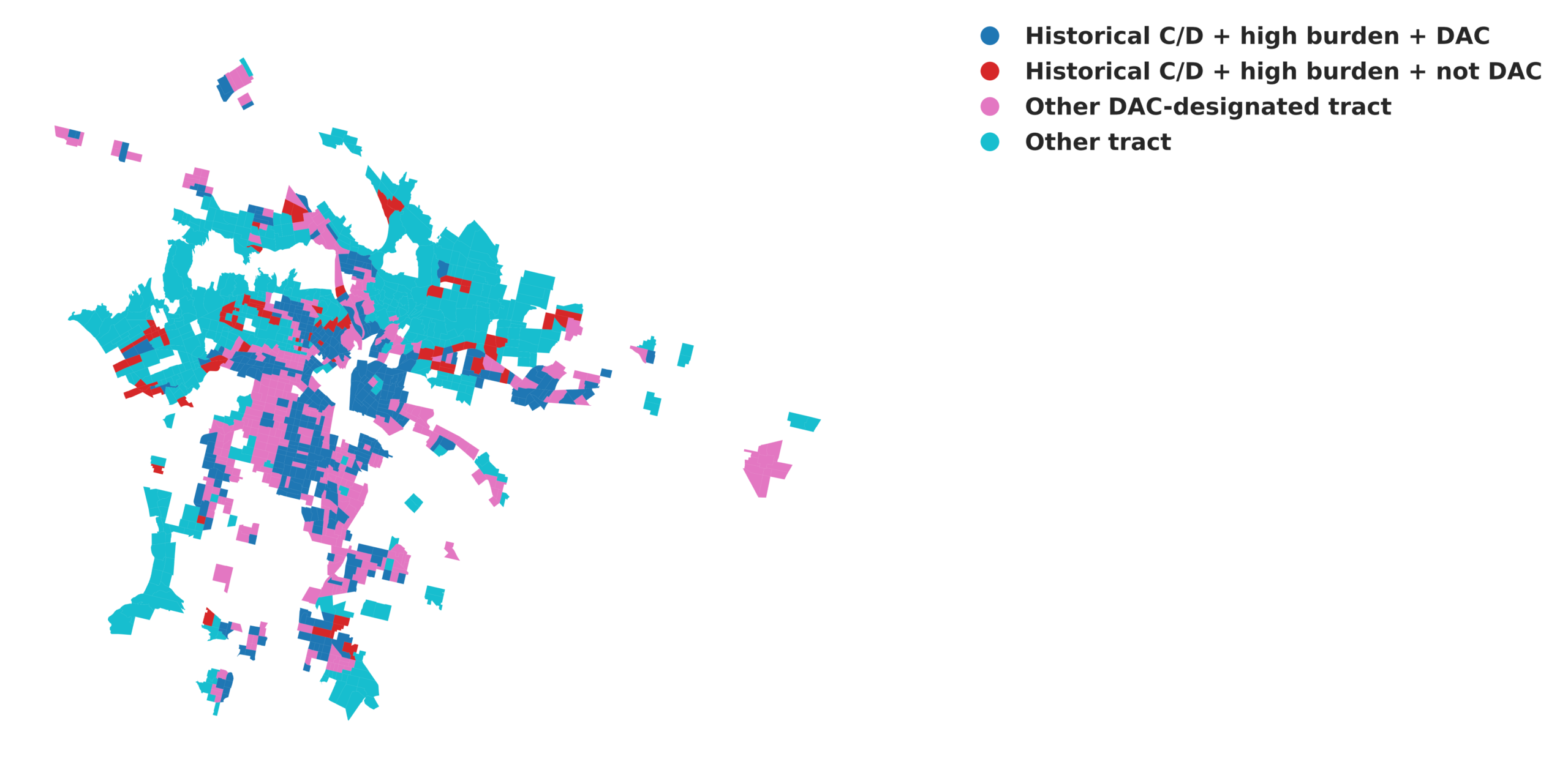
For the present article, we also created a subset of tracts. A tract in this subset has majority C/D exposure and a Pollution Burden percentile of at least 75, but does not have an official DAC designation. These are our research choices instead of SB 535 criteria.
| Source | Spatial unit | Primary variables used | Role in analysis |
| Mapping Inequality HOLC polygons | Historic neighborhood polygons | A–D grade; city; polygon geometry | Historical exposure |
| 2010 U.S. Census TIGER/Line | Census tract | GEOID; tract geometry; land area | Geographic matching base |
| CalEnviroScreen 4.0 | 2010 Census tract | Pollution Burden; PM2.5; diesel PM; traffic; cleanup sites; toxic-release hazard | Environmental outcomes |
| SB 535 DAC list | Census tract | Official DAC designation | Policy-alignment outcome |
| 2019 American Community Survey five-year estimates | 2010 Census tract | Population density; poverty; income; unemployment; education; race/ethnicity | Covariate adjustment |
| California Statewide Zoning North and South | Zoning polygon / 2010 Census tract | Industrial-zoned land share | Contemporary land-use sensitivity |
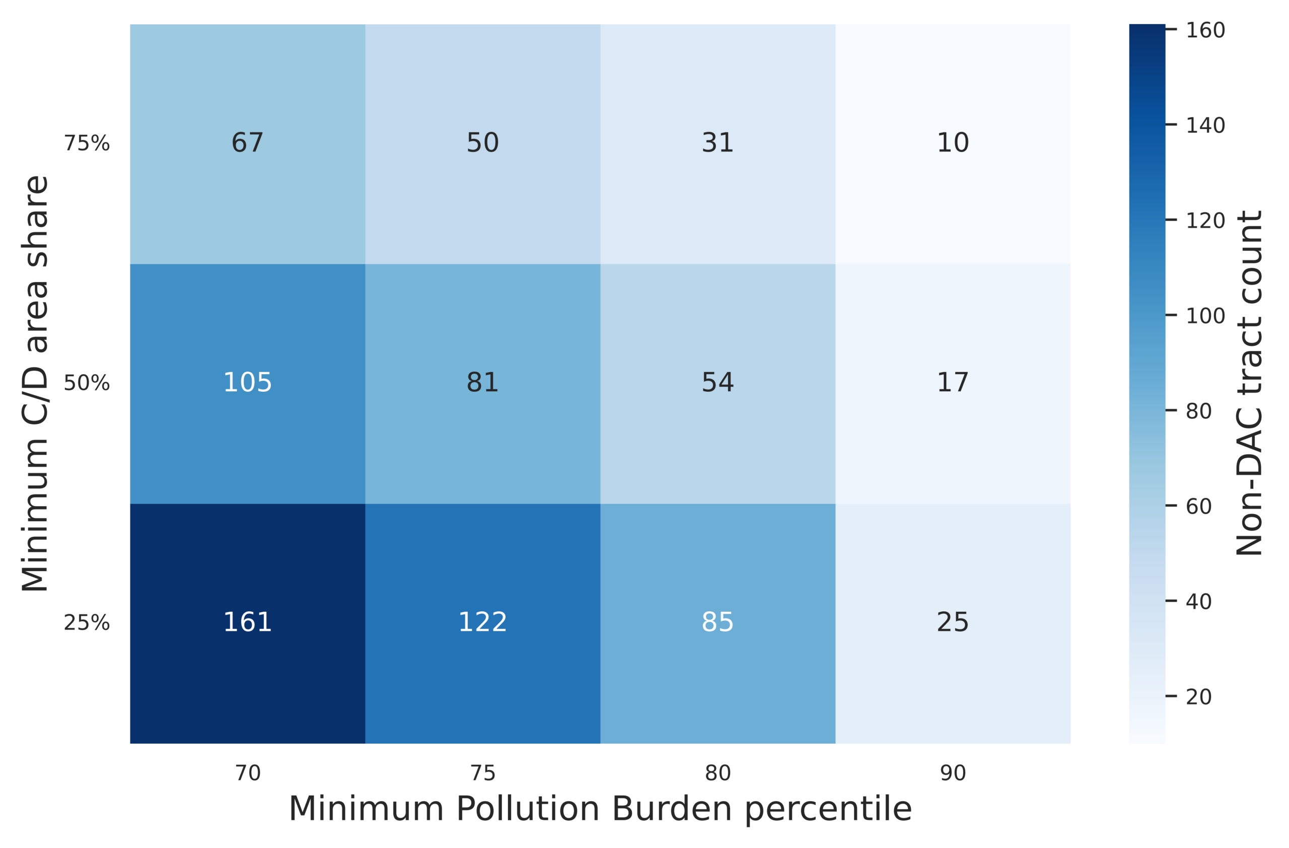
We repeated the classification varying the thresholds: C/D area share (25%, 50%, and 75%) and the Pollution Burden threshold (70th, 75th, 80th, and 90th percentiles). We also compared these tracts with the remaining high-Pollution-Burden non-DAC tracts that did not have majority C/D exposure.
In our analysis, five things are recorded for each of the 81 tracts: the overall CalEnviroScreen percentile, the Population Characteristics percentile, whether an overall score was missing, whether the tract appeared in the 2017 designation, and whether it fell within the official 2022 tribal-area map layer. These data help cover the pathways of tract designation.
Statistical Analysis and Visualization
For the present article, taking continuous HOLC severity as the predictor and the Pollution Burden percentile as the outcome, we created the ordinary least-squares regression model, specified as Pollution Burden_i = α + β(HOLC severity_i) + city fixed effects + ε_i, with fixed effects for historical cities and 95% confidence intervals estimated for β. The secondary models departed in one respect only: PM2.5, diesel particulate matter, traffic, cleanup-site, and toxic-release-hazard percentiles were each substituted, one at a time, in place of Pollution Burden as the dependent variable. We tested every model for residual spatial dependence. We used global and local Moran statistics under two weighting schemes: city-blocked queen contiguity and symmetric eight-nearest-neighbor weights. Significance was assessed with 999 permutations. Dependence remained under both schemes. We therefore used spatial-HAC inference for the reported confidence intervals. We also fitted spatial-error and spatial-lag sensitivity models under both weighting schemes.
A separate logistic model, logit[P(DAC_i = 1)] = α + β(HOLC severity_i) + city fixed effects, was used to examine the association between HOLC severity and official DAC designation. The adjusted model also added the same ACS covariates. Because DAC designation was common (820 of 1,713 tracts), we still used the logistic models for descriptive odds ratios and adjusted marginal probabilities. For inferential confidence intervals and p-values, we used spatial-HAC linear-probability models with the same predictors. Stockton (n = 16) was excluded because city-specific bivariate models required at least 20 tracts. In the robustness analyses, minimum HOLC coverage (10%, 25%, 50%, and 75%) was varied, continuous severity was replaced with dominant-grade indicators, and industrial-zoning share was added in a separate sensitivity model. Models used complete cases. All data cleaning, geographic matching, statistical analysis, and figure generation were performed in Python 3, using geopandas and shapely for the spatial overlay, pandas for data management, statsmodels for the regression models, and libpysal, esda and spreg for the spatial weights, Moran statistics and spatial regression models. The analysis code and the derived tract-level dataset are available from the corresponding author on request.
Results
Historical HOLC Severity was Associated with Current Pollution Burden within Cities
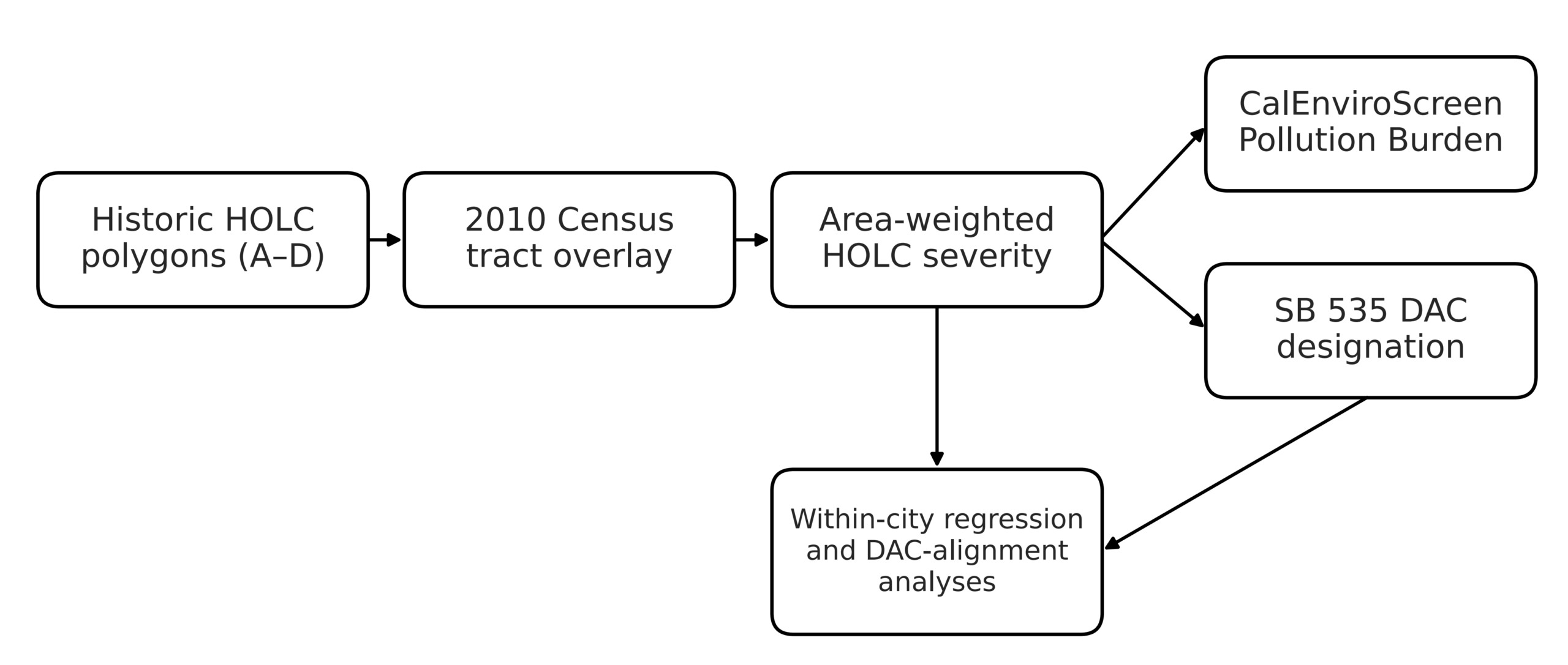
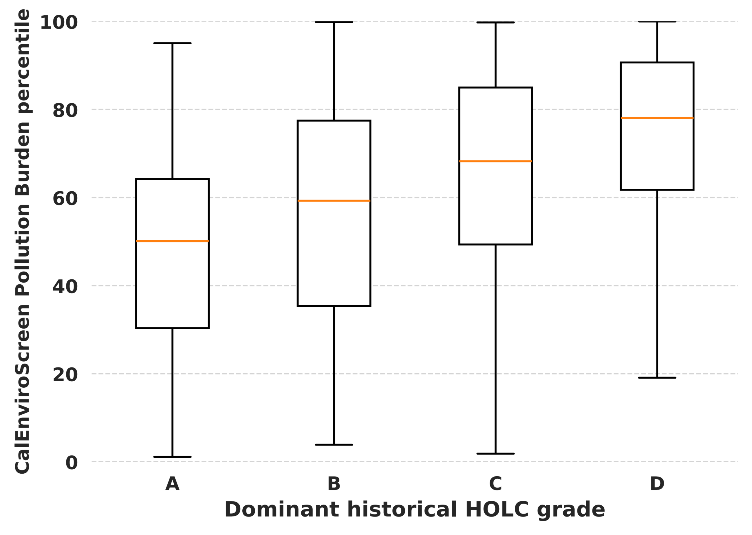
We included HOLC maps of eight California cities that have HOLC maps; among these, there are a total of 1,713 2010 Census tracts. Figure 1 illustrates the full data analytics flow. A tract would be included in the data analytics only if at least 25% of its area spatially overlaps with HOLC polygons. In Figure 2, current CalEnviroScreen Pollution Burden increases stepwise from A-grade tracts to D-grade tracts, in that both the median and the overall distributions of D-grade tracts shift upward, as the grade worsens, whereas A-grade tracts have the lowest median Pollution Burden percentile.
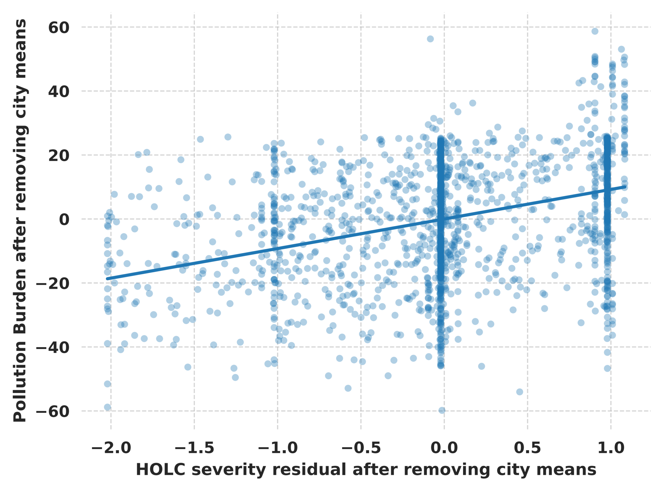
In the analysis, we included city fixed effects, and a one-unit increase in area-weighted HOLC severity is associated with a 9.24-point increase in Pollution Burden percentile (spatial-HAC 95% confidence interval: 7.69–10.80; p < 0.001; n = 1,713; Table 2). If we remove city means from both variables, the residual-on-residual visualization shows the same positive within-city relationship (R² = 0.128; Figure 3). The spatial-HAC inference is reported in Table 2.
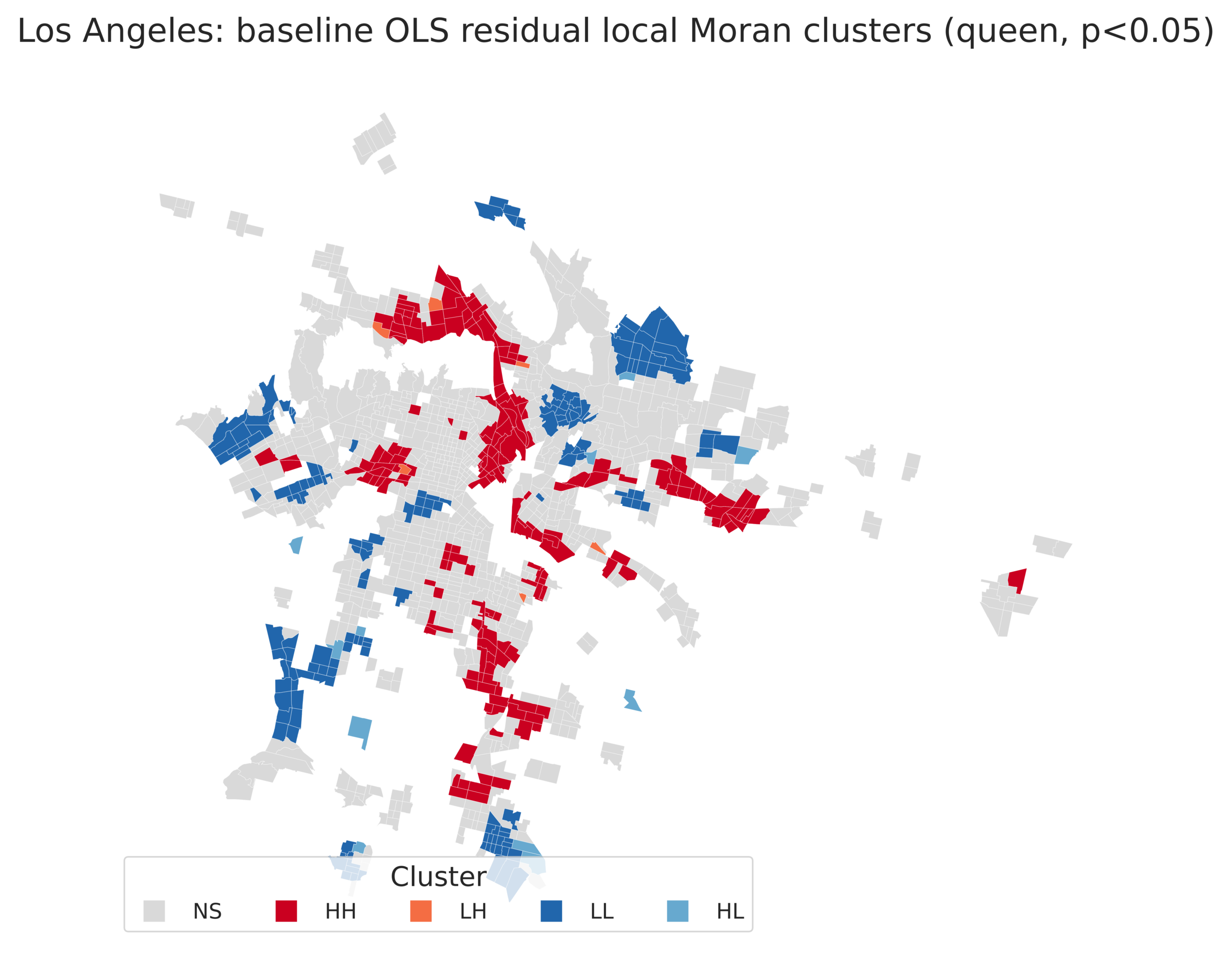
We observed residual dependence in the baseline model (Moran’s I = 0.601 with queen weights; I = 0.479 with eight-nearest-neighbor weights; both p = 0.001), as well as after ACS adjustment (I = 0.570 and 0.455; both p = 0.001). Local clusters are shown in Supplementary Figure S1. The baseline estimate was 9.24 (spatial-HAC 95% confidence interval: 7.69–10.80), and the adjusted estimate was 6.42 (4.64–8.20; both p < 0.001). The estimated spatial-error coefficients, 3.93–4.03 (both p < 0.001), indicated a positive association.
| Analysis or measure | Estimate or count | Interpretation |
| Primary sample | 1,713 tracts; 8 cities | Tracts with ≥25% HOLC-map coverage and complete primary-outcome data |
| Baseline and ACS-adjusted city-fixed-effect OLS | +9.24 baseline; +6.42 adjusted points per +1 HOLC severity | Spatial-HAC 95% CIs: 7.69–10.80 baseline; 4.64–8.20 adjusted; both p < 0.001 |
| Largest secondary association | +10.87 Diesel PM percentile points per +1 HOLC severity | Positive association after city fixed effects |
| Cleanup-site association | +8.92 percentile points per +1 HOLC severity | Positive association after city fixed effects |
| Official SB 535 DACs | 820 tracts | Designated DACs within analytic sample |
| Historically C/D, high-Pollution-Burden, non-DAC tracts | 81 of 159 high-Pollution-Burden non-DAC tracts (4.73% of sample) | Research-defined descriptive subset; not evidence of screening failure |
| Coverage-threshold sensitivity | Approximately +9.1 to +9.5 points | Primary estimate remained positive at 10%, 25%, 50%, and 75% minimum coverage |
| Residual spatial autocorrelation | Baseline Moran’s I: 0.601 (queen), 0.479 (8-NN); adjusted: 0.570, 0.455 | All permutation p = 0.001; residual dependence remained under both weights |
| Spatial-error sensitivity | Adjusted spatial-error: +3.93 to +4.03 | Both p < 0.001; positive association, with specification-dependent magnitude |
| Dominant-grade sensitivity | Adjusted vs. A: B +3.85; C +6.50; D +14.72 | Spatial-HAC 95% CIs: B −0.65–8.35; C 1.75–11.25; D 9.50–19.95 |
| Industrial-zoning sensitivity | +5.51 points per +1 HOLC severity | Spatial-HAC 95% CI: 3.74–7.29; p < 0.001 |
| DAC logistic models | Odds ratios: 4.37 baseline, 2.64 adjusted | Both p < 0.001; adjusted probabilities: 30.2%–55.1% across severity 1–4 |
| Descriptive-subset threshold sensitivity | 10–161 tracts | Across C/D-share thresholds of 25%–75% and Pollution Burden thresholds of 70–90 |
| Tribal-area audit | 0 of 81 tracts intersected the official mapped 2022 tribal-area layer | Cannot exclude consultation-established lands absent from the public map |
| Model diagnostics | R²: 0.473 baseline, 0.538 adjusted; HOLC VIF 1.41; maximum Cook’s distance 0.043 | Supporting results and diagnostics are summarized in Appendix Table A1 and Supplementary Figure S2 |
Specific Environmental Indicators Showed Different Magnitudes of Association
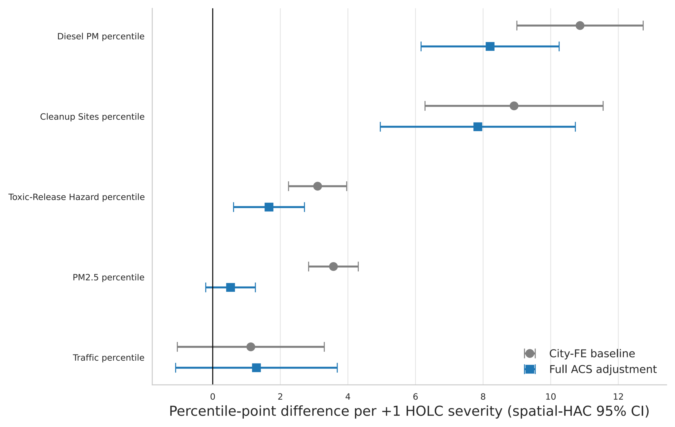
The positive association exists beyond the composite Pollution Burden percentile; more specifically, diesel particulate matter has the largest estimated association with HOLC severity, increasing by 10.87 percentile points per one-unit increase in severity (spatial-HAC 95% confidence interval: 9.00–12.74)—and cleanup-site burden increases by 8.92 percentile points (spatial-HAC 95% confidence interval: 6.28–11.55). We note, however, that although PM2.5 and toxic-release hazard percentiles also have positive associations, the traffic estimate was smaller and less precise (1.13; spatial-HAC 95% confidence interval: −1.05–3.30; p = 0.310; Figure 4); thus, we cannot conclude that HOLC severity is associated with traffic exposure with confidence.
DAC Designation Aligned Substantially, But Not Completely, with Historical and Current Burden
The official SB 535 DAC designation increases across dominant HOLC grades, as shown in Figure 5, with a very sharp trend: A-grade tracts have only 1% being DAC-designated; B-grade tracts increase to 24%, C-grade tracts further increase to 50%, and D-grade tracts show the largest overlap, with 65% DAC-designated. Out of 1,713 tracts, 820 are designated as DACs as part of this analytic sample.
Among the 159 high-Pollution-Burden non-DAC tracts, 81 also had majority C/D historical exposure, representing 4.73% of the analytic sample (Table 2). The 81 had a mean overall CalEnviroScreen percentile of 55.6 and Population Characteristics percentiles of 35.6, and the other 78 tracts had CalEnviroScreen of 50.3 and Population Characteristics percentiles of 30.7. The maximum overall percentile among the group of 81 was 74.6, and the group mean was 55.6 — no tract in this group reached the highest 25% of overall CalEnviroScreen scores. None of the 81 lacked an overall score, appeared under the tract-based 2017-retention pathway, or intersected the official mapped 2022 tribal-area layer. Using alternative thresholds, the count ranged from 10 to 161; threshold sensitivity is summarized in Appendix Table A2. Figure 6 presents the Los Angeles categories, which are not evidence of screening failure.
The Primary Association Was Robust to Alternative Overlap Thresholds
In all seven cities with at least 20 tracts for separate slope estimates, the city-specific exploratory model produced all positive point estimates, although the magnitude of the association varies across cities; Stockton had 16 tracts and was excluded under this prespecified rule. Moreover, we validate that the primary result remains quite stable, even when we change the minimal HOLC-map coverage threshold from 10% to 75%. Across these thresholds, the estimated association between HOLC severity and Pollution Burden remains approximately 9.1–9.5 percentile points per one-unit increase in severity. Furthermore, all corresponding confidence intervals remain above zero. Our validation checks indicate strongly that our primary result is not dependent on the 25% coverage threshold used in the main analysis.
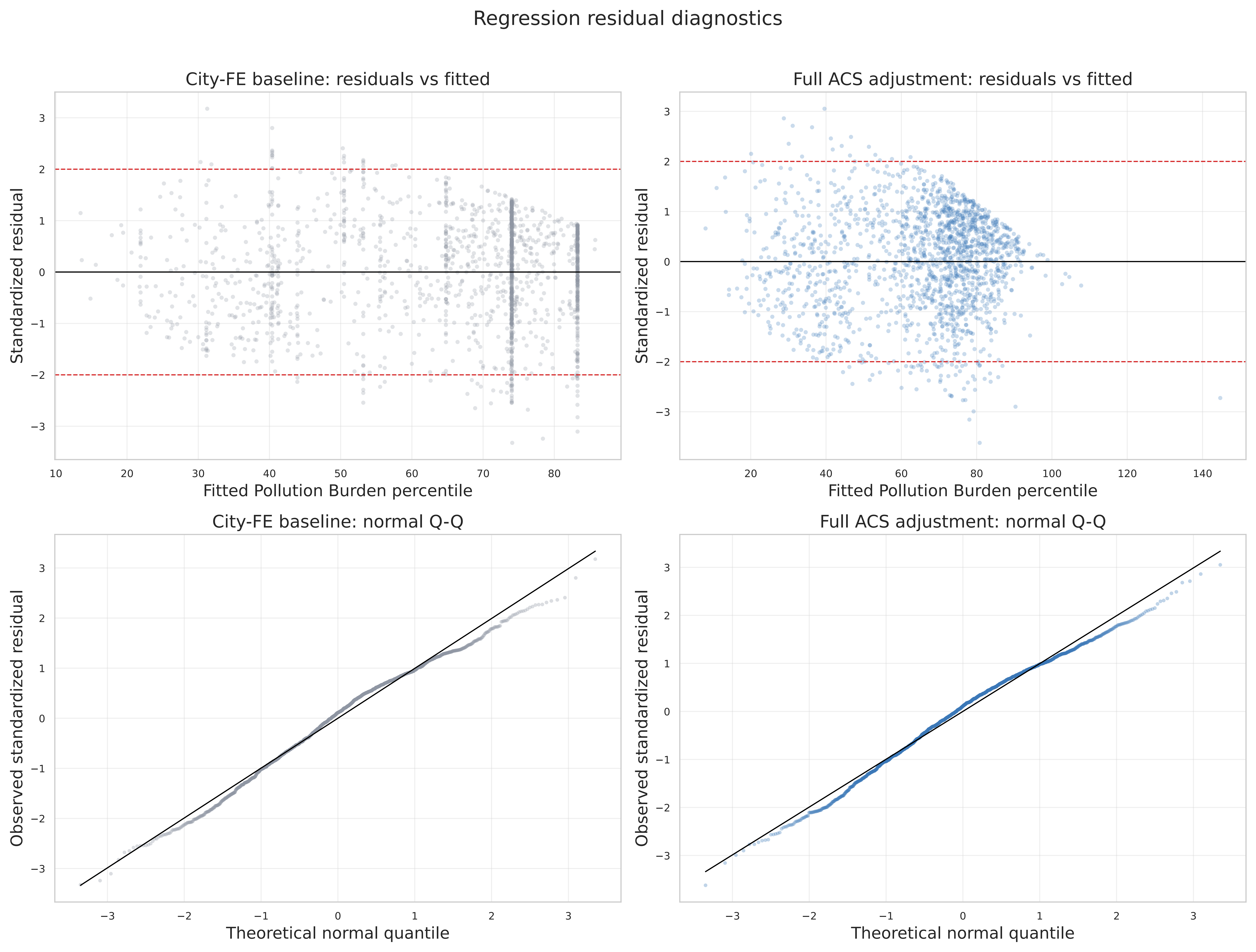
The baseline and adjusted logistic models produced descriptive odds ratios of 4.37 and 2.64, respectively. Adjusted marginal probabilities rose from 30.2% to 55.1% if we increase severity from 1 to 4. For inference, the baseline and adjusted spatial-HAC linear-probability models estimated increases of 24.35 and 4.38 percentage points for each one-unit increase in HOLC severity (95% confidence intervals: 21.08–27.61 and 1.69–7.07; p < 0.001 and p = 0.001, respectively). Pollution Burden model R² increased from 0.473 to 0.538 after adjustment. The HOLC-severity VIF was 1.41, and maximum Cook’s distance was 0.043. Residual tests indicated heteroskedasticity, nonnormality, and evidence that a linear specification did not fully capture the relationship (Supplementary Figure S2). If compared to grade A, coefficients in the adjusted dominant-grade model were +3.85 for B (spatial-HAC 95% confidence interval: −0.65–8.35; p = 0.094), +6.50 for C (1.75–11.25; p = 0.007), and +14.72 for D (9.50–19.95; p < 0.001). However, the concern about functional form remained.
Discussion
This study found that historical HOLC severity was positively associated with today’s CalEnviroScreen Pollution Burden within California cities, where the inclusion of city fixed effects simply means that the primary comparison occurred among tracts belonging to the same historical city, rather than between cities with different regional histories or industrial profiles. Taken together, the stepwise distribution of tracts from A-grade to D-grade and the positive residual-on-residual relationship indicate that this observed pattern was neither limited to a small set of unusually burdened cities nor a purely between-city contrast.
ACS adjustment reduced the estimate from 9.24 to 6.42 points. It will be further reduced to 5.51 if we add contemporary industrial-zoning share (spatial-HAC 95% confidence interval: 3.74–7.29; p < 0.001). Smaller coefficients were obtained from spatial-error models, because they re-estimate the coefficient under a spatial structure assumption, whereas spatial-HAC does not change the point estimate and only widens its confidence interval. The association is still positive – but its magnitude depended on model assumptions. These estimates do not identify an independent causal effect because contemporary covariates could be confounders, mediators, or both.
If we zoom in on these results relating to specific indicators, the association was strongest for diesel particulate matter and cleanup-site burden; these are consistent with urban processes that may concentrate freight corridors, industrial activities, hazardous-site legacies, or remediation needs in certain neighborhoods. We also observed positive associations for PM2.5 and toxic-release hazards, as they also reflect a broader environmental-burden pattern; however, not every present-day exposure followed the same gradient, as we can see from the weak and imprecise traffic result. It is not unexpected that environmental inequality is patterned along multiple pathways, particularly since individual indicators differ in spatial scale, measurement method, and relationship to local land use; these findings, therefore, extend prior research work on redlining and environmental conditions, although the associations reported in prior work are not uniform across all pollutants3,4,5,6,7,8. These results match nationwide work, as national analyses report redlining-associated air-pollution disparities12,19 and higher odds of historical D-grading where multiple hazards rise together20. However, the strongest components are diesel particulate matter and cleanup sites in our study, as compared to PM2.5 nationwide. This is consistent with California’s freight corridors and industrial-site legacy.
We further extended our research to the provided DAC analysis. SB 535 designation was shown to be substantially more common in historically lower-graded tracts, as the data show a rise from approximately 1% of A-graded tracts to approximately 65% of D-graded tracts. This pattern indicates that California’s current screening framework captures many communities where historical redlining and current environmental burden overlap. Please note that the result should not be interpreted as a test of whether the DAC framework is “correct” or not, because designation, in practice, uses several criteria beyond Pollution Burden and serves particular programmatic purposes35. Instead, this analysis shows broad alignment between historical grading and the current policy geography of environmental disadvantage.
Those 81 tracts meet the research definition: majority C/D exposure, Pollution Burden at or above the statewide 75th percentile, and no official DAC designation. They are a subset of the 159 high-Pollution-Burden non-DAC tracts, but not evidence of wrong exclusion. Historical maps may still add context to screening systems but without substituting for official designation pathways. In fact, historical grade data is more appropriate to use as supplementary information, rather than for designation. It could be useful for flagging tracts for closer review and informing outreach in communities with a documented history.
In our study, we also estimated variation in the relationship across cities, and we had expected this heterogeneity, because California cities differ in industrial development, highway construction, port activity, metropolitan growth, and local policy histories; the city fixed effects, as discussed, reduced the influence of average differences among cities, but they did not remove all within-city variation in zoning, land use, or demographic change. We suggest that future research examine city-specific mechanisms, including proximity to freight infrastructure, industrial land uses, and historical public investment decisions, rather than treating the statewide estimate as a single universal effect.
When interpreting the results, we need to be aware of several limitations. First, observational, tract-level data were used in this study, and they cannot establish that HOLC grading caused current Pollution Burden. Some neighborhood inequities preceded HOLC mapping; however, unmeasured factors may have influenced both historical grades and later environmental conditions. Second, modern Census tracts and earlier HOLC regions represented by polygons do not share identical boundaries. As a mitigation, we implemented area-weighted overlays and multiple coverage thresholds to reduce this mismatch, although tract-level measures remain approximations of neighborhood exposure. Third, CalEnviroScreen percentiles are relative statewide rankings and do not measure each resident’s personal exposure34. Fourth, the thresholds defining the subset are research decisions, and they are not official DAC rules35. Fifth, residual spatial dependence and functional-form concerns existed after adjustment. We therefore report spatial-HAC and spatial-model sensitivity estimates. Contemporary covariates, such as zoning, may be confounders or mediators. Sixth, the subset of 81 tracts is concentrated in Los Angeles — it characterizes the city far more than it characterizes the state.
Despite these limitations, our findings are strengthened by the observed consistency across HOLC coverage thresholds ranging from 10% to 75%; that is, the results do not appear to arise simply because of one arbitrary spatial-matching rule, nor from a particular subset of tracts. In addition, this study relies on direct environmental indicators rather than solely on a broad opportunity index, and it evaluates a current state policy framework alongside historical exposure. This approach, to our knowledge, combines historical urban geography, environmental conditions, and policy targeting in one tract-level analysis for the first time.
In conclusion, within California cities that have HOLC maps, historical HOLC severity was associated with higher present-day Pollution Burden. Historically, tracts with lower grades also had higher rates of SB 535 DAC designation, although a small group of historically C/D, high-burden tracts, was not designated.
Acknowledgments
We thank the Digital Scholarship Lab at the University of Richmond, the California Office of Environmental Health Hazard Assessment, and the United States Census Bureau for maintaining publicly accessible datasets used in this study.
Supplementary Materials
Appendix Tables A1–A2 summarize the principal added analyses. Supplementary Figures S1–S3 show local Moran clusters, regression diagnostics, and threshold sensitivity.
Appendix A. Supporting Results
| Analysis | Specification | Estimate or result |
| Residual Moran’s I | Baseline, queen | 0.601; permutation p = 0.001 |
| Residual Moran’s I | Baseline, 8-NN | 0.479; permutation p = 0.001 |
| Residual Moran’s I | ACS-adjusted, queen | 0.570; permutation p = 0.001 |
| Residual Moran’s I | ACS-adjusted, 8-NN | 0.455; permutation p = 0.001 |
| Spatial-error | ACS-adjusted, queen | +3.93 (95% CI: 2.56–5.30); p < 0.001 |
| Spatial-error | ACS-adjusted, 8-NN | +4.03 (2.66–5.41); p < 0.001 |
| Dominant grade | B vs. A, ACS-adjusted | +3.85 (spatial-HAC 95% CI: −0.65–8.35); p = 0.094 |
| Dominant grade | C vs. A, ACS-adjusted | +6.50 (1.75–11.25); p = 0.007 |
| Dominant grade | D vs. A, ACS-adjusted | +14.72 (9.50–19.95); p < 0.001 |
| Industrial zoning | ACS + zoning | +5.51 (spatial-HAC 95% CI: 3.74–7.29); p < 0.001 |
| DAC odds ratio | Baseline / adjusted | 4.37 (3.61–5.30) / 2.64 (1.95–3.58); both p < 0.001 |
| Tribal-area audit | Official mapped 2022 layer | 0 of 81 tracts intersected; public-layer caveat applies |
| Minimum C/D area share | Minimum Pollution Burden percentile | Tracts (% of primary sample) |
| 25% | 70th | 161 (9.40%) |
| 25% | 75th | 122 (7.12%) |
| 25% | 80th | 85 (4.96%) |
| 25% | 90th | 25 (1.46%) |
| 50% | 70th | 105 (6.13%) |
| 50% | 75th | 81 (4.73%) |
| 50% | 80th | 54 (3.15%) |
| 50% | 90th | 17 (0.99%) |
| 75% | 70th | 67 (3.91%) |
| 75% | 75th | 50 (2.92%) |
| 75% | 80th | 31 (1.81%) |
| 75% | 90th | 10 (0.58%) |
Supplementary Figures
References
- R. K. Nelson, L. Winling, R. Marciano, N. Connolly, E. L. Ayers. Mapping inequality: Redlining in New Deal America. Digital Scholarship Lab, University of Richmond, https://dsl.richmond.edu/panorama/redlining/, 2020. Accessed June 20, 2026. [↩] [↩]
- D. Aaronson, D. Hartley, B. Mazumder. The effects of the 1930s HOLC “redlining” maps. American Economic Journal: Economic Policy. Vol. 13, pg. 355–392, 2021, https://doi.org/10.1257/pol.20190414. [↩]
- J. S. Hoffman, V. Shandas, N. Pendleton. The effects of historical housing policies on resident exposure to intra-urban heat: A study of 108 US urban areas. Climate. Vol. 8, pg. 12, 2020, https://doi.org/10.3390/cli8010012. [↩] [↩]
- A. Nardone, K. E. Rudolph, R. Morello-Frosch, J. A. Casey. Redlines and greenspace: The relationship between historical redlining and 2010 greenspace across the United States. Environmental Health Perspectives. Vol. 129, pg. 017006, 2021, https://doi.org/10.1289/EHP7495. [↩] [↩]
- H. M. Lane, R. Morello-Frosch, J. D. Marshall, J. S. Apte. Historical redlining is associated with present-day air pollution disparities in U.S. cities. Environmental Science & Technology Letters. Vol. 9, pg. 345–350, 2022, https://doi.org/10.1021/acs.estlett.1c01012. [↩] [↩]
- C. B. Swope, D. Hernández, L. J. Cushing. The relationship of historical redlining with present-day neighborhood environmental and health outcomes: A scoping review and conceptual model. Journal of Urban Health. Vol. 99, pg. 959–983, 2022, https://doi.org/10.1007/s11524-022-00665-z. [↩] [↩]
- L. J. Cushing, S. Li, B. B. Steiger, J. A. Casey. Historical red-lining is associated with fossil fuel power plant siting and present-day inequalities in air pollutant emissions. Nature Energy. Vol. 8, pg. 52–61, 2023, https://doi.org/10.1038/s41560-022-01162-y. [↩] [↩]
- C. O. Estien, C. E. Wilkinson, R. Morello-Frosch, C. J. Schell. Historical redlining is associated with disparities in environmental quality across California. Environmental Science & Technology Letters. Vol. 11, pg. 54–59, 2024, https://doi.org/10.1021/acs.estlett.3c00870. [↩] [↩]
- D. J. X. Gonzalez, A. Nardone, A. V. Nguyen, R. Morello-Frosch, J. A. Casey. Historic redlining and the siting of oil and gas wells in the United States. Journal of Exposure Science & Environmental Epidemiology. Vol. 33, pg. 76–83, 2023, https://doi.org/10.1038/s41370-022-00434-9. [↩]
- D. H. Locke, B. Hall, J. M. Grove, S. T. A. Pickett, L. A. Ogden, C. Aoki, C. G. Boone, J. P. M. O’Neil-Dunne. Residential housing segregation and urban tree canopy in 37 US cities. npj Urban Sustainability. Vol. 1, pg. 15, 2021, https://doi.org/10.1038/s42949-021-00022-0. [↩]
- A. Nardone, J. Chiang, J. Corburn. Historic redlining and urban health today in U.S. cities. Environmental Justice. Vol. 13, pg. 109–119, 2020, https://doi.org/10.1089/env.2020.0011. [↩]
- I. Motairek, Z. Chen, M. H. E. Makhlouf, S. Rajagopalan, S. Al-Kindi. Historical neighborhood redlining and contemporary environmental racism. Local Environment. Vol. 28, pg. 518–528, 2023, https://doi.org/10.1080/13549839.2022.2155942. [↩] [↩]
- K. Schwarz, M. Fragkias, C. G. Boone, W. Zhou, M. McHale, J. M. Grove, J. O’Neil-Dunne, J. P. McFadden, G. L. Buckley, D. Childers, L. Ogden, S. Pincetl, D. Pataki, A. Whitmer, M. L. Cadenasso. Trees grow on money: urban tree canopy cover and environmental justice. PLoS ONE. Vol. 10, pg. e0122051, 2015, https://doi.org/10.1371/journal.pone.0122051. [↩]
- B. Wilson. Urban heat management and the legacy of redlining. Journal of the American Planning Association. Vol. 86, pg. 443–457, 2020, https://doi.org/10.1080/01944363.2020.1759127. [↩]
- L. H. Schinasi, C. Kanungo, Z. Christman, S. Barber, L. Tabb, I. Headen. Associations between historical redlining and present-day heat vulnerability housing and land cover characteristics in Philadelphia, PA. Journal of Urban Health. Vol. 99, pg. 134–145, 2022, https://doi.org/10.1007/s11524-021-00602-6. [↩]
- D. Li, G. D. Newman, B. Wilson, Y. Zhang, R. D. Brown. Modeling the relationships between historical redlining, urban heat, and heat-related emergency department visits: an examination of 11 Texas cities. Environment and Planning B: Urban Analytics and City Science. Vol. 49, pg. 933–952, 2022, https://doi.org/10.1177/23998083211039854. [↩]
- D. J. Nowak, A. Ellis, E. J. Greenfield. The disparity in tree cover and ecosystem service values among redlining classes in the United States. Landscape and Urban Planning. Vol. 221, pg. 104370, 2022, https://doi.org/10.1016/j.landurbplan.2022.104370. [↩]
- C. O. Estien, M. Fidino, C. E. Wilkinson, R. Morello-Frosch, C. J. Schell. Historical redlining is associated with disparities in wildlife biodiversity in four California cities. Proceedings of the National Academy of Sciences. Vol. 121, pg. e2321441121, 2024, https://doi.org/10.1073/pnas.2321441121. [↩]
- J. Liu, J. D. Marshall. Spatial decomposition of air pollution concentrations highlights historical causes for current exposure disparities in the United States. Environmental Science & Technology Letters. Vol. 10, pg. 280–286, 2023, https://doi.org/10.1021/acs.estlett.2c00826. [↩] [↩]
- A. Shkembi, R. L. Neitzel. Historical redlining and cumulative environmental impacts across the United States. Environmental Science & Technology Letters. Vol. 12, pg. 377–382, 2025, https://doi.org/10.1021/acs.estlett.4c01111. [↩] [↩]
- A. Nardone, J. A. Casey, R. Morello-Frosch, M. Mujahid, J. R. Balmes, N. Thakur. Associations between historical residential redlining and current age-adjusted rates of emergency department visits due to asthma across eight cities in California: an ecological study. The Lancet Planetary Health. Vol. 4, pg. e24–e31, 2020, https://doi.org/10.1016/S2542-5196(19)30241-4. [↩]
- A. L. Nardone, J. A. Casey, K. E. Rudolph, D. Karasek, M. Mujahid, R. Morello-Frosch. Associations between historical redlining and birth outcomes from 2006 through 2015 in California. PLOS ONE. Vol. 15, pg. e0237241, 2020, https://doi.org/10.1371/journal.pone.0237241. [↩]
- M. Chan, S. Parikh, E. Willcocks, J. Lytel-Sternberg, E. Castro, L. P. Tabb, J. Schwartz, T. James-Todd. Associations between historical redlining and the risk of pregnancy complications and adverse birth outcomes in Massachusetts, 1995–2015. Journal of Women’s Health. Vol. 33, pg. 1308–1317, 2024, https://doi.org/10.1089/jwh.2024.0031. [↩]
- N. Krieger, E. Wright, J. T. Chen, P. D. Waterman, E. R. Huntley, M. Arcaya. Cancer stage at diagnosis, historical redlining, and current neighborhood characteristics: breast, cervical, lung, and colorectal cancers, Massachusetts, 2001–2015. American Journal of Epidemiology. Vol. 189, pg. 1065–1075, 2020, https://doi.org/10.1093/aje/kwaa045. [↩]
- N. T. Kraus, S. Connor, K. Shoda, S. E. Moore, E. Irani. Historic redlining and health outcomes: a systematic review. Public Health Nursing. Vol. 41, pg. 287–296, 2024, https://doi.org/10.1111/phn.13276. [↩]
- M. S. Mujahid, X. Gao, L. P. Tabb, C. Morris, T. T. Lewis. Historical redlining and cardiovascular health: the Multi-Ethnic Study of Atherosclerosis. Proceedings of the National Academy of Sciences. Vol. 118, pg. e2110986118, 2021, https://doi.org/10.1073/pnas.2110986118. [↩]
- K. H. Nguyen, R. Buckle-Rashid, R. Thorsness, C. O. Agbai, D. C. Crews, A. N. Trivedi. Structural racism, historical redlining, and incidence of kidney failure in US cities, 2012–2019. Journal of the American Society of Nephrology. Vol. 34, pg. 1493–1503, 2023, https://doi.org/10.1681/ASN.0000000000000165. [↩]
- S. Linde, R. J. Walker, J. A. Campbell, L. E. Egede. Historic residential redlining and present-day diabetes mortality and years of life lost: the persistence of structural racism. Diabetes Care. Vol. 45, pg. 1772–1778, 2022, https://doi.org/10.2337/dc21-2563. [↩]
- N. Krieger, G. Van Wye, M. Huynh, P. D. Waterman, G. Maduro, W. Li, R. C. Gwynn, O. Barbot, M. T. Bassett. Structural racism, historical redlining, and risk of preterm birth in New York City, 2013–2017. American Journal of Public Health. Vol. 110, pg. 1046–1053, 2020, https://doi.org/10.2105/AJPH.2020.305656. [↩]
- M. Poulson, M. Y. Neufeld, T. Dechert, L. Allee, K. M. Kenzik. Historic redlining, structural racism, and firearm violence: a structural equation modeling approach. The Lancet Regional Health – Americas. Vol. 3, pg. 100052, 2021, https://doi.org/10.1016/j.lana.2021.100052. [↩]
- S. J. Huang, N. J. Sehgal. Association of historic redlining and present-day health in Baltimore. PLOS ONE. Vol. 17, pg. e0261028, 2022, https://doi.org/10.1371/journal.pone.0261028. [↩]
- L. Cushing, J. Faust, L. M. August, R. Cendak, W. Wieland, G. Alexeeff. Racial/ethnic disparities in cumulative environmental health impacts in California: evidence from a statewide environmental justice screening tool (CalEnviroScreen 1.1). American Journal of Public Health. Vol. 105, pg. 2341–2348, 2015, https://doi.org/10.2105/AJPH.2015.302643. [↩]
- E. Alcala, P. Brown, J. A. Capitman, M. Gonzalez, R. Cisneros. Cumulative impact of environmental pollution and population vulnerability on pediatric asthma hospitalizations: a multilevel analysis of CalEnviroScreen. International Journal of Environmental Research and Public Health. Vol. 16, pg. 2683, 2019, https://doi.org/10.3390/ijerph16152683. [↩]
- California Office of Environmental Health Hazard Assessment. CalEnviroScreen 4.0. https://oehha.ca.gov/calenviroscreen/report/calenviroscreen-40, 2021. Accessed June 20, 2026. [↩] [↩] [↩] [↩]
- California Office of Environmental Health Hazard Assessment. SB 535 disadvantaged communities. https://oehha.ca.gov/calenviroscreen/sb535, 2022. Accessed June 20, 2026. [↩] [↩] [↩] [↩]
- California Environmental Protection Agency. Final designation of disadvantaged communities pursuant to Senate Bill 535. https://calepa.ca.gov/wp-content/uploads/2022/05/Updated-Disadvantaged-Communities-Designation-DAC-May-2022-Eng.a.hp_-1.pdf, 2022. Accessed August 2, 2026. [↩]
- California Office of Environmental Health Hazard Assessment. CalEnviroScreen 4.0 report, scoring and model. https://oehha.ca.gov/media/downloads/calenviroscreen/report/calenviroscreen40reportf2021.pdf, 2021. Accessed August 2, 2026. [↩]
- United States Census Bureau. 2010 TIGER/Line shapefiles. https://www.census.gov/geographies/mapping-files/2010/geo/tiger-line-file.html, 2010. Accessed June 20, 2026. [↩]
- United States Census Bureau. 2019 American Community Survey five-year summary files. https://www2.census.gov/programs-surveys/acs/summary_file/2019/. Accessed July 31, 2026. [↩]
- California Governor’s Office of Land Use and Climate Innovation. California Statewide Zoning North and South. California State Geoportal, 2024. https://data.ca.gov/dataset/california-statewide-zoning-north and https://data.ca.gov/dataset/california-statewide-zoning-south. Accessed July 31, 2026. [↩]